Over the past few weeks outbreaks centered around meat processing facilities hit the news. I started wondering how these would impact Nebraska’s numbers. I break down Nebraska’s numbers by county here to see what is working and where we should be frankly alarmed. TL;DR: too early to open up Lancaster county according to whitehouse guidelines.
The first post in this series was March 13, in case you’re just joining and want to see the progression. I’m now posting the bottom line figures for each state and province on the same post that just gets updated each day.
DISCLAIMER: These unofficial results are not peer reviewed, and should not be treated as such. My goal is to learn about forecasting in real time, how simple models compare with more complex models, and even how to compare different models.1
For this analysis I’m going to the NY Times dataset directly, which has data for the USA broken
down by county. I’m also testing out a data package I contributed to – wnvdata2 –
has county level census
data so I can calculate per capita case rates.
library("tidyverse")
library("lubridate")
library("broom")
library("EpiEstim")

source("R/plot_functions.R")

# this package only from github
census_data <- wnvdata::census.data %>%
  filter(year == 2019) %>%
  select(fips,POP)

nytimes_counties <- read_csv("https://raw.githubusercontent.com/nytimes/covid-19-data/master/us-counties.csv")
ne_counties <- nytimes_counties %>% filter(state == "Nebraska",
                                           county != "Unknown") %>%
  group_by(county) %>%
  mutate(maxcases = max(cases)) %>%
  filter(maxcases > 100)
ggplot(data = ne_counties,
       mapping = aes(x = date, y = cases)) +
  geom_point(mapping = aes(color = county)) +
#  scale_y_log10() +
  labs(x = "Date",
       y = "Cumulative confirmed cases",
       title = "Confirmed cases of COVID-19 in Nebraska",
       subtitle = "Only counties with at least 100 cases",
caption = "Data from NY Times Github Repository.") 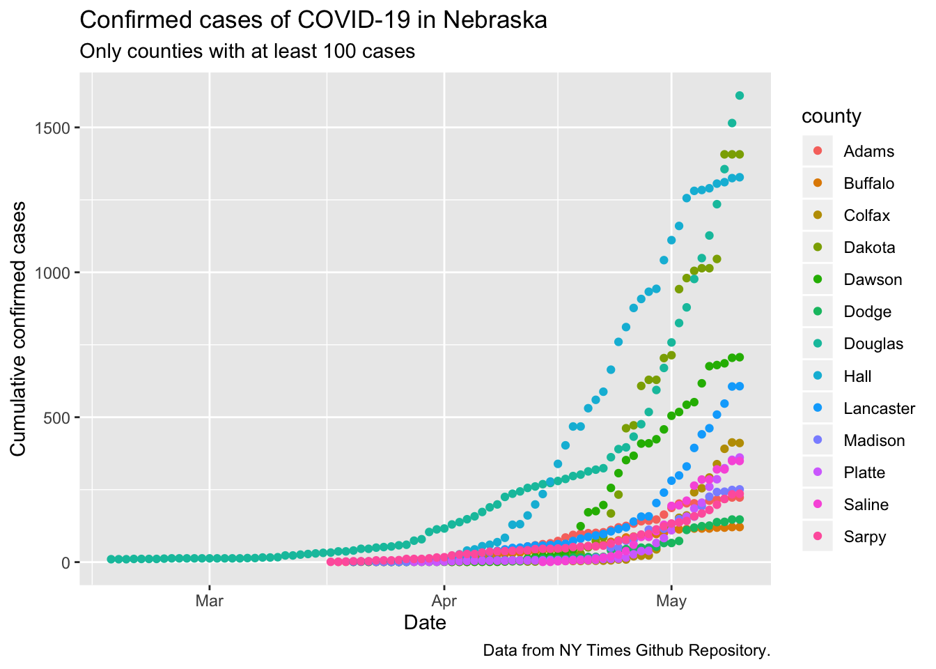
Looks like this data is including some of the initial cases from the Diamond Princess that were flown to UNMC, because I’m pretty sure there were no local cases in February.
So lets give these the Tyre Treatment. I’ll start the models on the day each county hit 20 cases, and only look at 6 counties that are interesting. The y axes are Active or Recovered cases per 100,000 population, so these curves can be directly compared despite the huge variation in the number of people in each county. I’ve put the actual dates on the x-axes, but let them shift, so all the x axes start on different days.
ne_counties <- nytimes_counties %>% filter(state == "Nebraska",
                                           county != "Unknown")

county_data <- ne_counties %>%
  group_by(county) %>%
  summarize(fips = last(fips)) %>%
  left_join(census_data)

# new function adapted from the one for states
ne_counties_plot <- plot_nytimes_counties(ne_counties,
                                          county_data,
                                          case_cutoff = 20,
                                          exclude = c())
county_pops <- ne_counties_plot$data %>%
  group_by(county) %>%
  summarize(POP = first(POP)) %>%
  arrange(POP)

plot_data <- ne_counties_plot$data %>%
  mutate(county = factor(county, levels = county_pops$county)) %>%
  filter(day >= 0,
         county %in% c("Sarpy","Douglas", "Lancaster", "Hall", "Dakota","Dawson"))
fits_data <- ne_counties_plot$fits %>%
  filter(county %in% c("Sarpy","Douglas", "Lancaster", "Hall", "Dakota","Dawson"))
predictions_data <- ne_counties_plot$predictions %>%
  filter(county %in% c("Sarpy","Douglas", "Lancaster", "Hall", "Dakota","Dawson"))


ggplot(data = plot_data,
                    mapping = aes(x = date)) +
      geom_point(mapping = aes(y = active, color = county)) +
      facet_wrap(~county, dir="v",
                 labeller = labeller(county = ne_counties_plot$facet_labels),
                 ncol=2, scales = "free") +
      scale_y_log10() +
      theme(legend.position = "none",
            legend.title = element_blank()) +
      geom_line(data = fits_data,
                mapping = aes(y = fit, color = county),
                size = 1.25) +
      geom_ribbon(data = fits_data,
                  mapping = aes(ymin = lcl, ymax = ucl),
                  alpha = 0.2) +
      geom_line(data = predictions_data,
                mapping = aes(y = fit, color = county),
                linetype = 2) +
      geom_ribbon(data = predictions_data,
                  mapping = aes(ymin = lpl, ymax = upl),
                  alpha = 0.2)  +
      # geom_rect(data = country_data,
      #           mapping = aes(x = start_day, xmin = start_day, xmax = end_day, ymin = icu_beds, ymax = icu_beds * 20),
      #           fill = "red", alpha = 0.2) +
      labs(y = "Active/recovered cases per 100,000 population",
           title = paste0("Active/recovered cases by date since 20th case"),
           x = paste0("Date"),
           subtitle = "Solid line: exponential model; Dashed line: forecast cases with 95% prediction intervals.",
caption = "Data from NY Times Github Repository.") 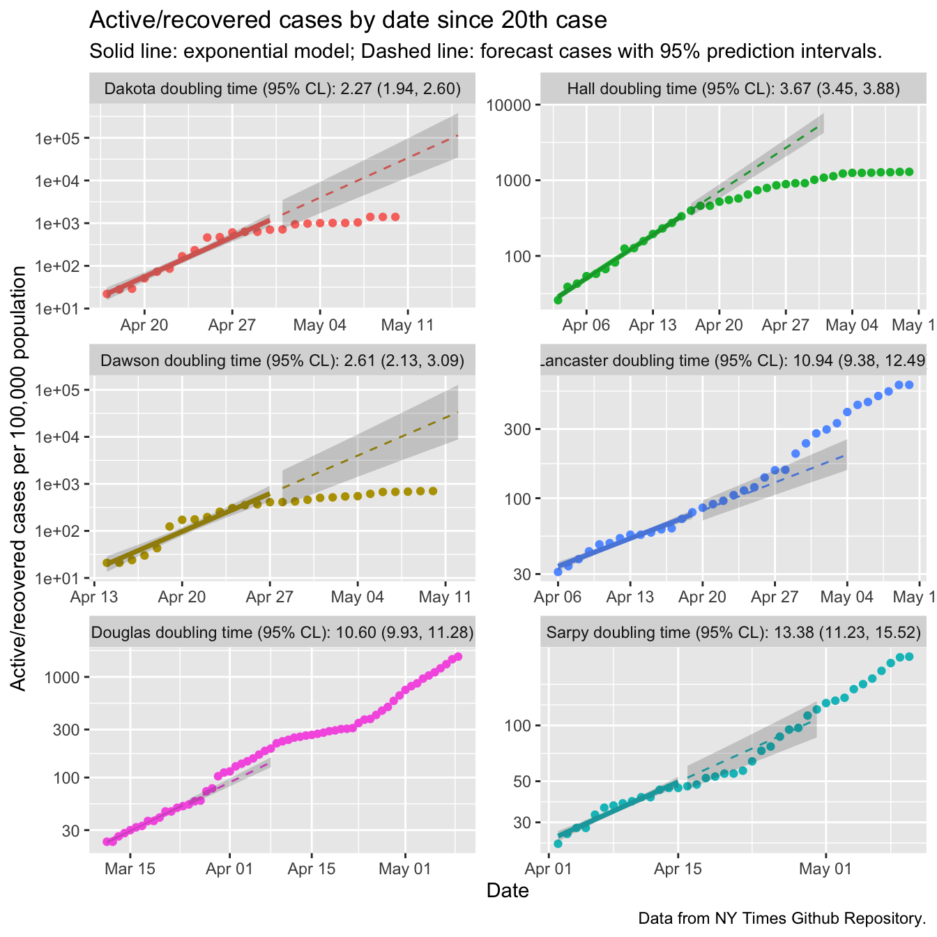
There are quite a few things to see here! First, the bump upwards in cases for the entire state that I attributed to an increase in testing just at the end of March happened entirely in Douglas county (part of Omaha, for non-Nebraskans), as far as I can tell. Douglas county also had clear signs of transmission reduction, with the points after April 8 flattening off relative to the exponential growth rate estimated from the first two weeks. Sarpy county is also part of Omaha and also showed signs of flattening. However, by the 3rd week of April both counties resumed accelerating at the early pace.
Lincoln is in Lancaster county, and we clearly are not flattening the curve.
In fact the doubling time will have decreased relative to the early number of 11 days.
Douglas and Sarply counties also had long doubling times early. One possible
reason is that urban Nebraskans had already started social distancing before the 20th
case was reported. Another possibility is that even in Nebraska’s urban centers
we are not as dense.
And then there are Dakota, Hall, and Dawson counties, all with early doubling times less than four days. All three broke through 1000 cases per 100,000 people (1% incidence). All three have clearly flattened off, indicating that the outbreaks there are more under control.
That’s encouraging. However, we are about to “open up” the state, and our cases in urban counties are still accelerating. The state as a whole has not hit \(R_t < 1\) (at least as of May 11). The guidelines for opening up suggest “a downward trajectory of documented cases within a 14 day period”. There are other possible criteria, but this one we can check with the data in hand. The observation on May 10 is quite an outlier with outsized effect on the model, so we’ll slide back one day.
lincoln_data <- ne_counties_plot$data %>%
  filter(county == "Lancaster",
         date > "2020-04-25",
         date < "2020-05-10")
lincoln_trend <- lm(incident_cases ~ day, data = lincoln_data)
summary(lincoln_trend)
##
## Call:
## lm(formula = incident_cases ~ day, data = lincoln_data)
##
## Residuals:
## Min 1Q Median 3Q Max
## -22.697 -8.870 1.234 8.130 25.613
##
## Coefficients:
## Estimate Std. Error t value Pr(>|t|)
## (Intercept) -30.1670 26.7219 -1.129 0.2810
## day 2.4484 0.9969 2.456 0.0303 *
## ---
## Signif. codes: 0 '***' 0.001 '**' 0.01 '*' 0.05 '.' 0.1 ' ' 1
##
## Residual standard error: 15.04 on 12 degrees of freedom
## Multiple R-squared: 0.3345, Adjusted R-squared: 0.279
## F-statistic: 6.032 on 1 and 12 DF, p-value: 0.03026The slope estimate is positive, an average of 2.4 more cases per day over the past 14 days. This is a statistically significant result, albeit barely. However, there is arguably no evidence of a decrease in cases over the past 14 days. So, at least by this criterion, there is NO WAY we should be re-opening Lancaster county yet.
This package isn’t available on CRAN. Get it on Github.↩
