Trying something new – all plots for states with sufficient data. Click the name of the locale you want to see. Tabs would be better, but for reasons beyond my ken, automatic tabsets don’t work with blogdown.
The first post in this series was on March 13, in case you’re just joining and want to see the progression.
DISCLAIMER: These unofficial results are not peer reviewed, and should not be treated as such. My goal is to learn about forecasting in real time, how simple models compare with more complex models, and even how to compare different models.1
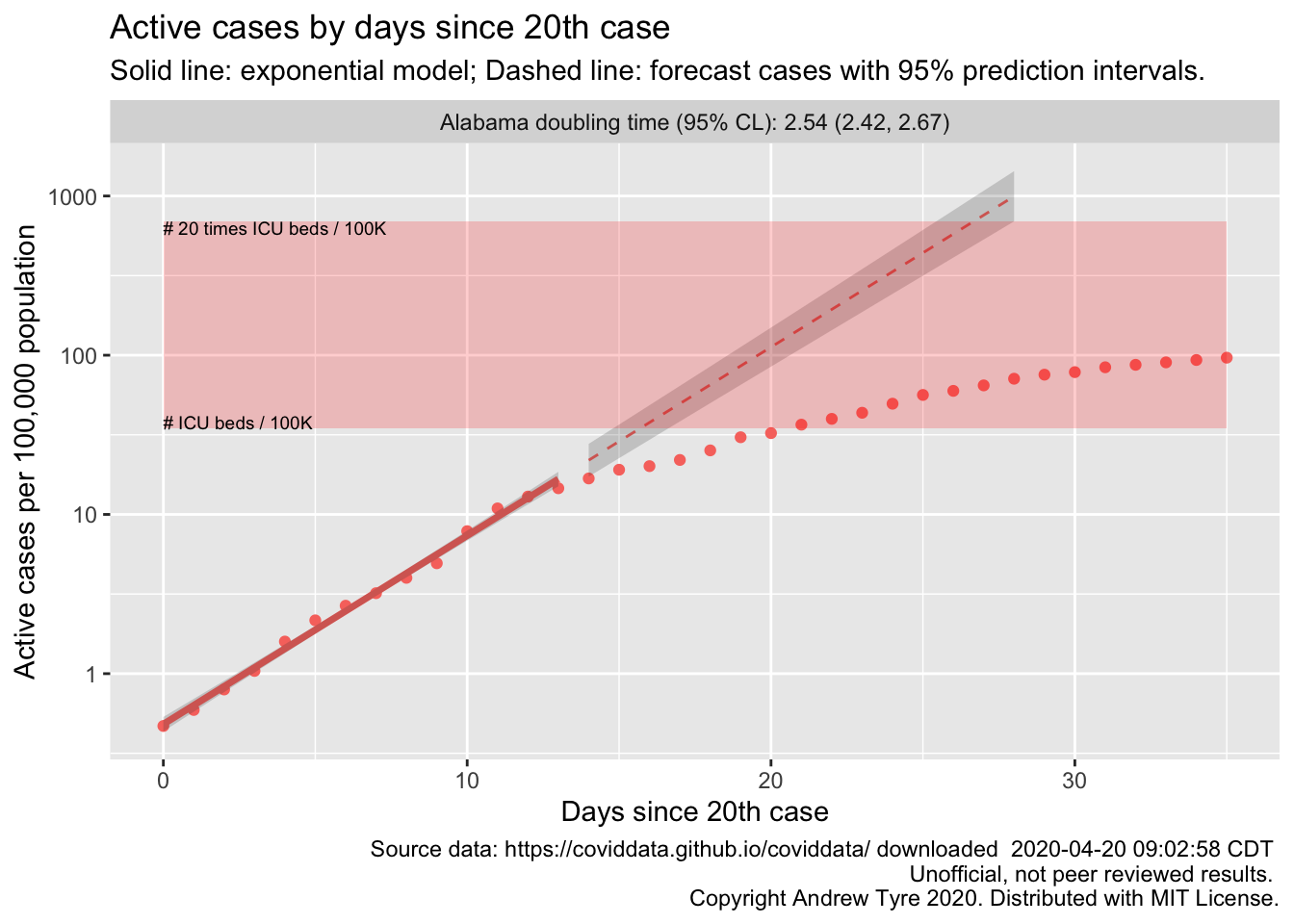
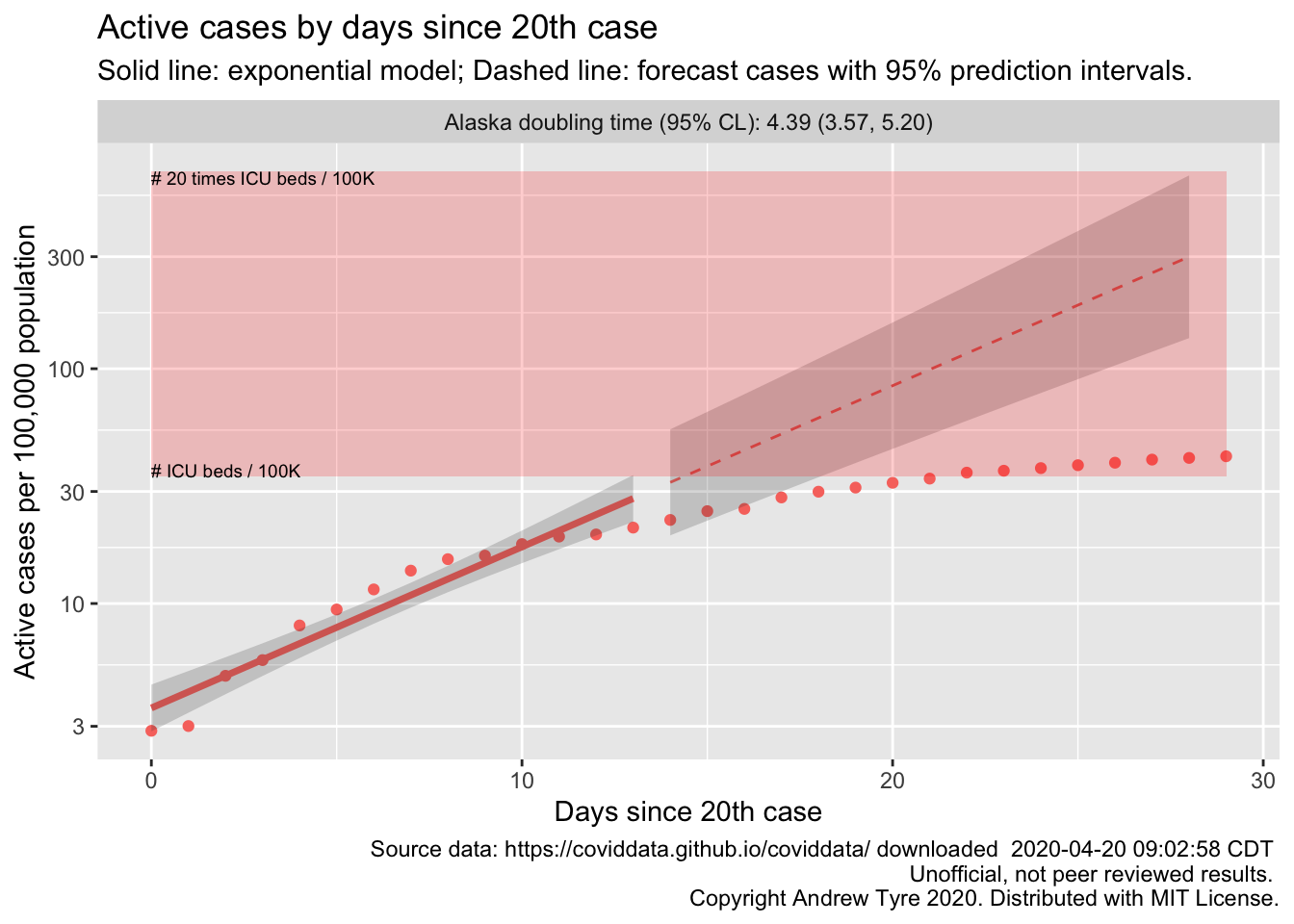
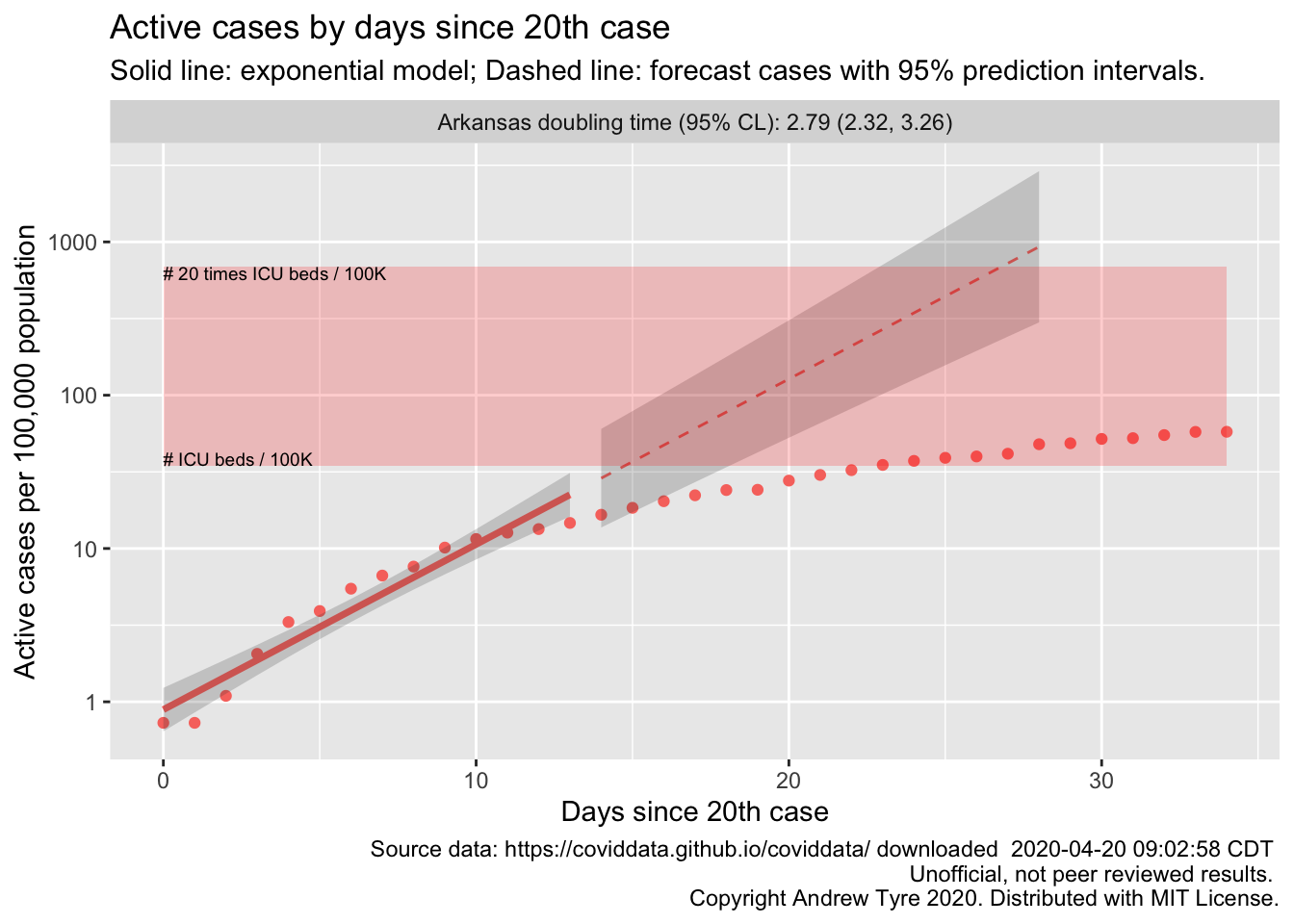
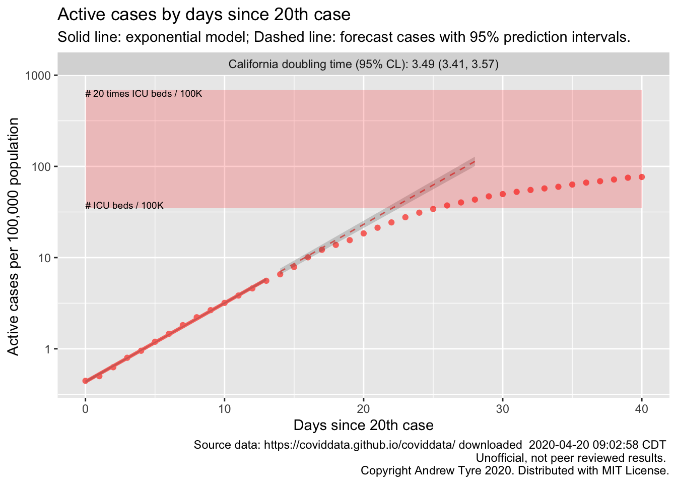
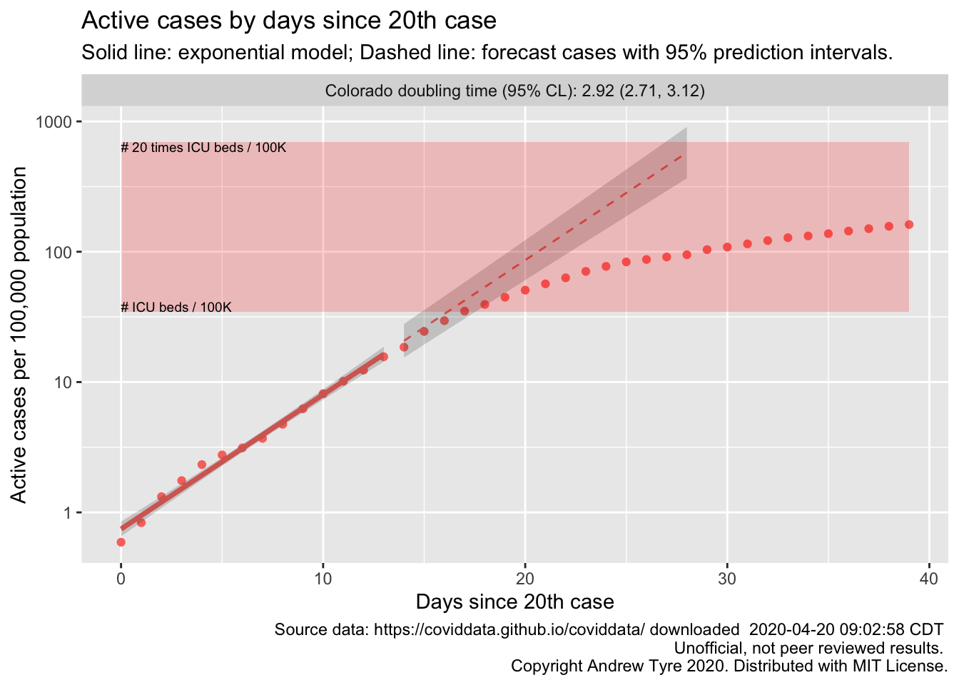
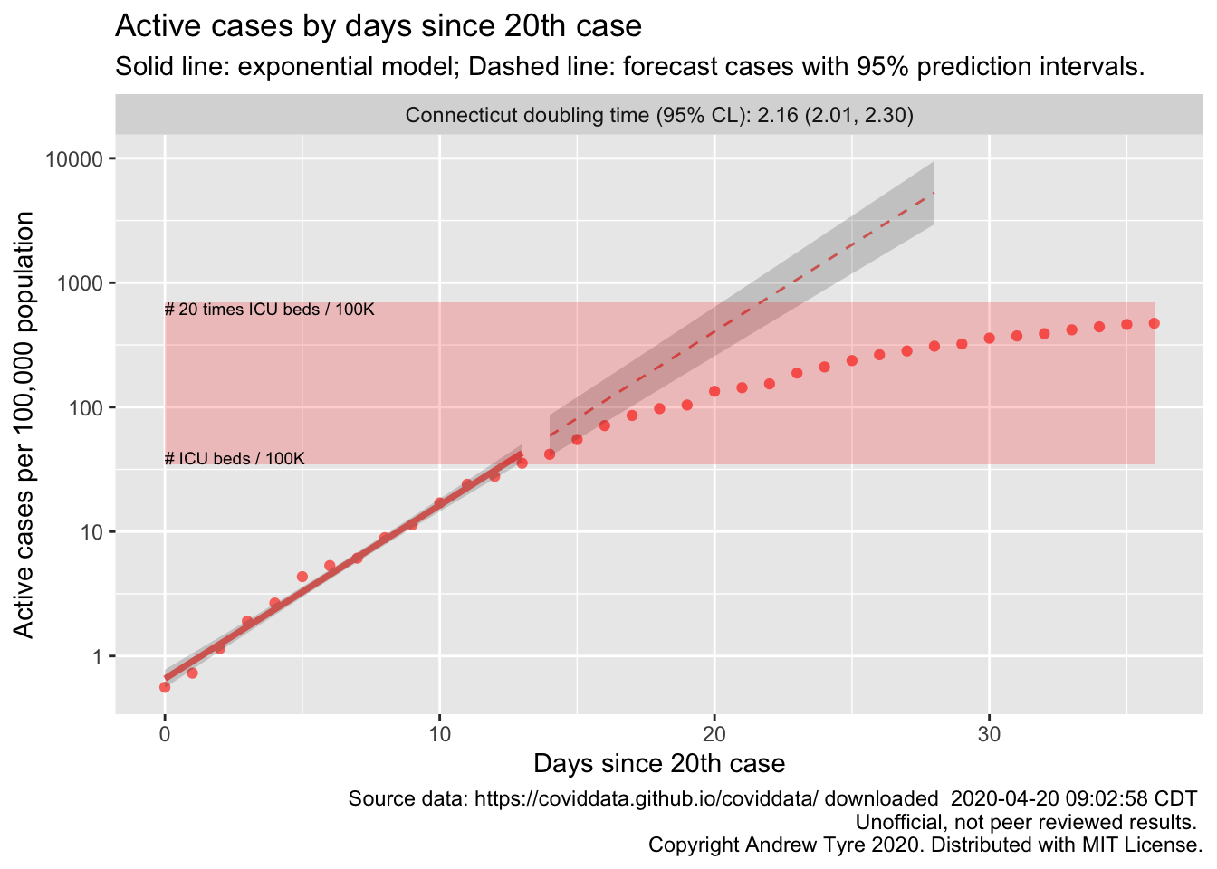
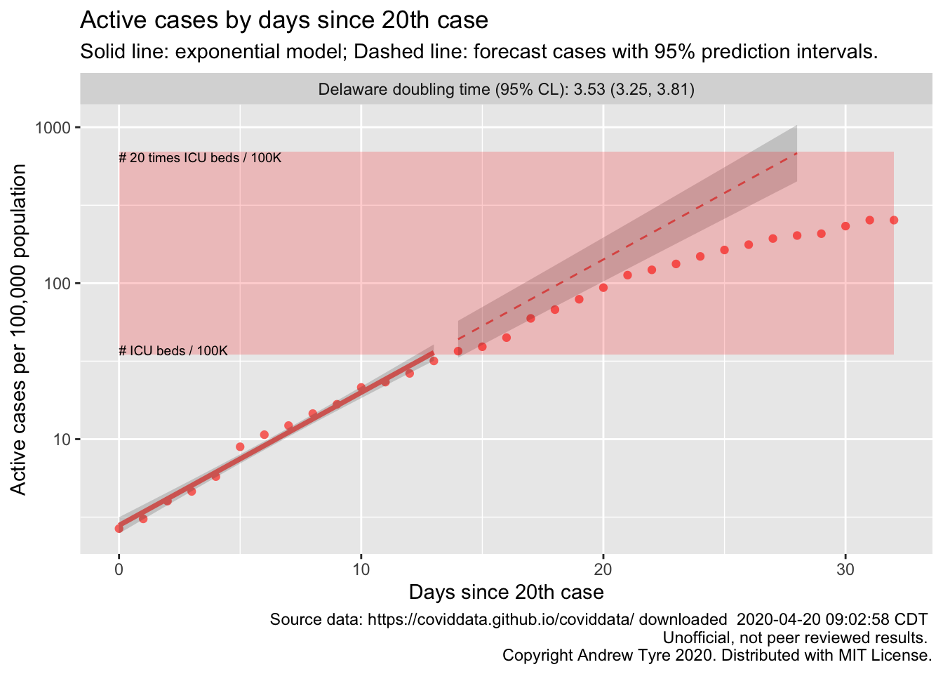
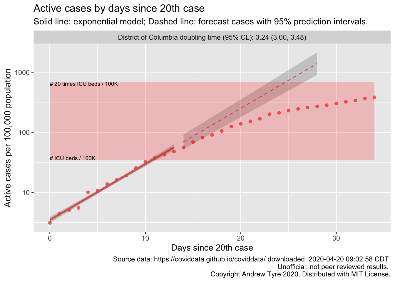
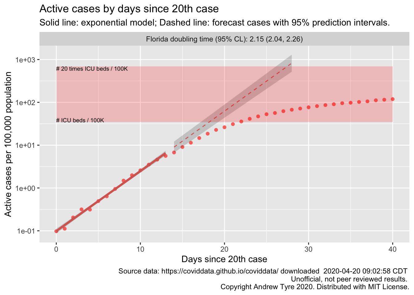
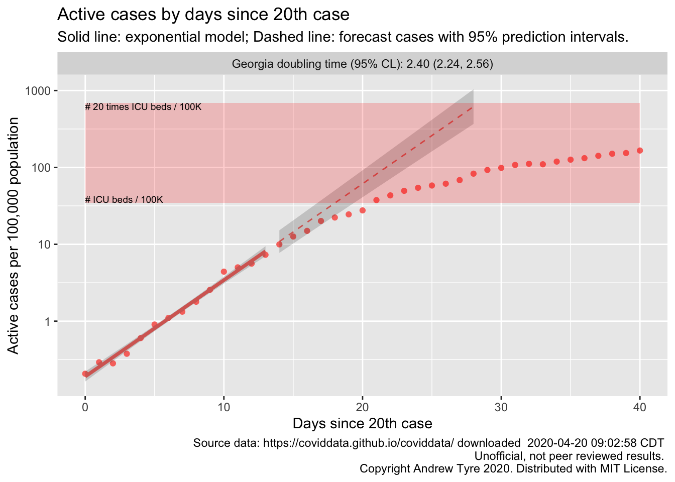
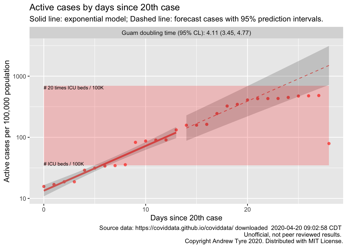
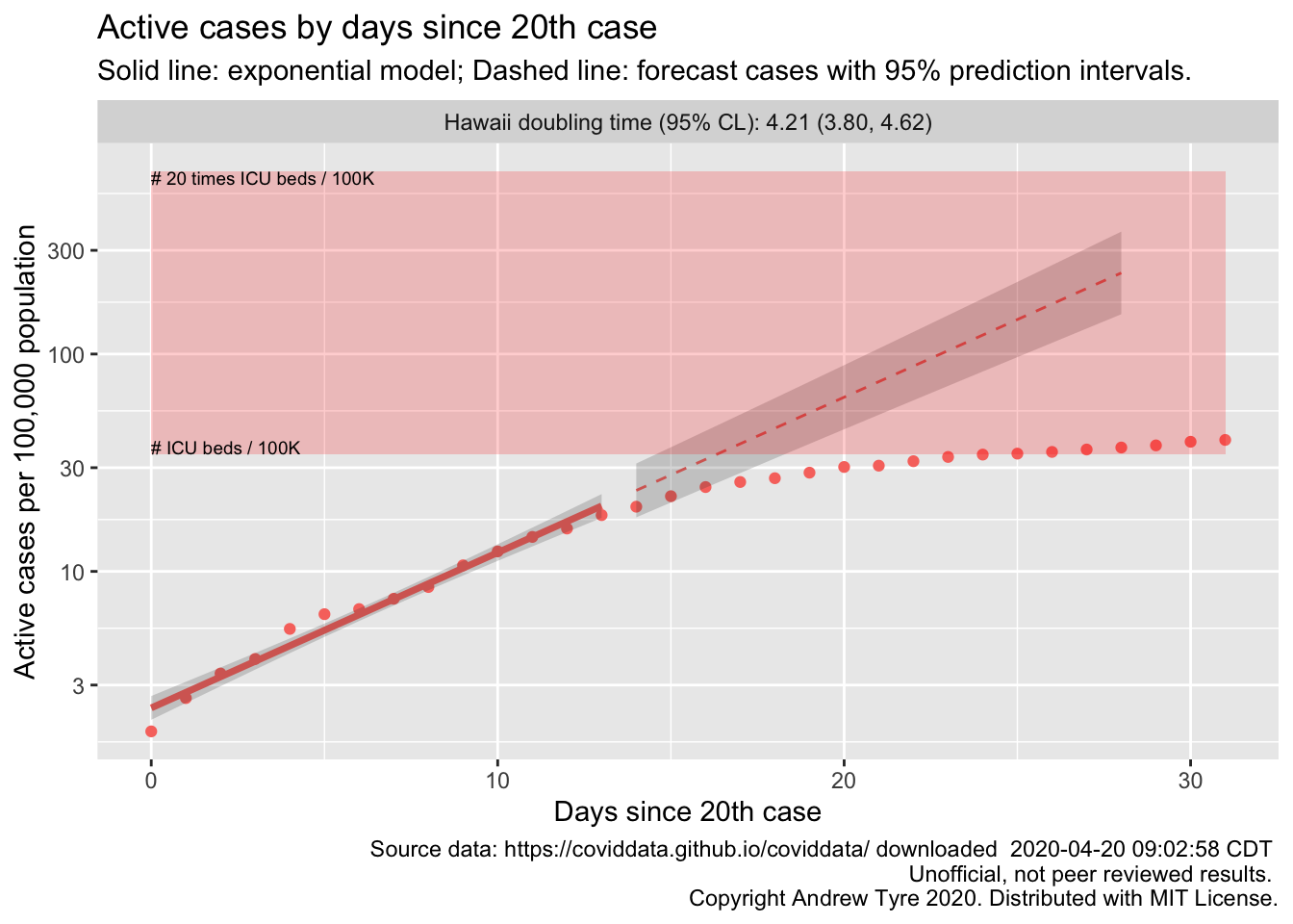
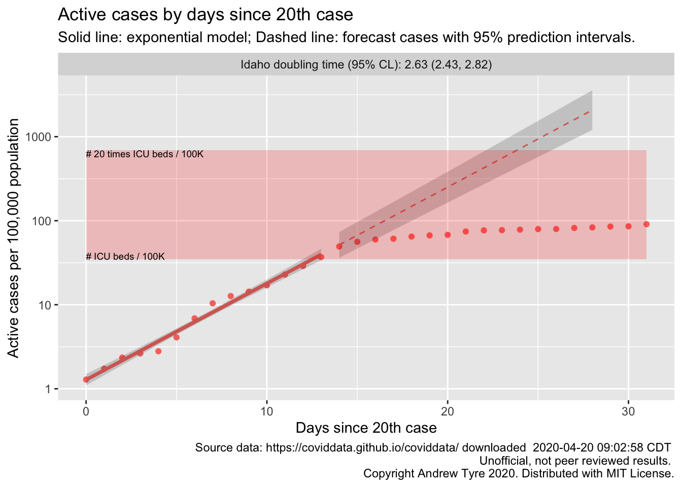
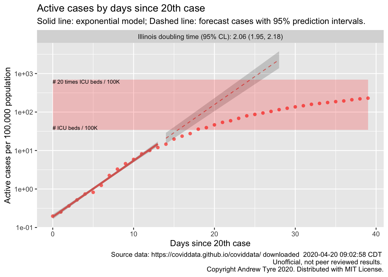
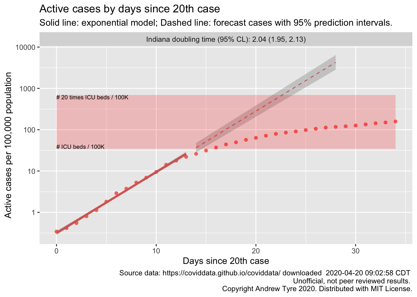
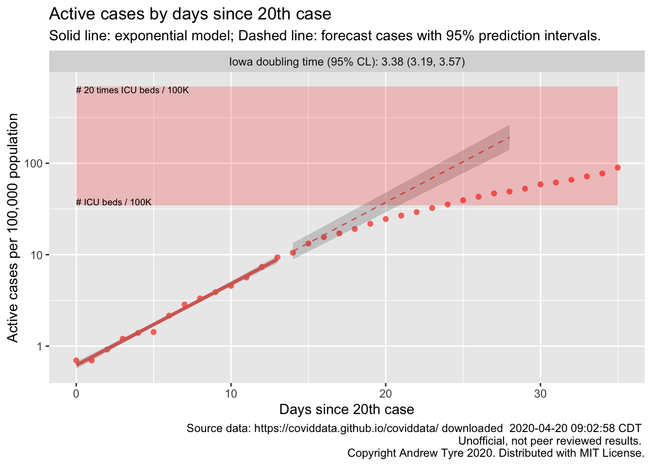
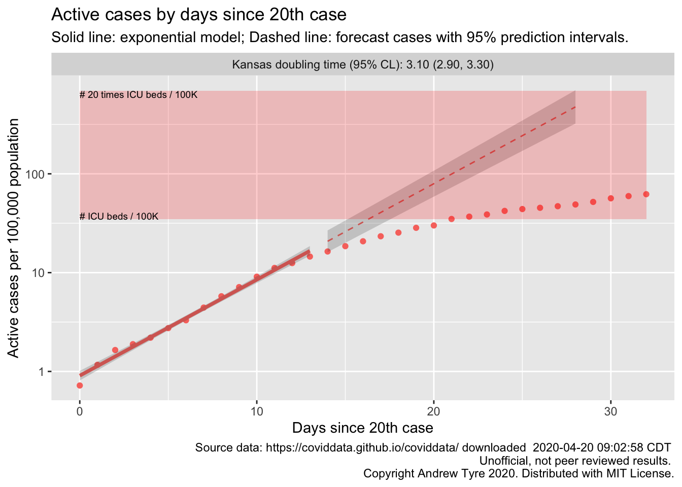
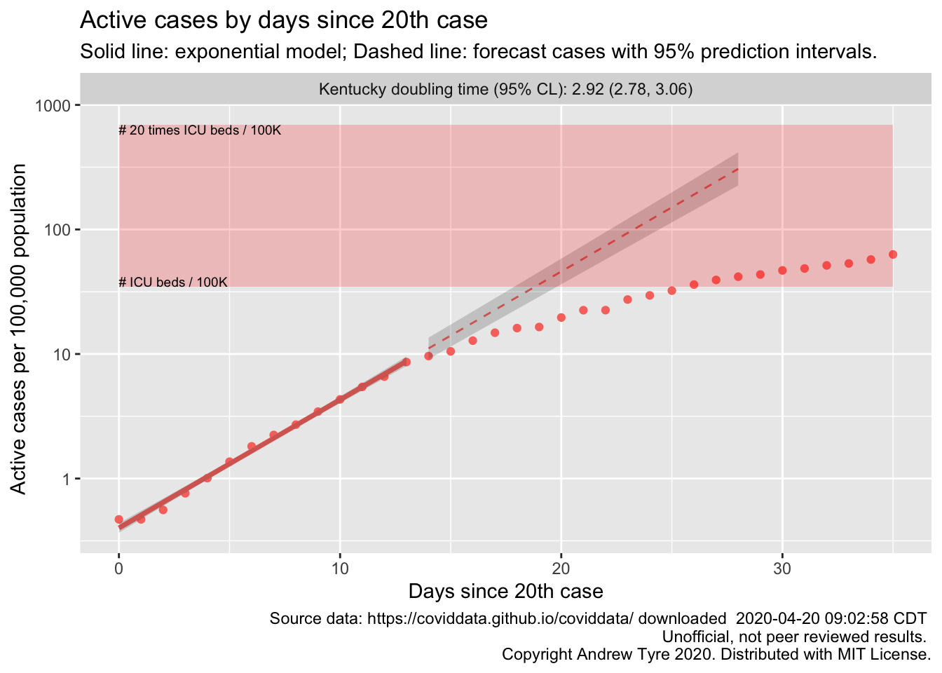
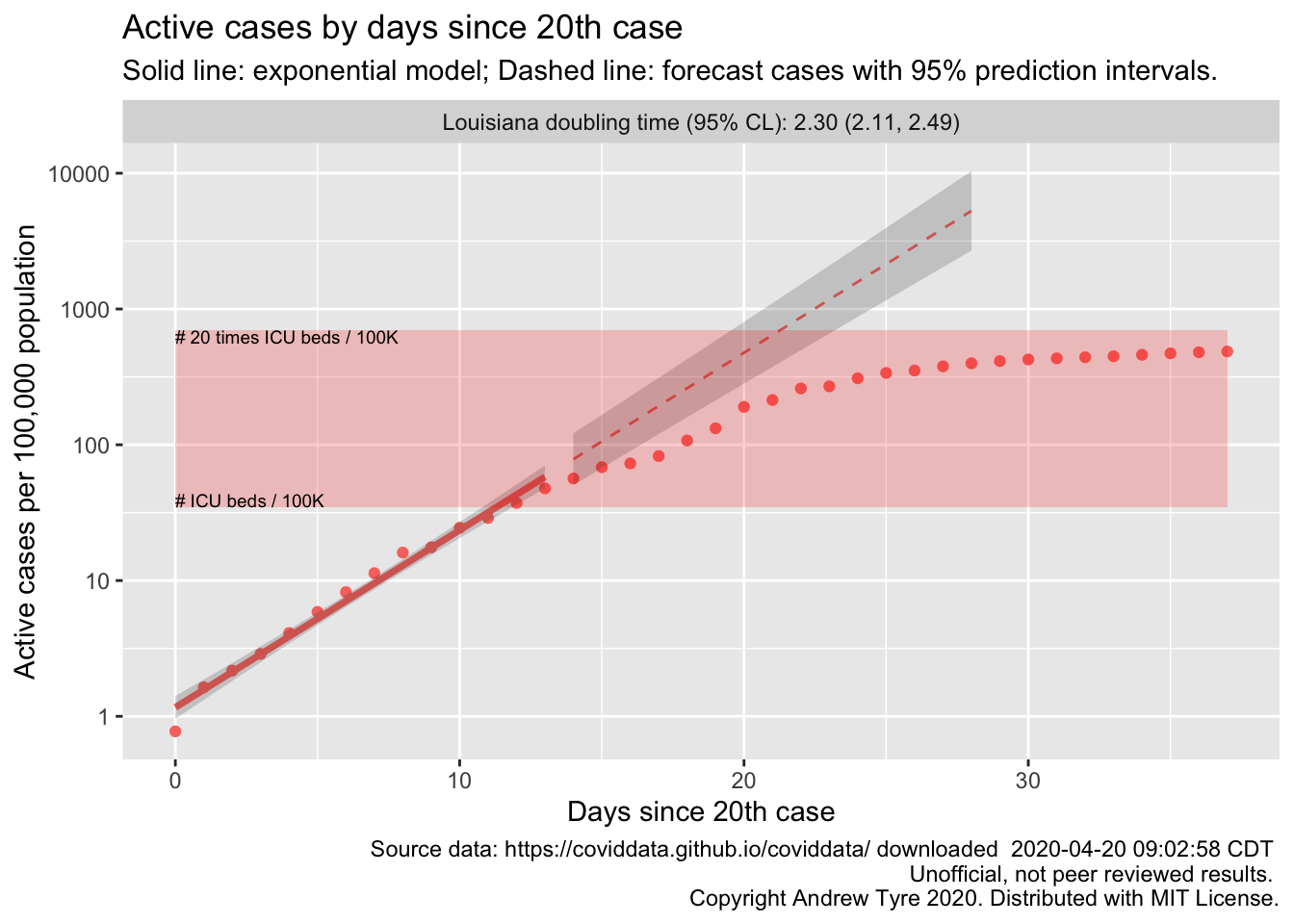
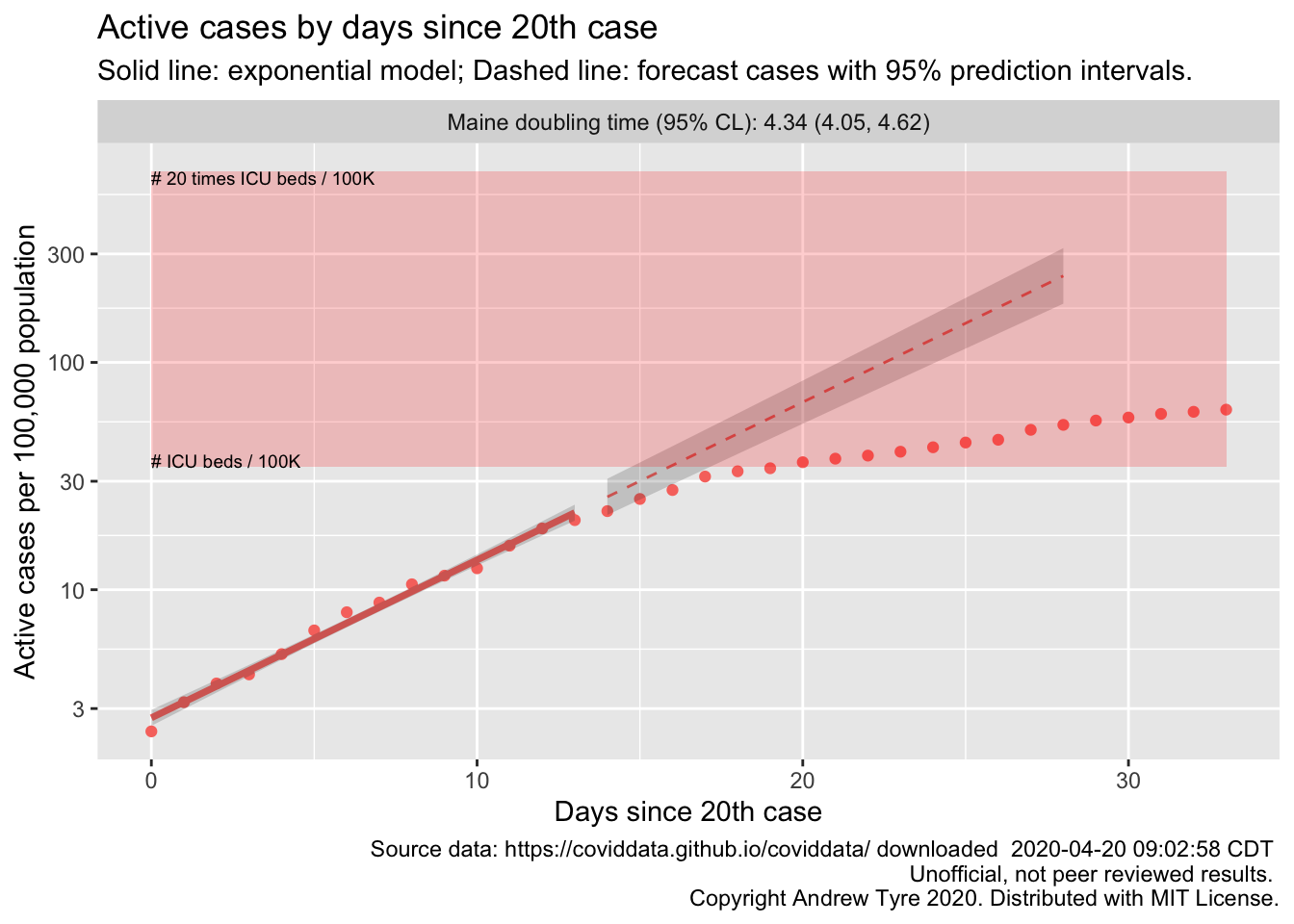
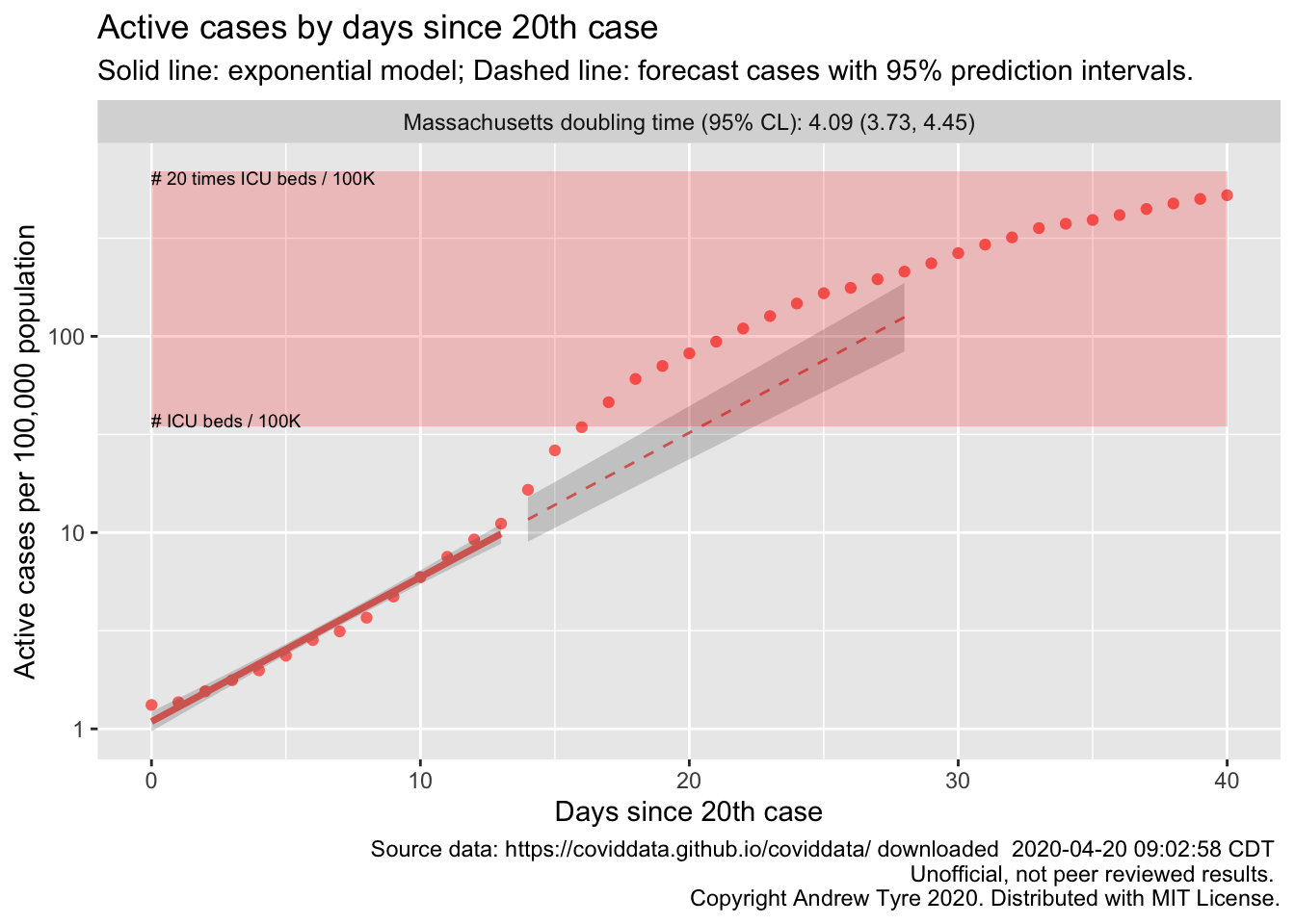
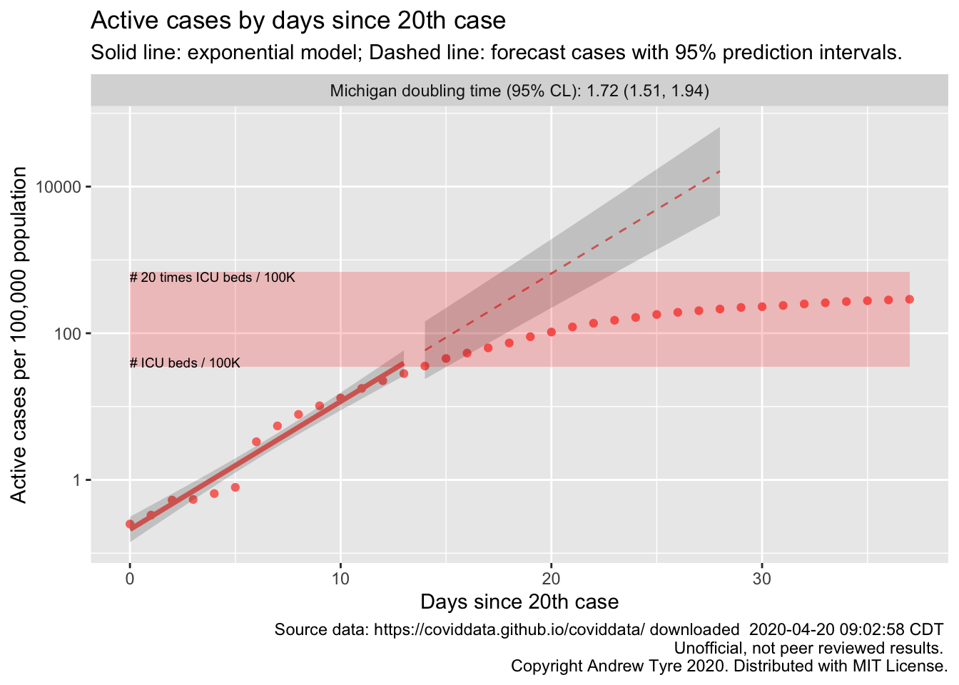
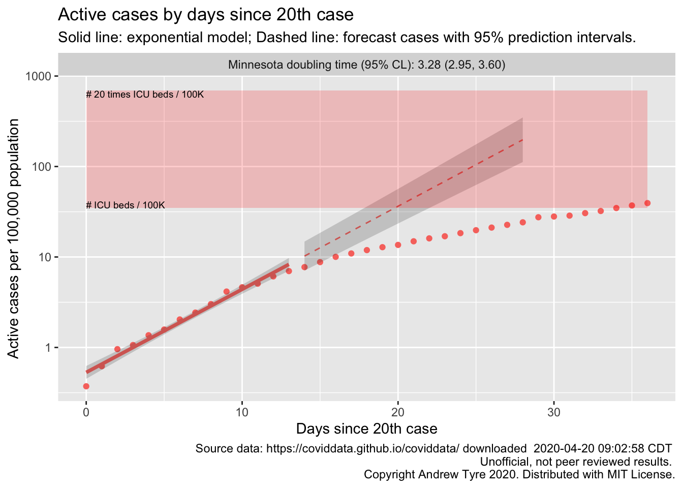
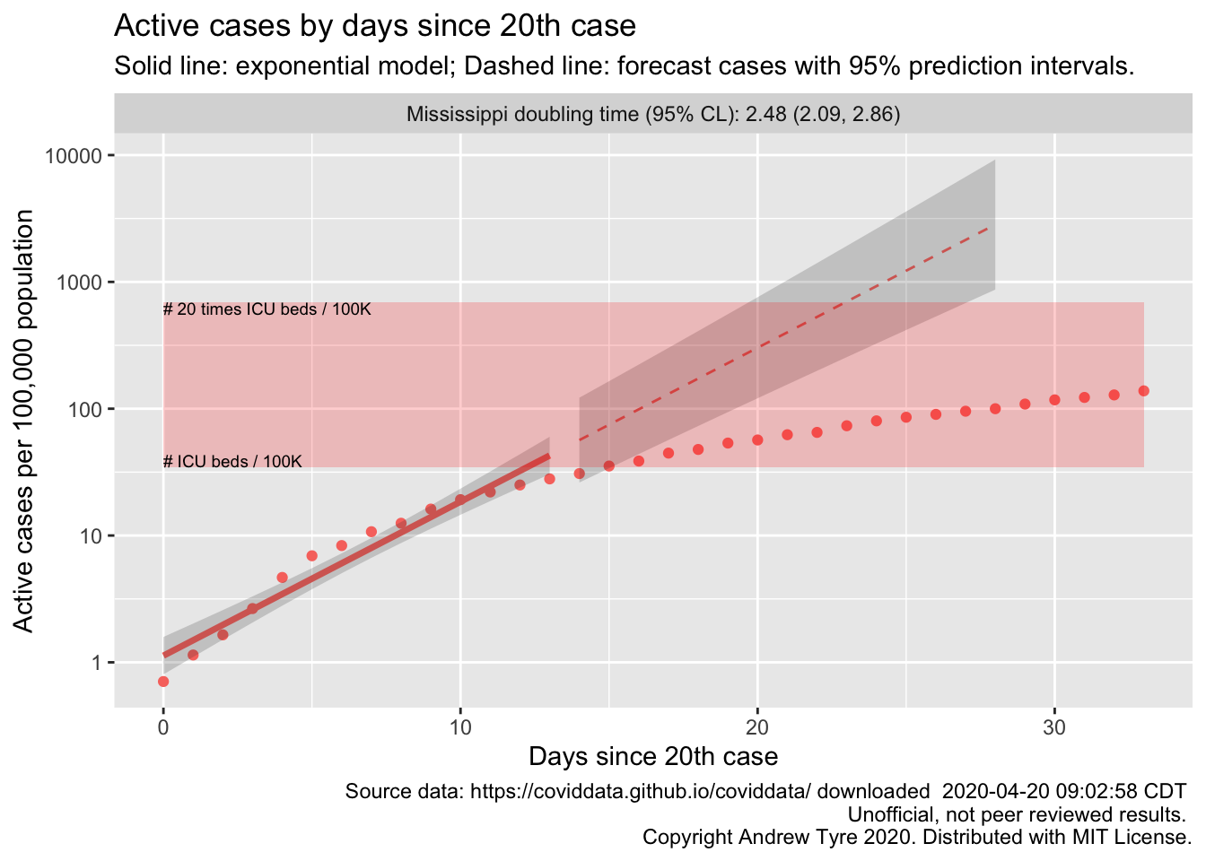
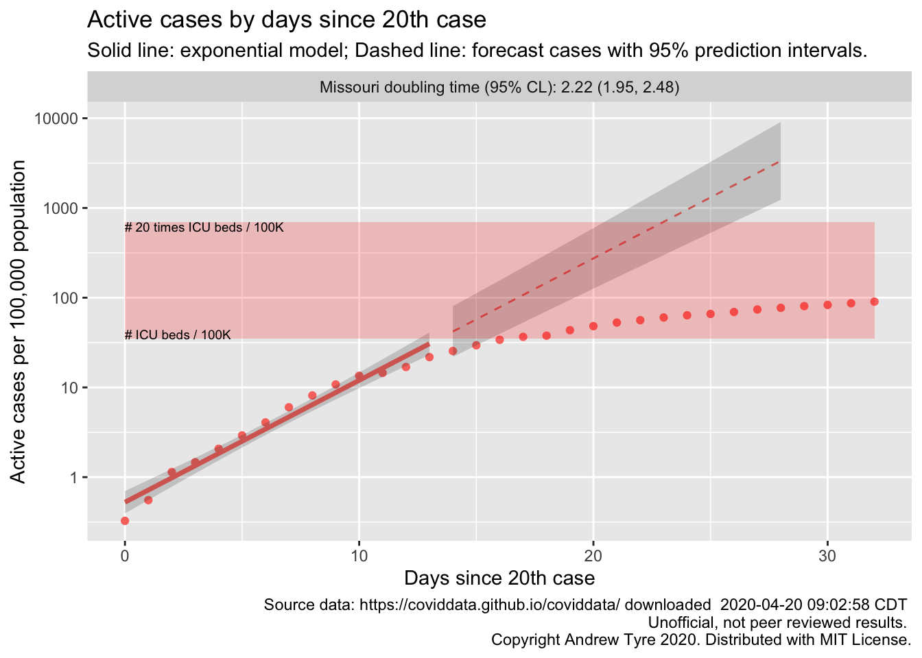
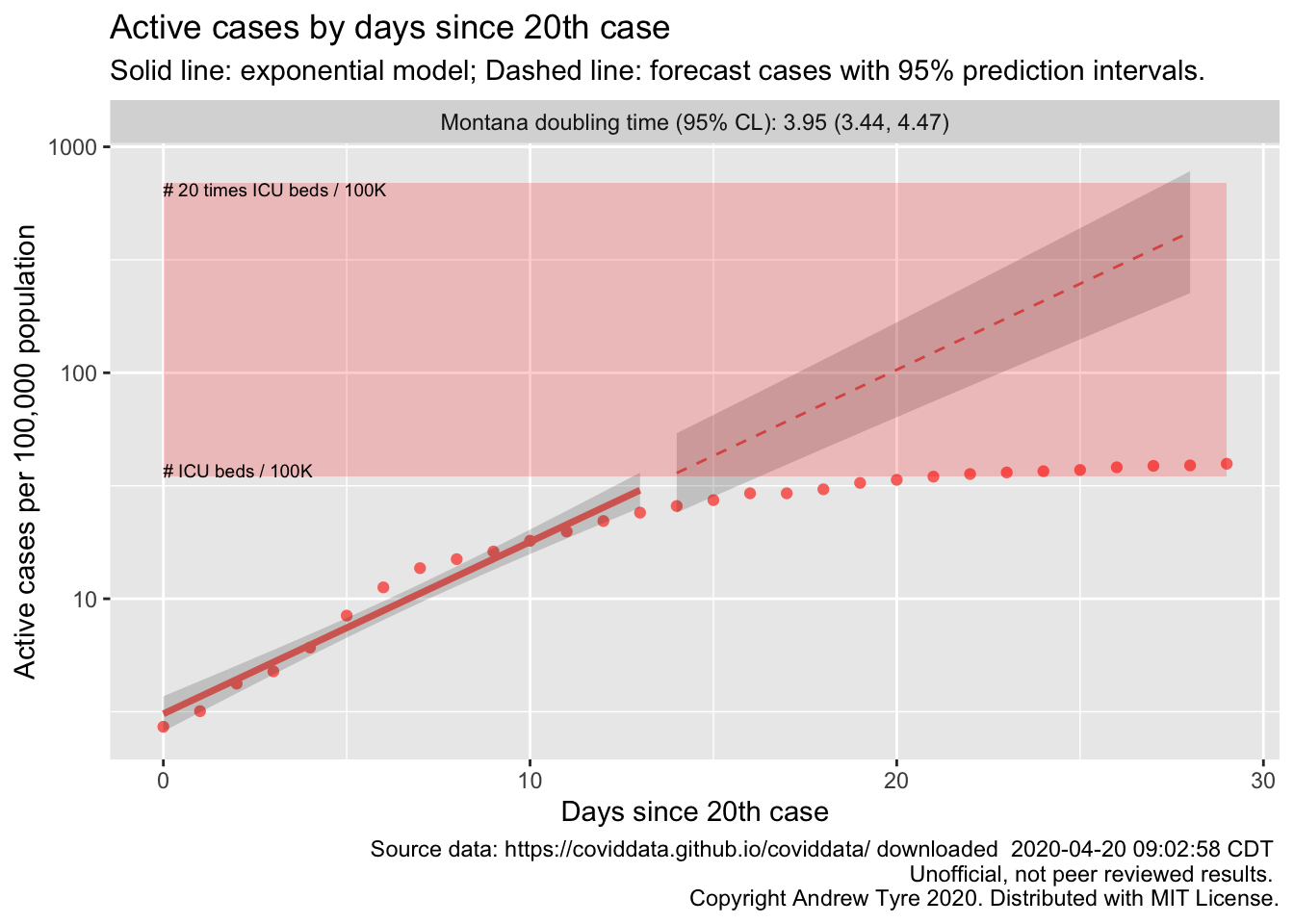
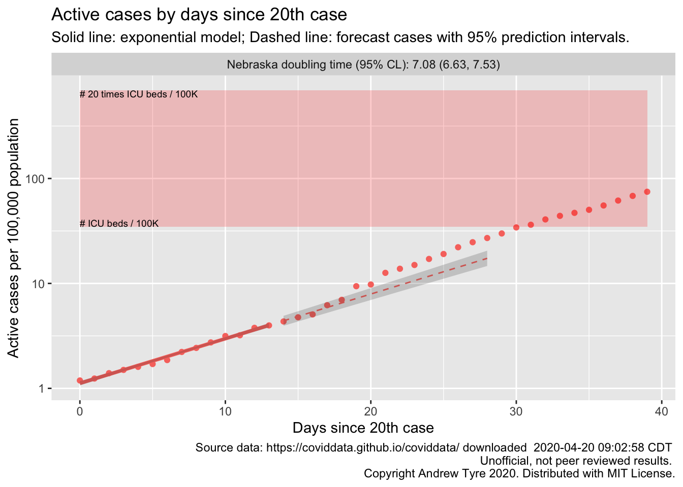
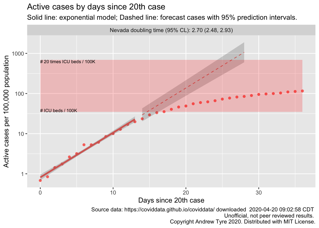
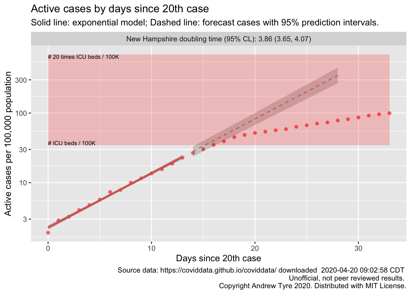
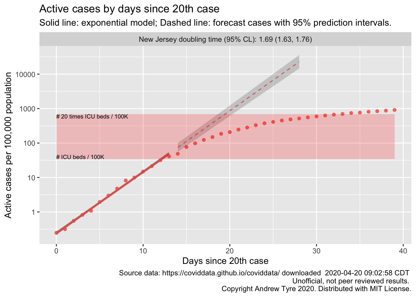
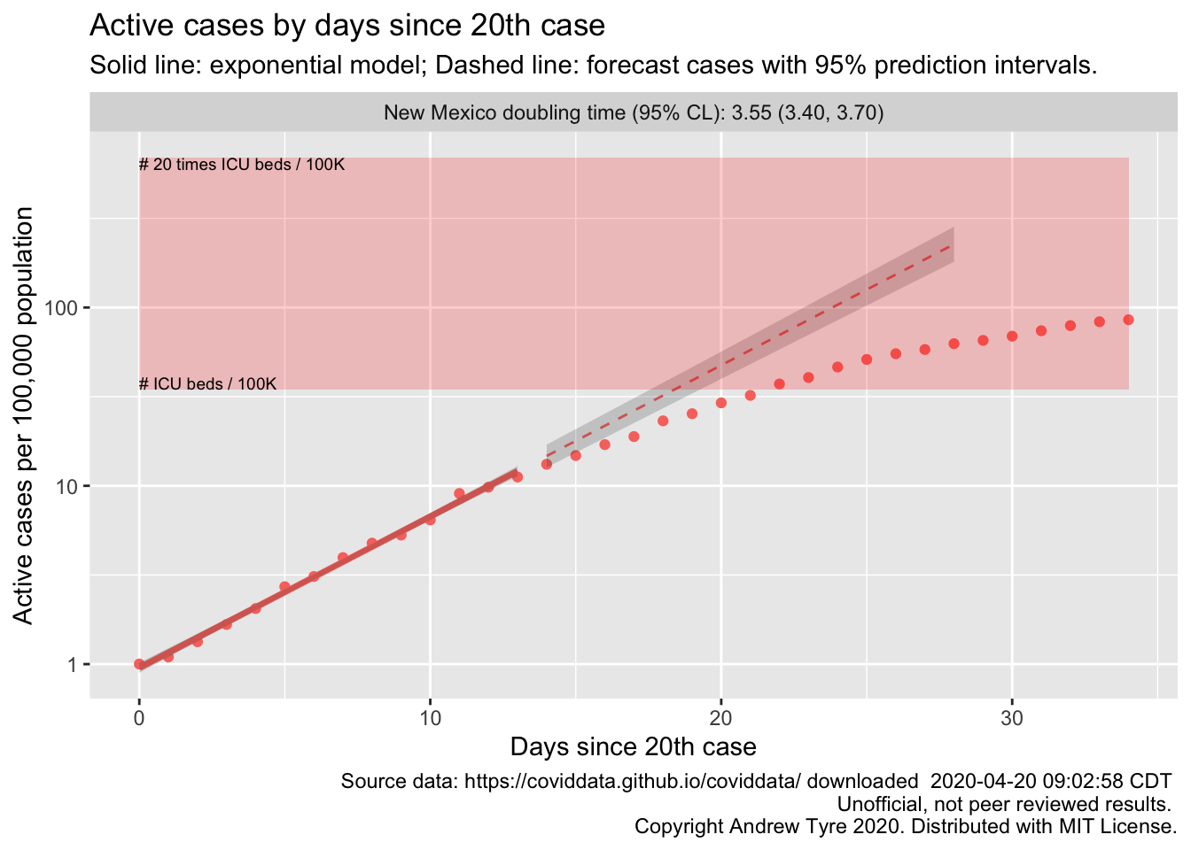
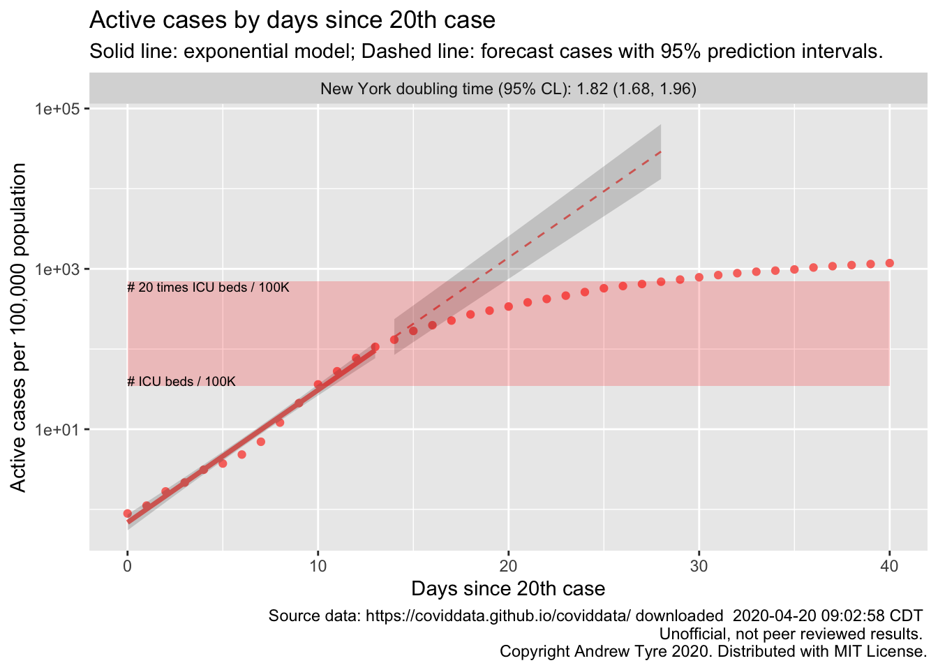
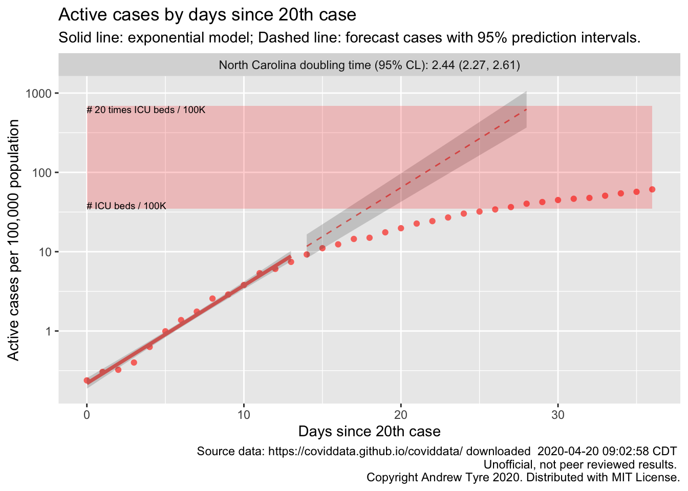
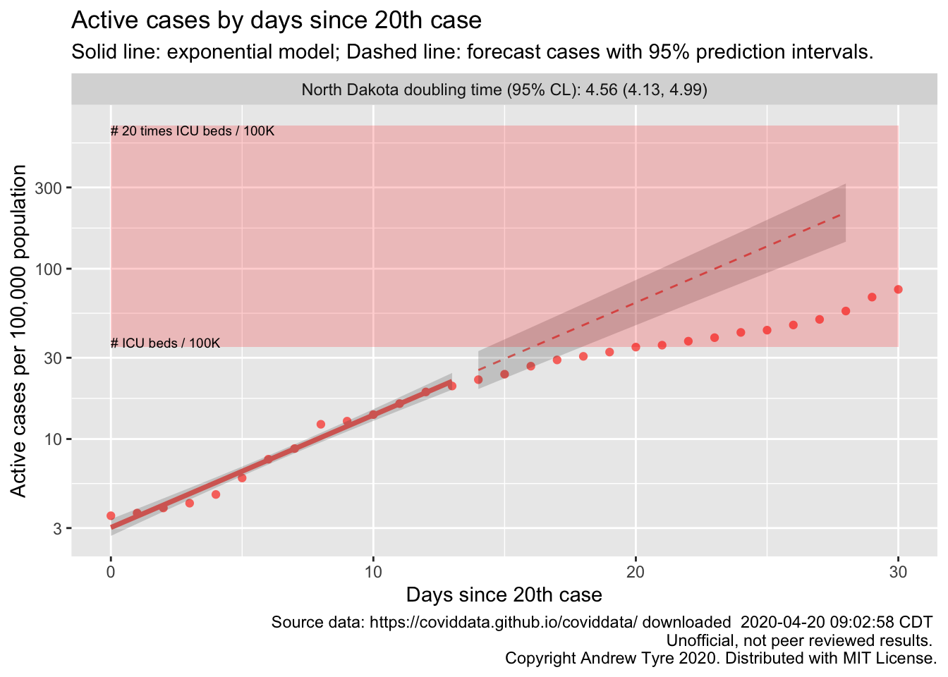
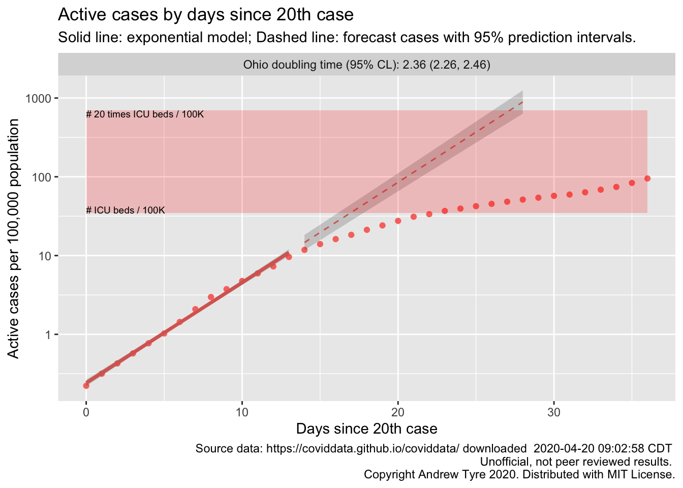
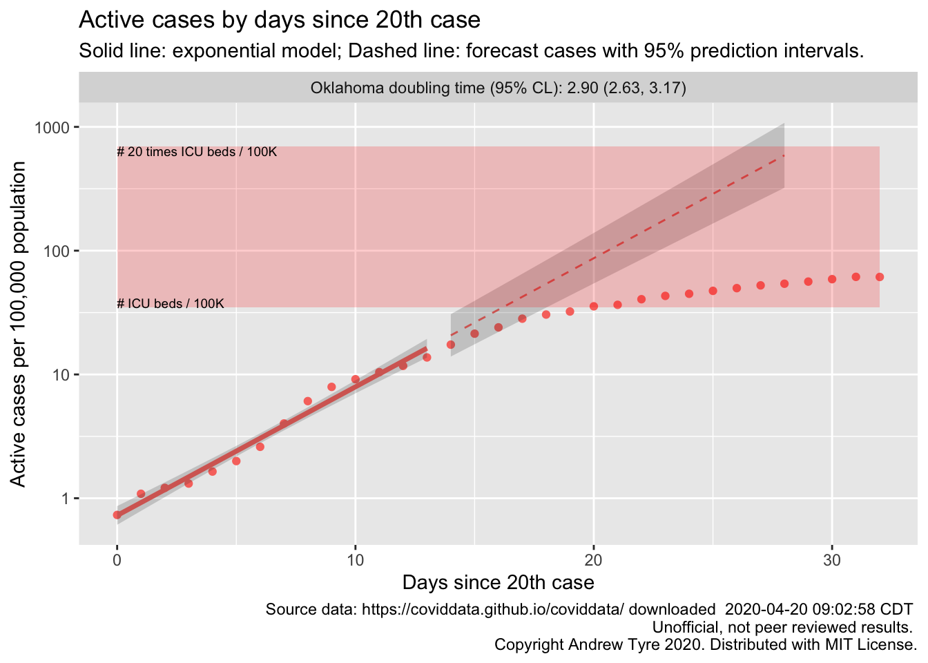
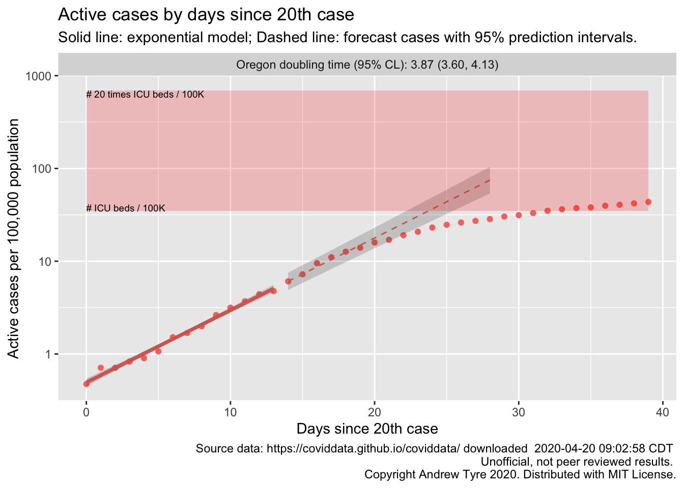
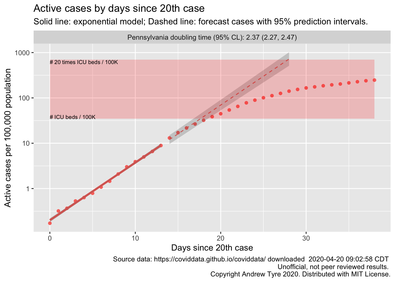
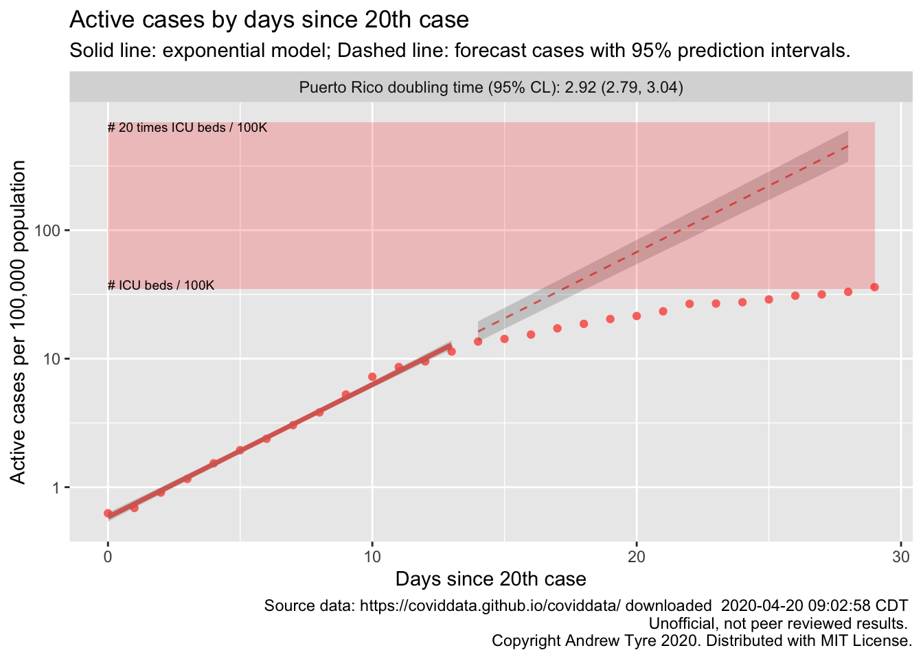
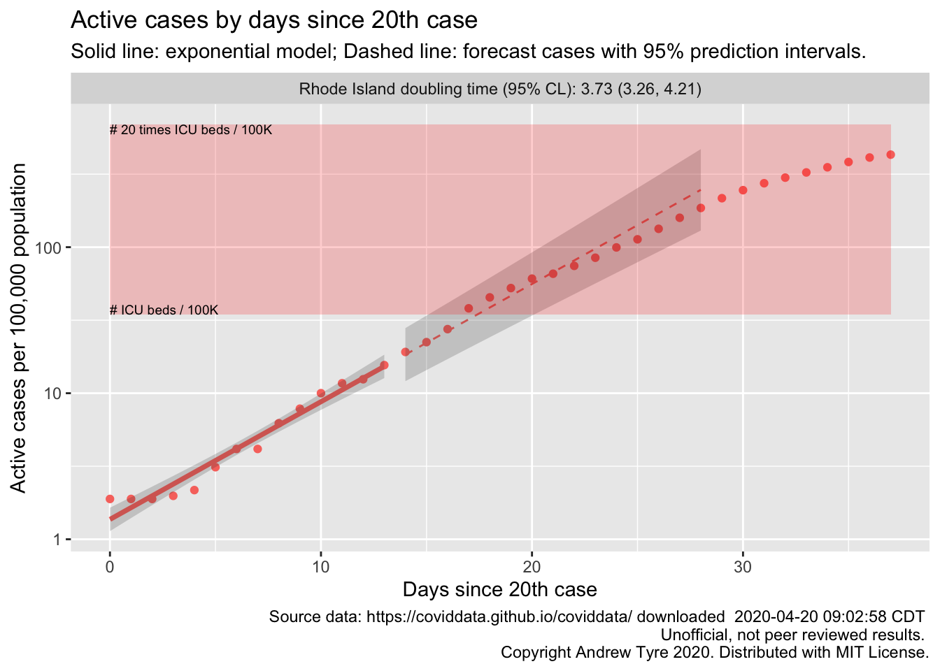
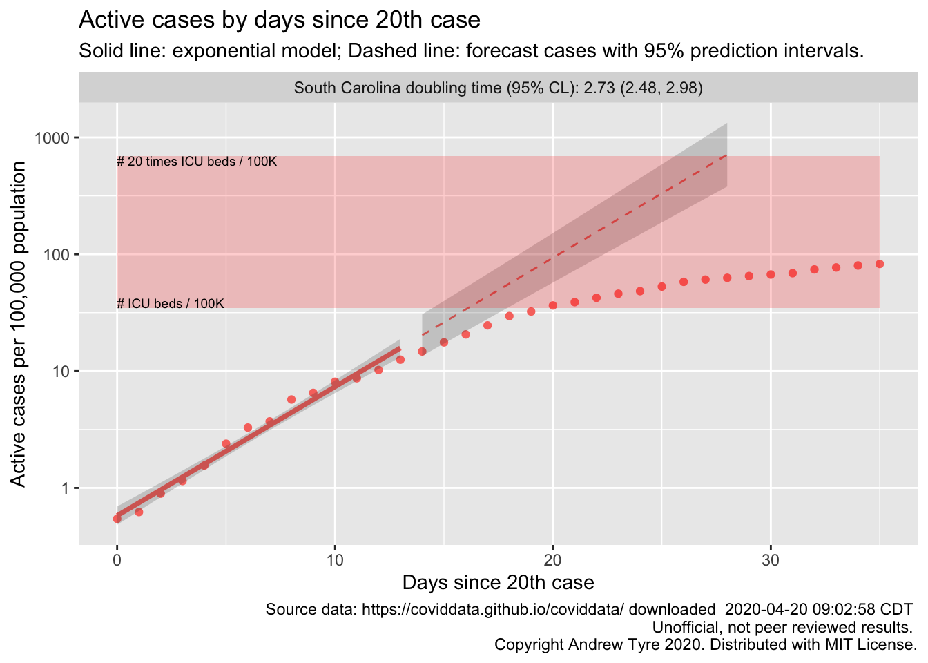
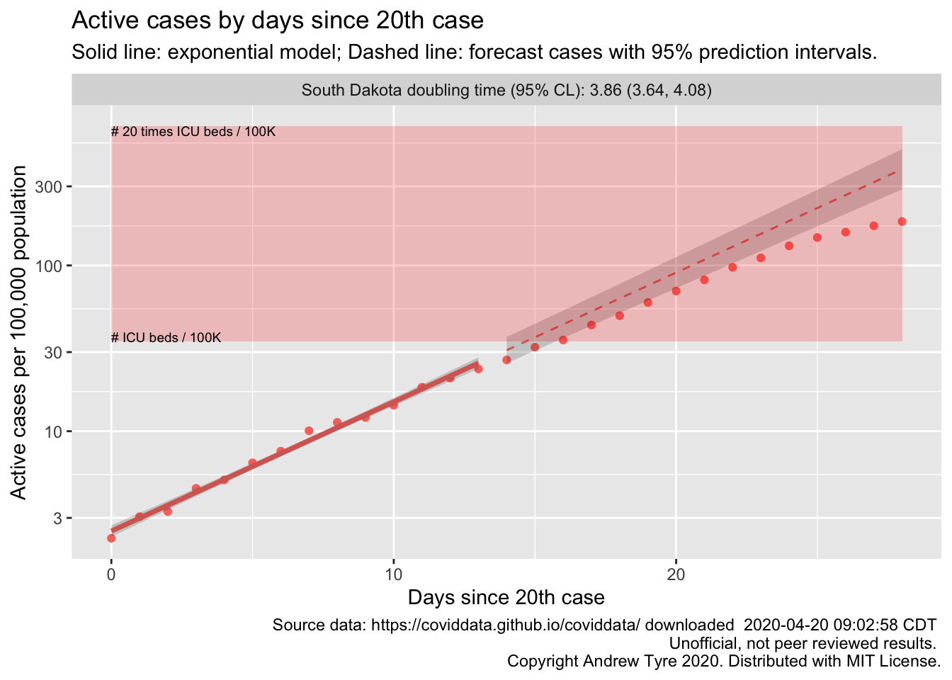
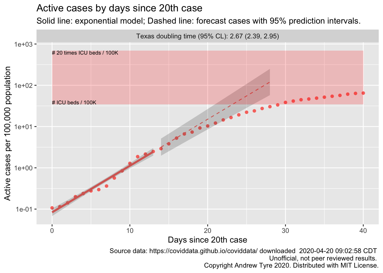
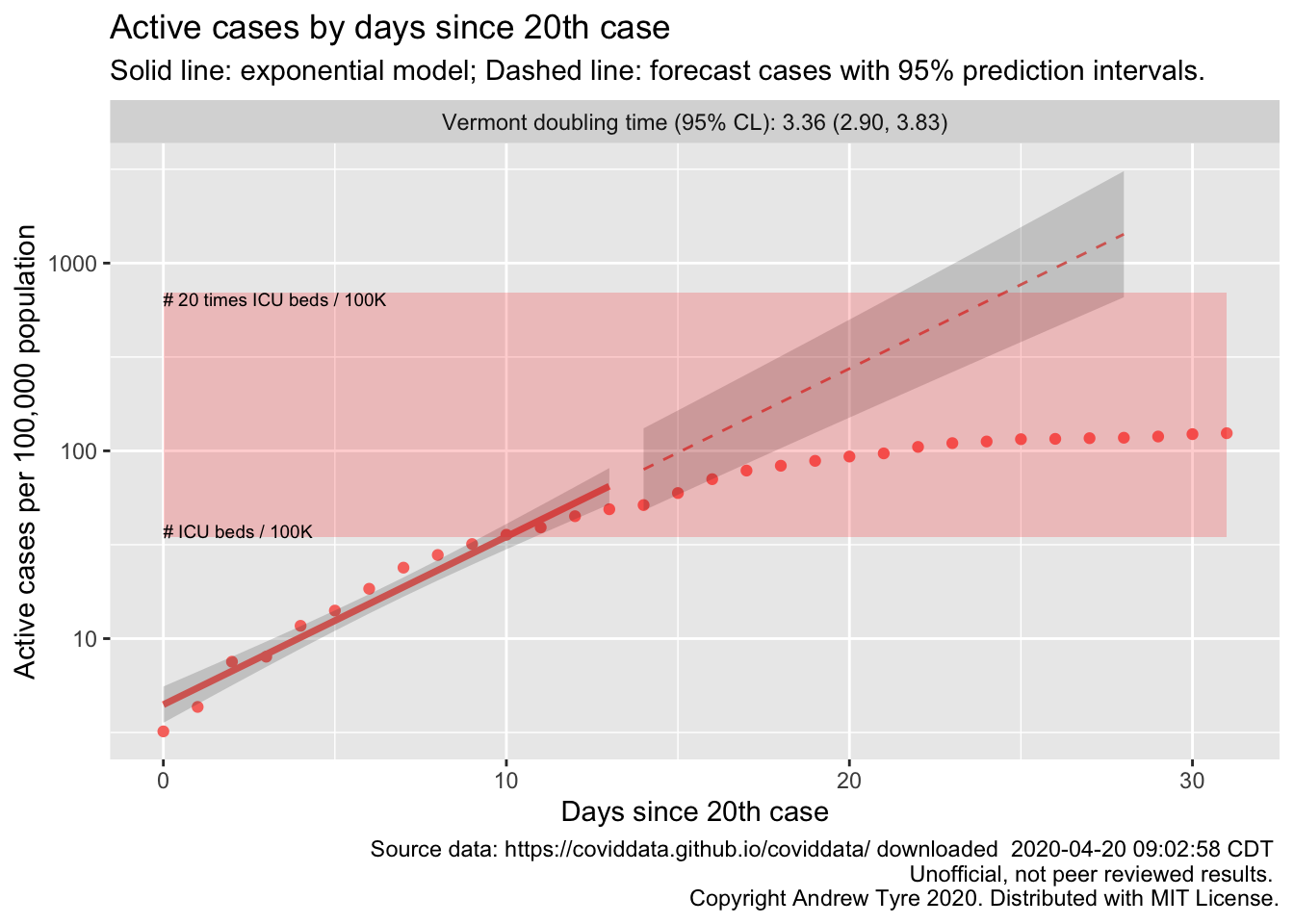
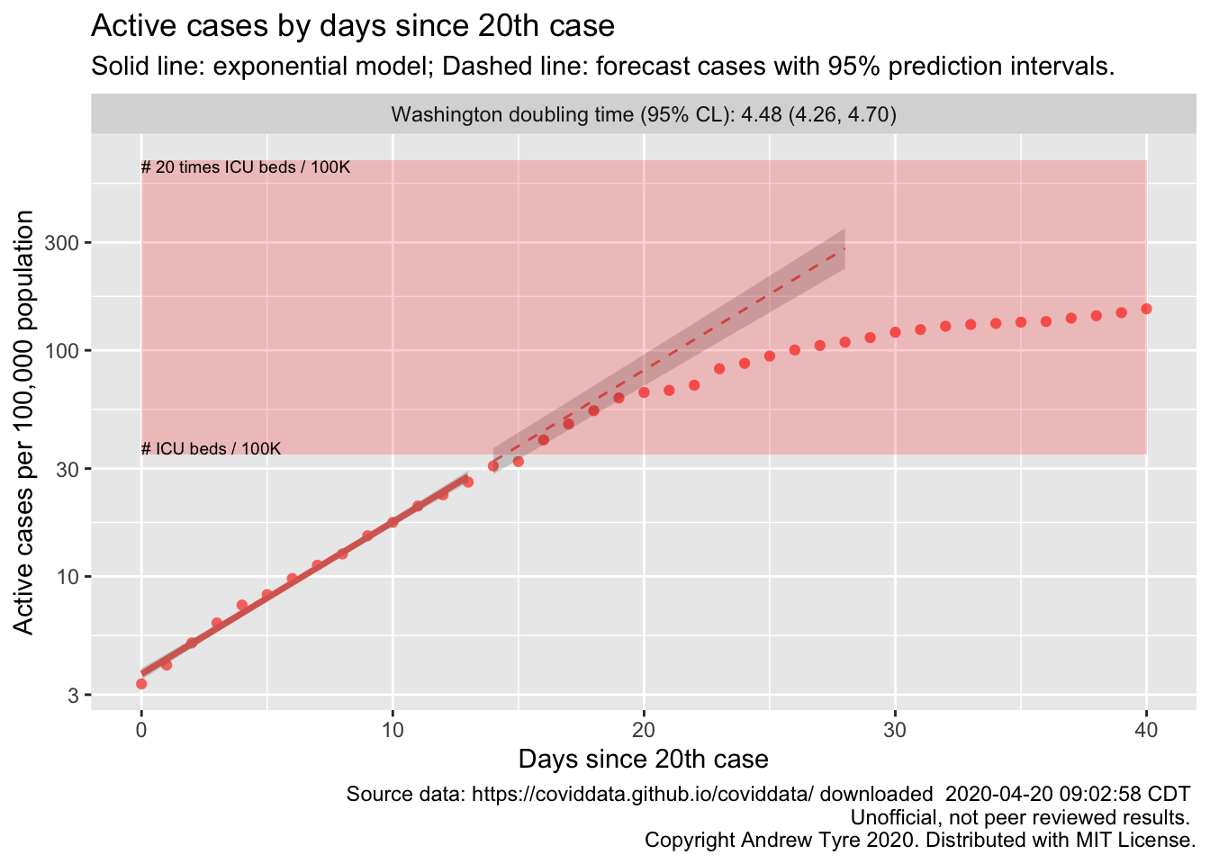
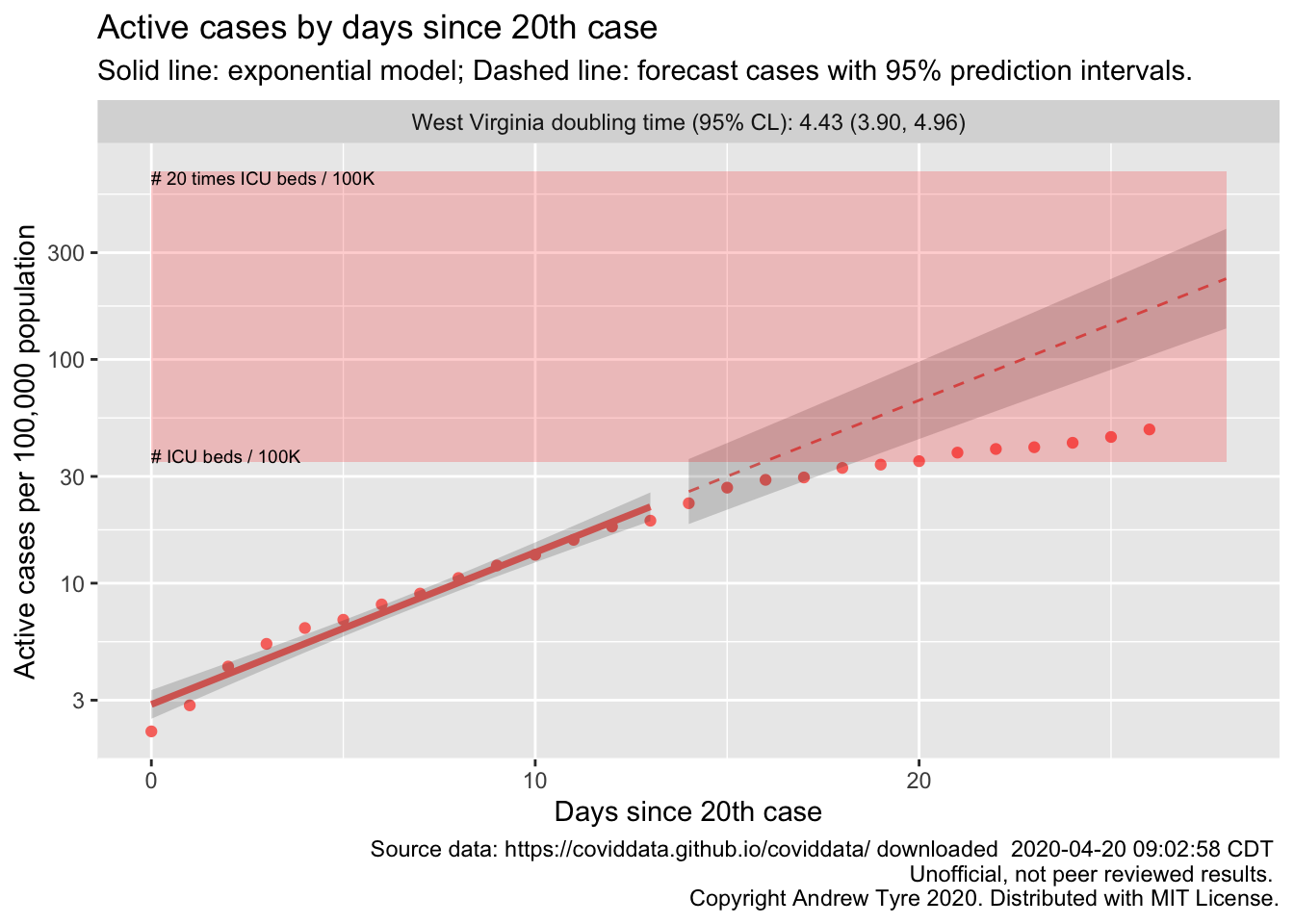
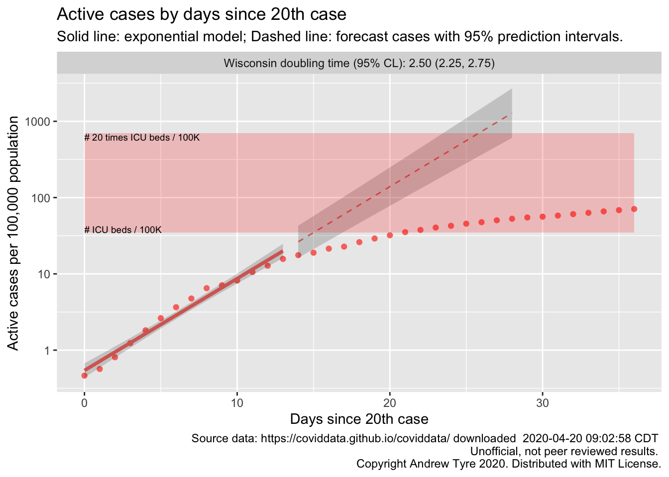
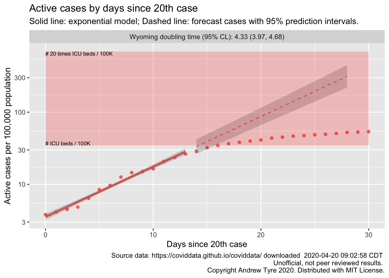
The figures below are complex, so I’ll highlight some features first. The y axis is now Active and Recovered cases / 100,000 population to make it easier to compare locales. The SOLID LINES are exponential growth models that assume the rate of increase is constant. The dashed lines are predictions from that model. The red rectangle shows the range of ICU bed capacity per 100,000 population. The lower limit assumes all reported cases need ICU care (unlikely, but worst case). The top of the rectangle assumes only 5% of cases need ICU support. That best case assumes that the confirmed cases are a good representation of the size of the outbreak (also unlikely, unfortunately). Note that the y axis is logarithmic. The x axis is days since the 20th case in each state.
If the figure is blank there is insufficient data to build the model.
Alabama
Alaska
American Samoa

Arizona

Arkansas
California
Colorado
Connecticut
Delaware
District of Columbia
Florida
Georgia
Guam
Hawaii
Idaho
Illinois
Indiana
Iowa
Kansas
Kentucky
Louisiana
Maine
Maryland

Massachusetts
Michigan
Minnesota
Mississippi
Missouri
Montana
Nebraska
Nevada
New Hampshire
New Jersey
New Mexico
New York
North Carolina
North Dakota
Northern Mariana Islands

Ohio
Oklahoma
Oregon
Pennsylvania
Puerto Rico
Recovered

Rhode Island
South Carolina
South Dakota
Tennessee

Texas
Utah

Vermont
Virginia

Washington
West Virginia
Wisconsin
Wyoming
The main drawback to this approach is that I can’t keep up with individual interpretations. Please post questions in the comments below!
