Trying something new – all plots for provinces with sufficient data. Click the name of the locale you want to see. Tabs would be better, but for reasons beyond my ken, automatic tabsets don’t work with blogdown.
The first post in this series was on March 13, in case you’re just joining and want to see the progression.
DISCLAIMER: These unofficial results are not peer reviewed, and should not be treated as such. My goal is to learn about forecasting in real time, how simple models compare with more complex models, and even how to compare different models.1
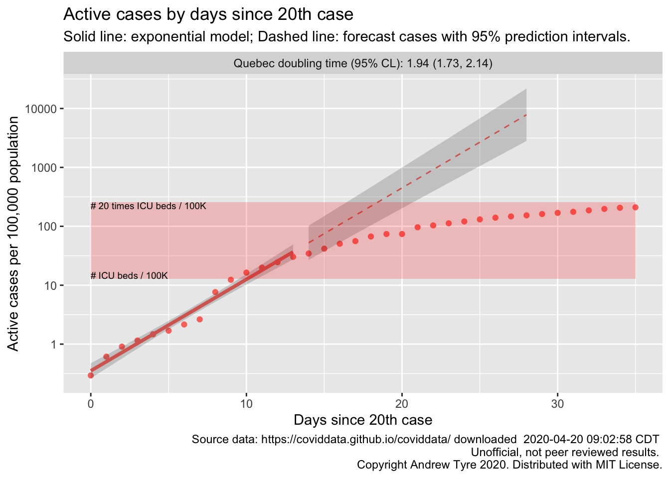
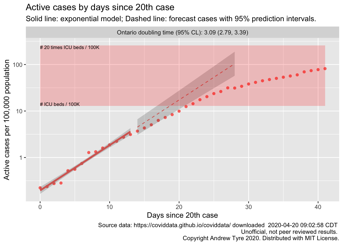
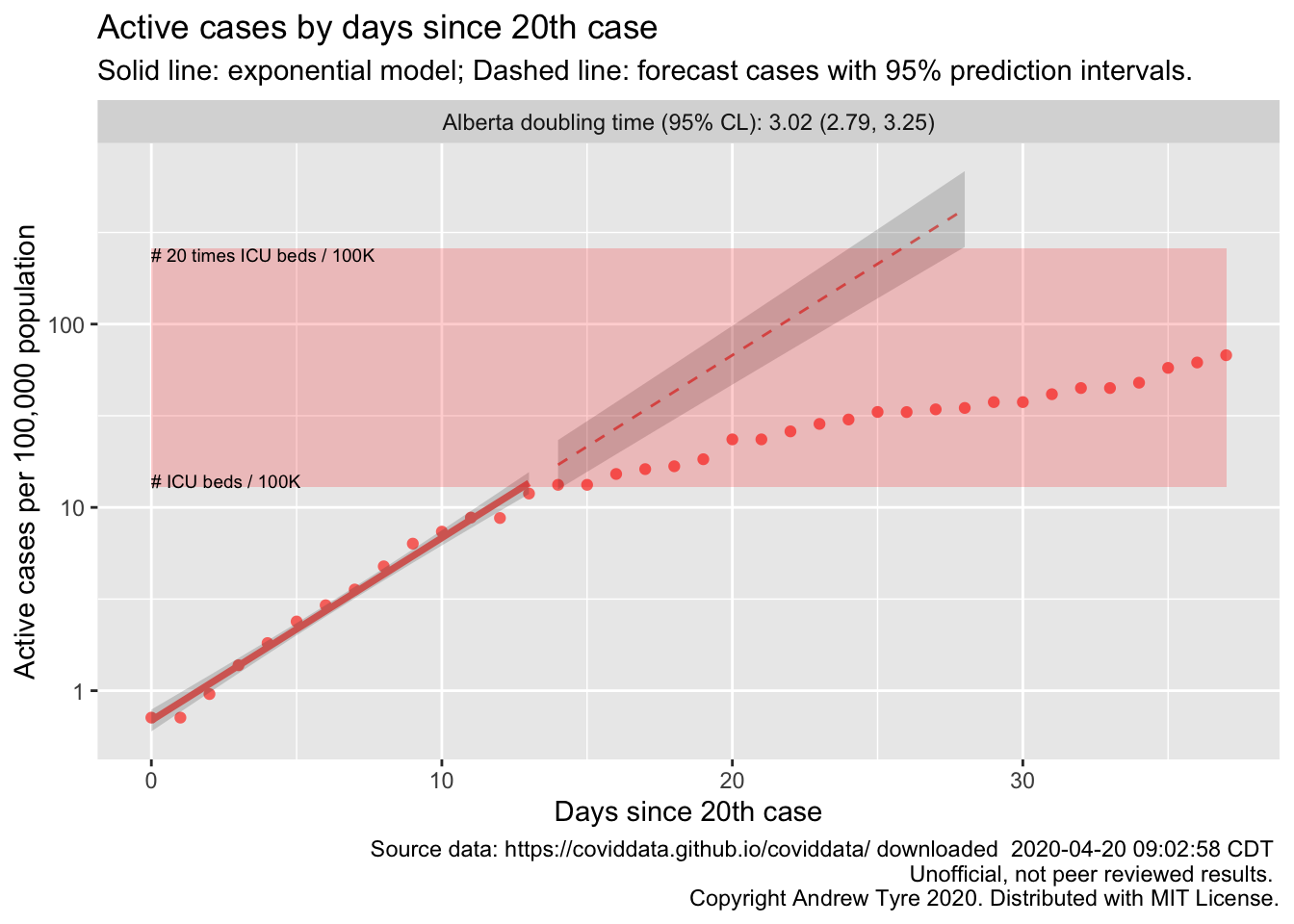
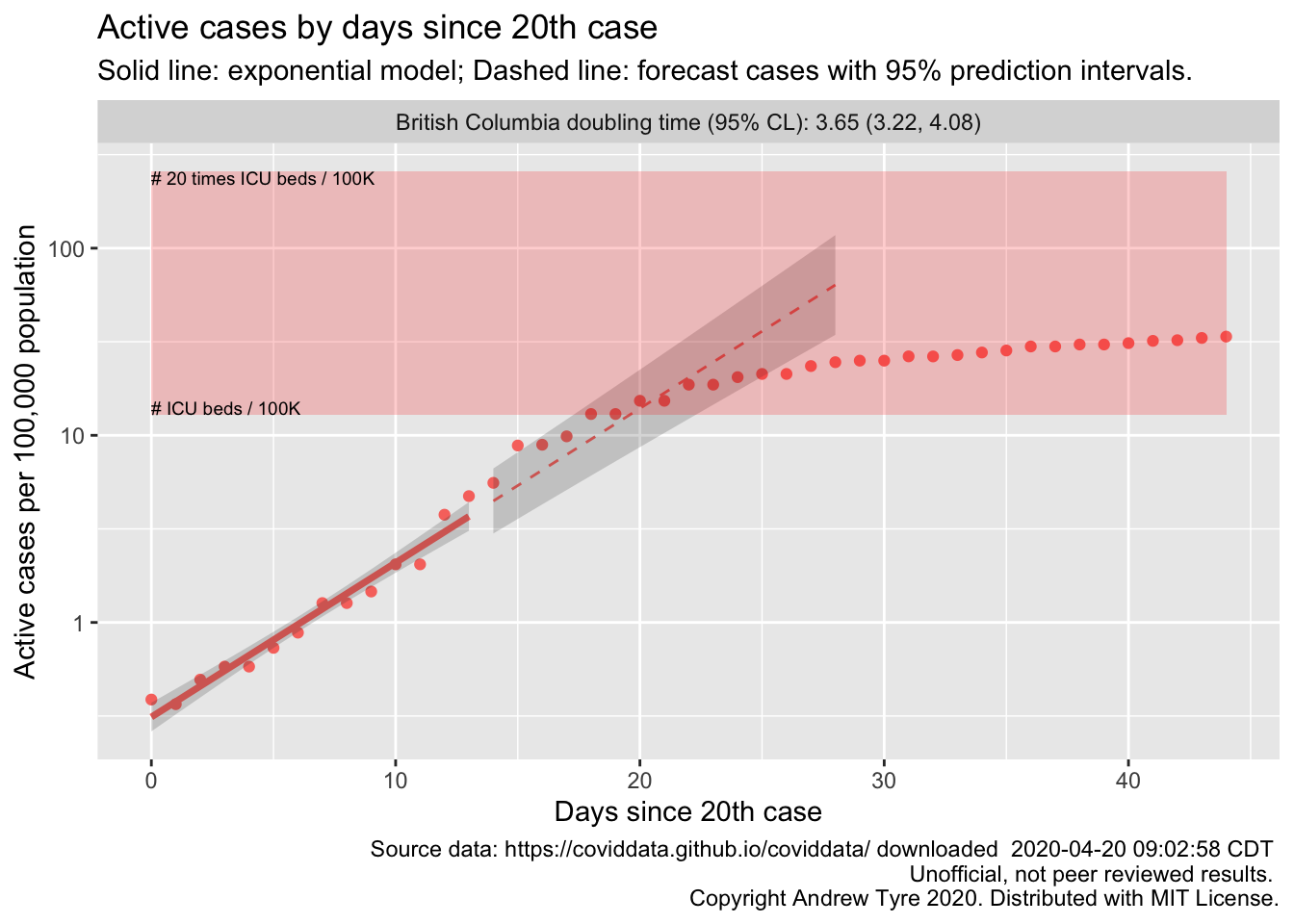
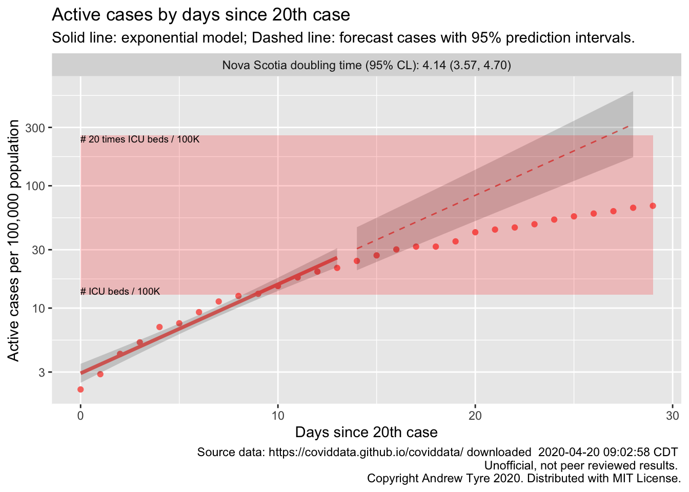
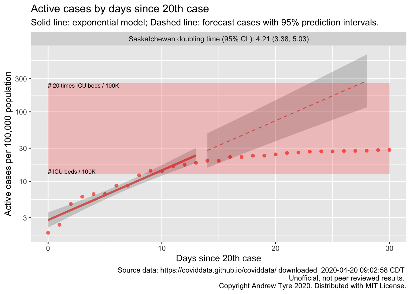
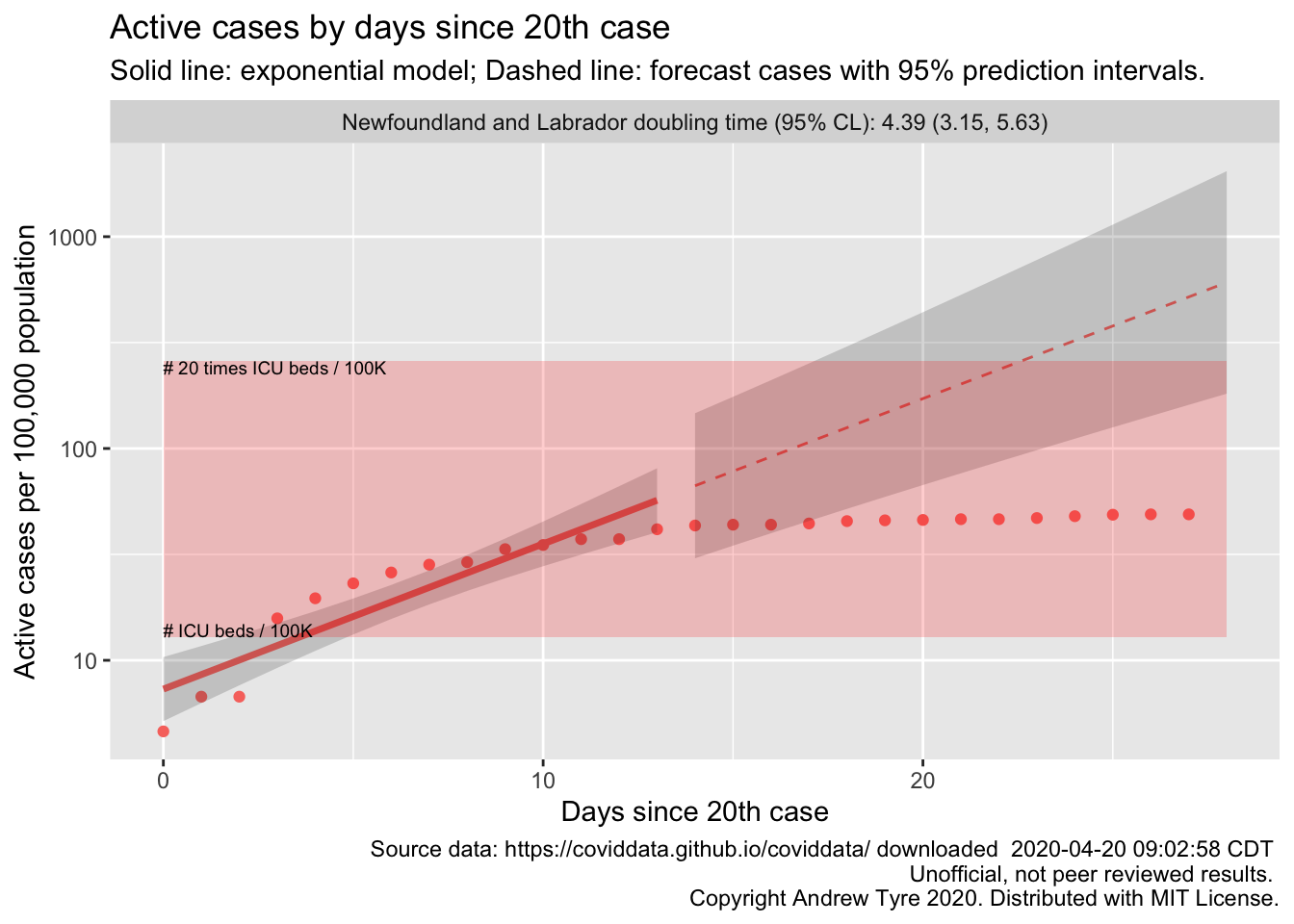
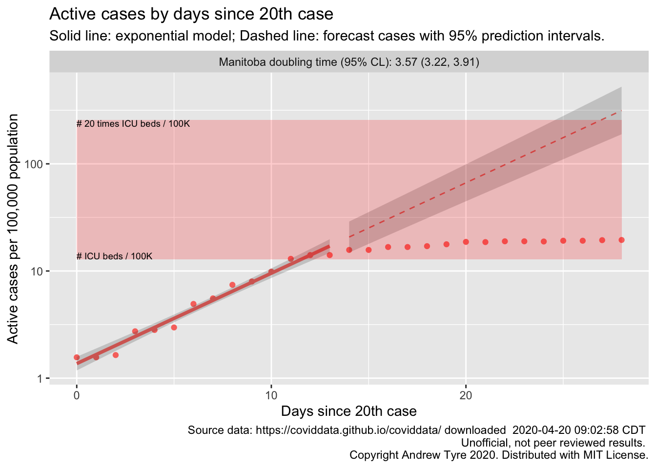
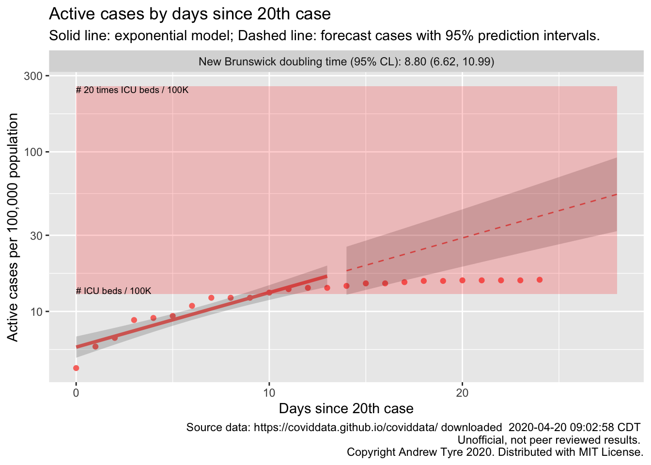
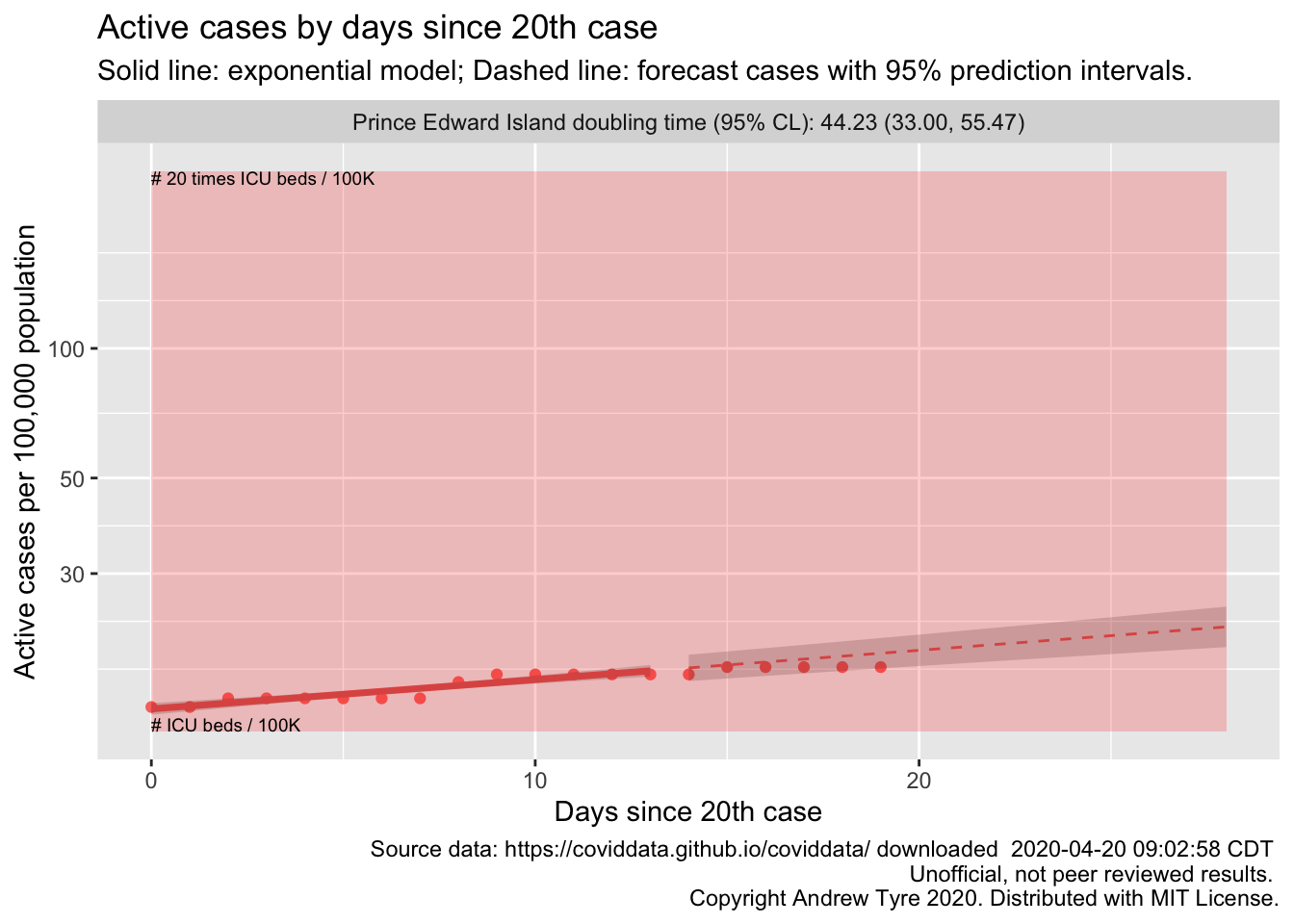
The figures below are complex, so I’ll highlight some features first. The y axis is now Active and Recovered cases / 100,000 population to make it easier to compare locales. The SOLID LINES are exponential growth models that assume the rate of increase is constant. The dashed lines are predictions from that model. The red rectangle shows the range of ICU bed capacity per 100,000 population. The lower limit assumes all reported cases need ICU care (unlikely, but worst case). The top of the rectangle assumes only 5% of cases need ICU support. That best case assumes that the confirmed cases are a good representation of the size of the outbreak (also unlikely, unfortunately). Note that the y axis is logarithmic. The x axis is days since the 20th case in each province.
If the figure is blank there is insufficient data to build the model.
Quebec
Ontario
Alberta
British Columbia
Nova Scotia
Saskatchewan
Newfoundland and Labrador
Manitoba
New Brunswick
Prince Edward Island
Yukon

Northwest Territories

One of the drawbacks to this approach is that I can’t provide any interpretation of the figures. Please post questions in the comment section at the bottom!
