A screenshot of a plot from Fox News went somewhat viral among some segments of society. The y-axis is funky, apparently changing scales part way through. There was some debate about the plot, was Fox News trying to lie about the curve flattening? Or are their graphics people just incompetent?
EDIT 2020-04-14: An error in the post was pointed out, I said “Incident cases should be linear if cumulative cases are growing exponentially, …” which is wrong, they are linear on a log scale. Corrected.
The first post in this series was March 13, in case you’re just joining and want to see the progression. I’m now posting the bottom line figures for each state and province on the same post that just gets updated each day.
DISCLAIMER: These unofficial results are not peer reviewed, and should not be treated as such. My goal is to learn about forecasting in real time, how simple models compare with more complex models, and even how to compare different models.1
This is the plot in question, if you haven’t seen it. Pay close attention to the top of the y axis – the interval between the gridlines changes from 30 to 50. This reduces the perceived slope of the data from March 26.
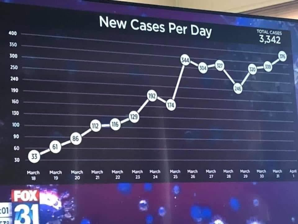
Fox News Funky Plot
Visual inspection of my data suggested that this was Colorado. Rebuild the plot.
library("tidyverse")
library("lubridate")
library("broom")

savefilename <- "data/api_all_2020-04-06.Rda"

load(savefilename)

country_data <- read_csv("data/countries_covid-19.csv") %>%
  mutate(start_date = mdy(start_date))

source("R/jhu_helpers.R")
source("R/plot_functions.R")

fox_data <- tibble(
  Date = seq(ymd("2020-03-18"), ymd("2020-04-01"), by = "day"),
  cases = c(33,61,86,112,116,129,192,174,344,304,327,246,320,339,376)
)

usa_by_state <- list(
  confirmed = us_wide2long(api_confirmed_regions, "United States"),
  deaths = us_wide2long(api_deaths_regions, "United States"),
  # recovered data is a mess lots of missing values
  recoveries = us_wide2long(api_recoveries_regions, "United States")
  ) %>%
  bind_rows(.id = "variable") %>%
  pivot_wider(names_from = variable, values_from = cumulative_cases)

colorado <- plot_active_case_growth(usa_by_state, country_data)$data %>%
  filter(Region == "Colorado") %>%
  select(Date, cases = incident_cases)

all_data <- bind_rows("Fox" = fox_data, "NYT" = colorado, .id = "source")
totals <- all_data %>%
  filter(Date <= "2020-04-01") %>%
  group_by(source) %>%
  summarize(total_cases = sum(cases)) %>%
  mutate(total_cases = paste(source, total_cases))


ggplot(data = all_data) +
  geom_point(mapping = aes(x = Date, y = cases, color = source)) +
  annotate("text", x = ymd("2020-03-10"), y = c(454, 404, 354),
           label = c("Total Cases to April 1", pull(totals, total_cases)),
           hjust = "left", vjust = "top") +
  annotate("rect", xmin = ymd("2020-03-18"), xmax = ymd("2020-04-01"),
           ymin = 0, ymax = 454, alpha = 0.1) +
      labs(y = "New Cases per day",
           title = "New cases per day in Colorado by source",
           x = "Date",
           subtitle = "Grey box is extent of Fox News Plot",
           caption = paste("Source data: https://coviddata.github.io/coviddata/ downloaded ",
                           format(file.mtime(savefilename), usetz = TRUE),
                           "\n Unofficial, not peer reviewed results.",
                           "\n Copyright Andrew Tyre 2020. Distributed with MIT License.")) +
  theme(legend.position = "top",
        legend.title = element_blank())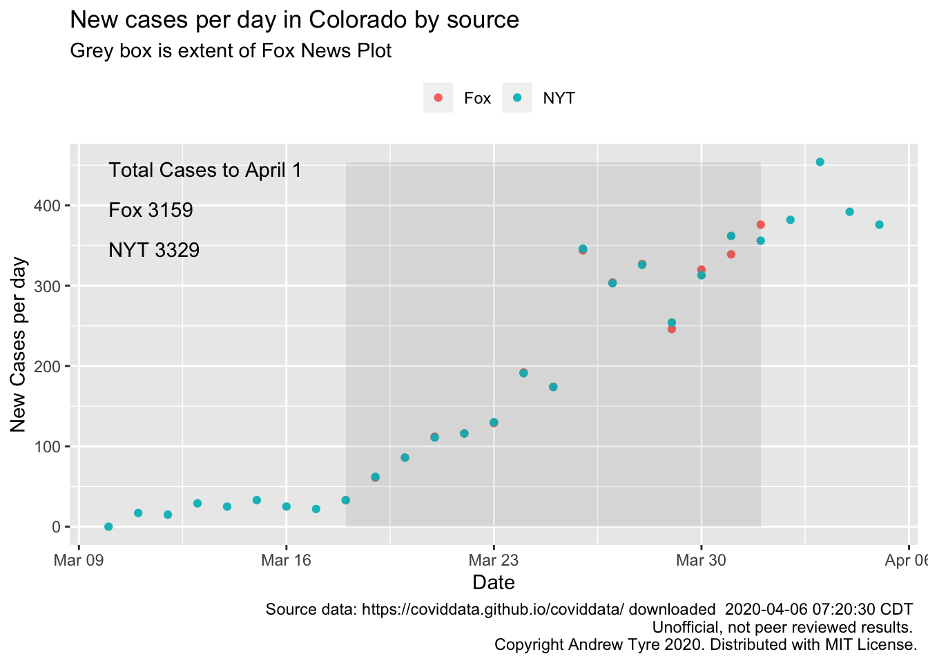
Incident cases should be linear if cumulative cases are growing
exponentially, so by eye the original plot is still suggestive of
exponential growth. I can’t see where they are getting their
total cases from – if I add up the data in their plot or even the NYT
data through April 1 I get smaller numbers. NYT numbers are not much
smaller, could be there were some cases prior to March 10 that my
data source isn’t picking up anymore.
One suggestion was that the axes were merely mislabeled. Let’s call
this the “incompetent” hypothesis. Alternatively, Fox was trying
to reduce the apparent slope of points after March 25. Let’s call that
the “devious” hypothesis. So now I’ll try to force ggplot() to do both
of those things …
incompetent <- ggplot(data = fox_data) +
  geom_line(mapping = aes(x = Date, y = cases), size = 2, color="white") +
  geom_label(mapping = aes(x = Date, y = cases, label = cases)) +
  scale_y_continuous(breaks = seq(30,400,30), labels = c(30, 60, 90, 100, 130, 160, 190, 240, 250, 300, 350, 400, 450))+
  scale_x_date(date_breaks = "1 day", date_labels = "%B\n%d")+
     labs(y = "New Cases per day",
           title = "New cases per day by Fox News",
          subtitle = "Y axis is mislabeled to match Fox News original plot",
           x = "Date",
           caption = paste("Source data: Fox News Plot",
                           "\n Unofficial, not peer reviewed results.",
                           "\n Copyright Andrew Tyre 2020. Distributed with MIT License.")) +
  theme(panel.grid.major.x = element_blank(),
        panel.grid.minor.x = element_blank(),
        panel.grid.minor.y = element_blank(),
        panel.background = element_rect(fill = "darkblue"),
        plot.background = element_rect(fill = "darkblue"),
        plot.title = element_text(color = "white"),
        plot.subtitle = element_text(color = "white"),
        plot.caption = element_text(color = "white"),
        axis.text = element_text(color = "white"),
        axis.title = element_blank(),
        )
incompetent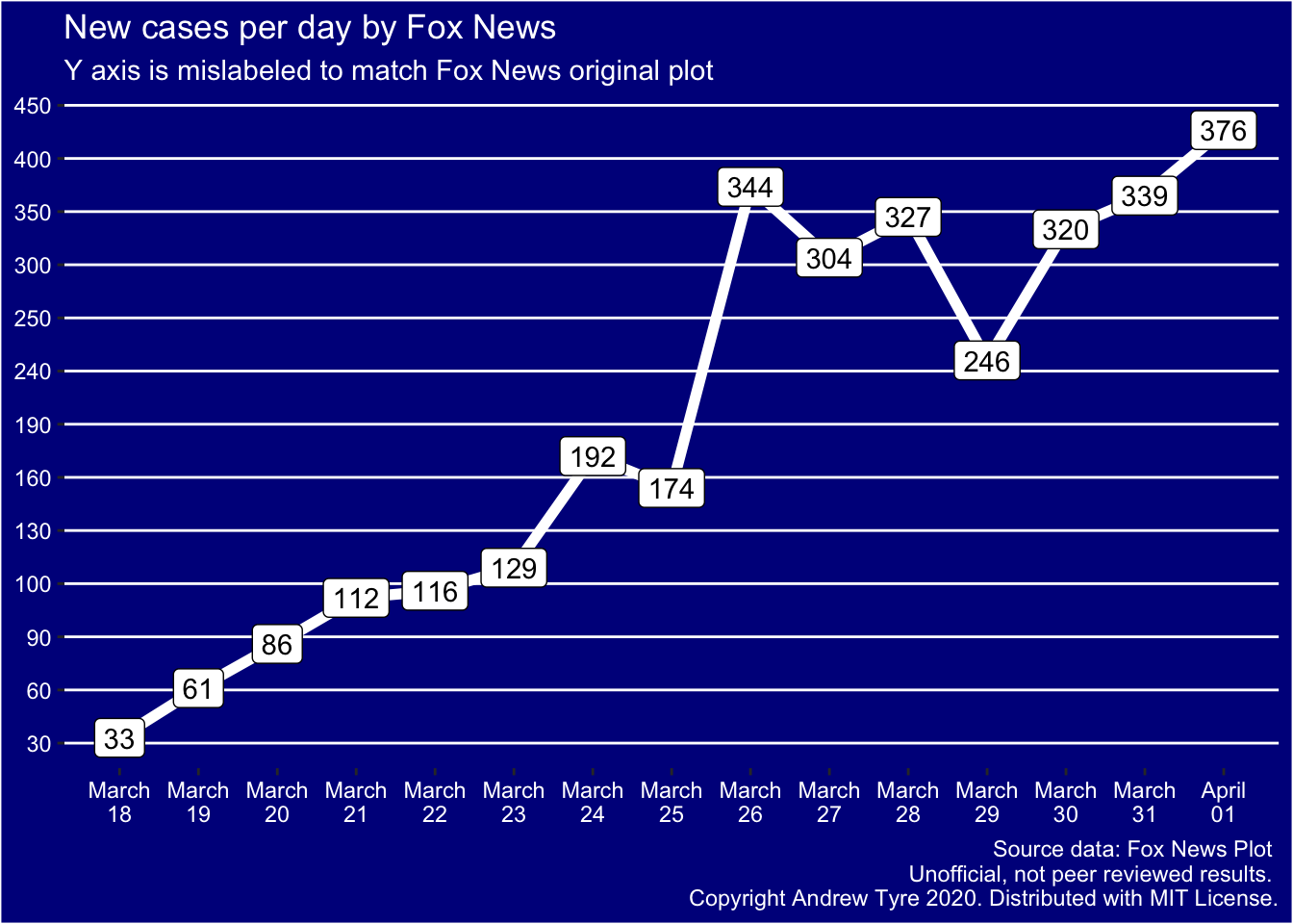
OK, I think that rules out the incompetent hypothesis – the points don’t match the mislabeled axes at all. They do match up on the original plot. For example, March 26 is just below the line labeled 350, while if the axes are merely mislabeled that point is above the 350 line.
I was going to try to make a “devious” plot, but I can’t figure out how! Initially I thought there was only one break in the axis, but there are several. I might be able to reproduce it by using a discrete axis, and then bumping points up or down to match? Regardless, this degree of messing up has to be deliberate.
