Looks like social distancing is having an impact at the level of the entire United States, but we’re a long ways from the end of the first wave of COVID-19. In this post I test out a couple new ways of visualizing and forecasting what is happening.
The first post in this series was March 13, in case you’re just joining and want to see the progression. I’m now posting the bottom line figures for each state and province on the same post that just gets updated each day.
DISCLAIMER: These unofficial results are not peer reviewed, and should not be treated as such. My goal is to learn about forecasting in real time, how simple models compare with more complex models, and even how to compare different models.1
Plotting growth rates by cumulative cases
YouTube science communicator minutephysics posted a great video on COVID-19 data that explains why I’ve been focused on simple exponential models. If you haven’t watched it, you should go do that now. I’ll wait.
So they looked at country level data, and I thought I would try to reproduce that plot with with state and province level data. One issue minutephysics had was the noise from daily data made plotting a line very irregular. They chose to use a sliding window sum to reduce the noise. But another alternative is to use a statistical model to smooth the data – that’s what they are for after all.
library("tidyverse")
library("lubridate")
library("broom")
library("forecast")
library("lme4")
savefilename <- "data/api_all_2020-04-04.Rda"

load(savefilename)

country_data <- read_csv("data/countries_covid-19.csv") %>%
  mutate(start_date = mdy(start_date))

source("R/jhu_helpers.R")
source("R/plot_functions.R")


canada_by_region <- list(
  confirmed = other_wide2long(api_confirmed_regions, countries = "Canada"),
  deaths = other_wide2long(api_deaths_regions, countries = "Canada"),
  # recovered data is a mess lots of missing values
  recoveries = other_wide2long(api_recoveries_regions, countries = "Canada")
  ) %>%
  bind_rows(.id = "variable") %>%
  pivot_wider(names_from = variable, values_from = cumulative_cases)
canada_by_region2 <- plot_active_case_growth(canada_by_region, country_data)$data

usa_by_state <- list(
  confirmed = us_wide2long(api_confirmed_regions, "United States"),
  deaths = us_wide2long(api_deaths_regions, "United States"),
  # recovered data is a mess lots of missing values
  recoveries = us_wide2long(api_recoveries_regions, "United States")
  ) %>%
  bind_rows(.id = "variable") %>%
  pivot_wider(names_from = variable, values_from = cumulative_cases)
usa_by_state2 <- plot_active_case_growth(usa_by_state, country_data)$data

usa_plot1 <- filter(usa_by_state2, incident_cases > 0, samplesize > 10) %>%
ggplot(mapping = aes(x = confirmed, y = incident_cases)) +
  geom_point(alpha = 0.2) +
  geom_smooth(mapping = aes(group = Region), se = FALSE, size = 0.5, method.args = list(span = 1, degree = 1)) +
  scale_y_log10() + scale_x_log10() +
  labs(x = "Confirmed cases",
       y = "Incident cases per day",
       title = "USA",
       subtitle = "Solid lines: locally weighted smooth splines.")

canada_plot1 <- filter(canada_by_region2, incident_cases > 0, samplesize > 10) %>%
ggplot(mapping = aes(x = confirmed, y = incident_cases)) +
  geom_point(alpha = 0.2) +
  geom_smooth(mapping = aes(group = Region), se = FALSE, size = 0.5, method.args = list(span = 1, degree = 1)) +
  scale_y_log10() + scale_x_log10()+
  labs(x = "Confirmed cases",
       y = "",
       title = "Canada\n",
       caption = paste("Source data: https://coviddata.github.io/coviddata/ downloaded ",
                           format(file.mtime(savefilename), usetz = TRUE),
                           "\n Unofficial, not peer reviewed results.",
                           "\n Copyright Andrew Tyre 2020. Distributed with MIT License."))

egg::ggarrange(usa_plot1, canada_plot1, nrow = 1)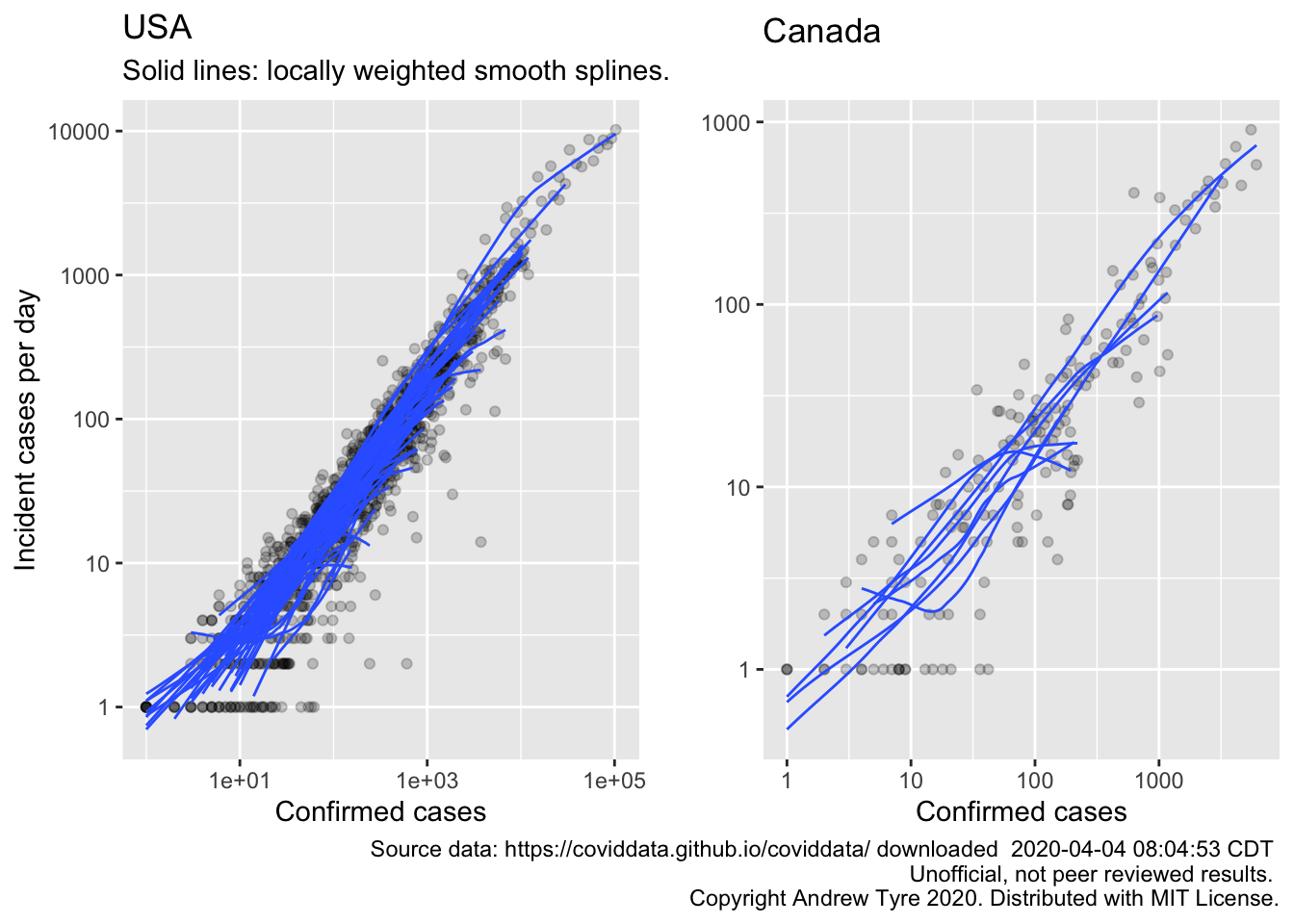
The top curve for the USA is NY state. Could be that they are dropping off the exponential curve because the line is bending downwards. Still adding close to 10000 cases a day.
Incident cases has a problem: the extent of testing is highly variable between locales, and changing rapidly with time. The continued exponential increase could be an artifact of increased testing. For that reason the IMHE group is focusing on the increase in deaths, because that number is more likely to be accurate2. Make the same plot for deaths?
usa_plot2 <- filter(usa_by_state2, incident_deaths > 0) %>%
  group_by(Region) %>%
  mutate(days_of_deaths = n()) %>%
  ungroup() %>%
  filter(days_of_deaths > 10) %>%
ggplot(mapping = aes(x = deaths, y = incident_deaths)) +
  geom_point(alpha = 0.2) +
  geom_smooth(mapping = aes(group = Region), se = FALSE, size = 0.5, method.args = list(span = 1, degree = 1)) +
  scale_y_log10() + scale_x_log10()+
  labs(x = "Cumulative deaths",
       y = "Incident deaths per day",
       title = "USA",
       subtitle = "Solid lines: locally weighted smooth splines.")

canada_plot2 <- filter(canada_by_region2, incident_deaths > 0) %>%
  group_by(Region) %>%
  mutate(days_of_deaths = n()) %>%
  ungroup() %>%
  filter(days_of_deaths > 10) %>%
ggplot(mapping = aes(x = deaths, y = incident_deaths)) +
  geom_point(alpha = 0.2) +
  geom_smooth(mapping = aes(group = Region), se = FALSE, size = 0.5, method.args = list(span = 1, degree = 1)) +
  scale_y_log10() + scale_x_log10() +
  labs(x = "Cumulative Deaths",
       y = "",
       title = "Canada\n",
       caption = paste("Source data: https://coviddata.github.io/coviddata/ downloaded ",
                           format(file.mtime(savefilename), usetz = TRUE),
                           "\n Unofficial, not peer reviewed results.",
                           "\n Copyright Andrew Tyre 2020. Distributed with MIT License."))

egg::ggarrange(usa_plot2, canada_plot2, nrow=1)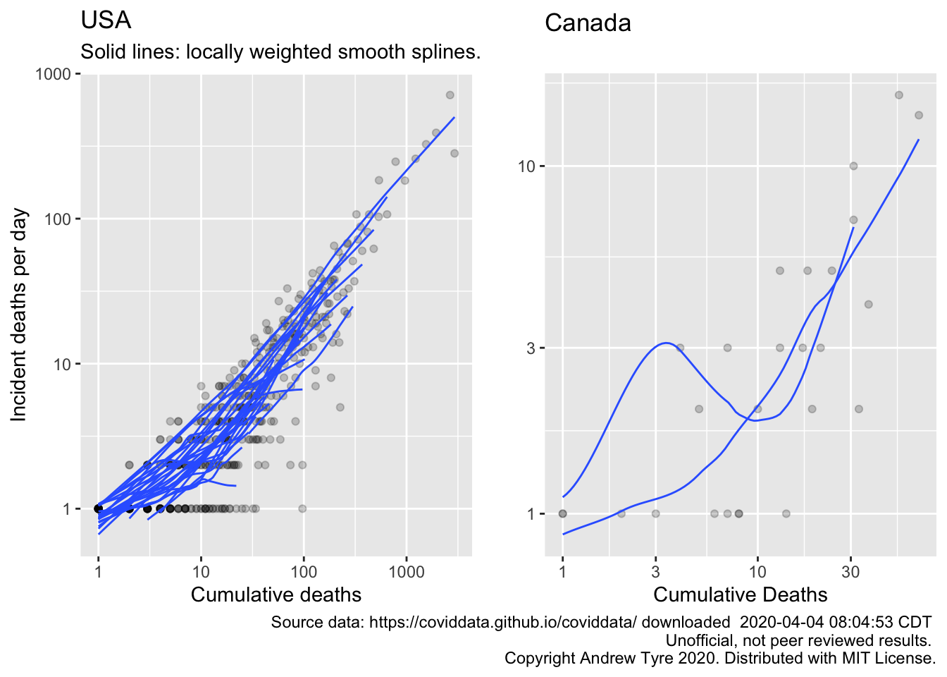
OK, so no sign yet of the # of deaths “dropping” off the exponential line for USA. The epidemic is too early in Canada to show what’s going on with deaths. It would be better if we had some kind of confidence limits for these plots. It looks like they share a slope but have varying intercepts. Another problem is that I’ve filtered out days with 0 deaths, but that means that the subsequent number represents growth over a longer period.
Time series modelling
I want to try the
excellent forecast package by Rob Hyndman et al.. The main reason for
shifting to time series analysis is that the variation around the line is not
independent. I’ll use the number of deaths per day from New York.
I will also use “my” method – simple linear model on log10 transformed data. I’ve been assuming this is comparable to an exponential growth model with independent errors. I will hold out ~20% of the data to check the validity of the forecasts, and forecast 2 weeks out.
ny_deaths3 <- filter(usa_by_state2, Region == "New York", incident_deaths > 0) %>%
  mutate(log10_id = log10(incident_deaths),
         # match how autoplot is representing the x axis?
         Time = as.numeric(Date),
         n_obs = n(),
         Training = Time < floor(n_obs*0.8) + min(Time))
training_data <- filter(ny_deaths3, Training)
nyd_lm <- lm(log10_id~Time, data = training_data)
nyd_lm_fit <- augment(nyd_lm) %>%
  mutate(Date = as.Date(Time, origin = ymd("1970-01-01")))
nyd_predicted <- filter(ny_deaths3, !Training) %>%
  summarize(start = min(Time)) %>%
  pull(start) %>%
  tibble(Time = (.):(.+13)) %>%
  augment(x = nyd_lm, newdata = ., se_fit = TRUE) %>%
  mutate(sigma = summary(nyd_lm)$sigma,
         fit = 10^.fitted,
         pred_var = sigma^2 + .se.fit^2,
         lpl = 10^(.fitted - sqrt(pred_var)*qt(0.975, df = 14)),
         upl = 10^(.fitted + sqrt(pred_var)*qt(0.975, df = 14)),
         Date = as.Date(Time, ymd("1970-01-01")))


nyd_ts3 <- zoo::zoo(pull(training_data, log10_id), pull(training_data, Date))
nyd3_fit <- auto.arima(nyd_ts3, seasonal = FALSE)
ndy3_forecast <- forecast(nyd3_fit, h = 14) %>%
  as_tibble() %>%
  mutate(Date = pull(nyd_predicted, Date),
         fit = 10^`Point Forecast`,
         lpl = 10^`Lo 95`,
         hpl = 10^`Hi 95`)
ggplot(data = ny_deaths3)  + scale_y_log10() +
  geom_point(mapping = aes(x = Date, y = incident_deaths))+
  geom_line(data = ndy3_forecast,
            mapping = aes(x = Date, y = fit), linetype = 2)+
  geom_ribbon(data = ndy3_forecast,
              mapping = aes(x = Date, ymin = lpl, ymax = hpl), alpha = 0.2) +
  geom_line(data = nyd_lm_fit,
            mapping = aes(x = Date, y = 10^.fitted),
            color = "blue", size = 2, alpha = 0.5) +
  geom_line(data = nyd_predicted,
            mapping = aes(x = Date, y = fit), linetype = 2, color = "blue") +
  geom_ribbon(data = nyd_predicted,
              mapping = aes(x = Date, y = fit, ymin = lpl, ymax = upl),
               alpha = 0.2)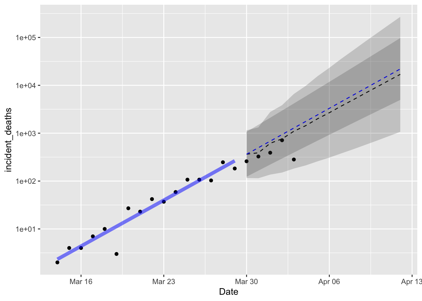
Both models are near identical in forecast, with the ARIMA(1,1) model having a wider prediction interval as I expected. The drift parameter from the ARIMA(1,1) model is nearly identical to the slope parameter estimated by the linear model, which is also what I expected, but reassuring nonetheless. Reassuring in that it means my understanding of statistics is holding up, not reassuring because it implies deaths per day were doubling in New York state every 2.3 days. I am happy to see that the latest data on deaths is less than the expected value. That’s good.
FiveThirtyEight is reporting on a project generating consensus predictions from experts. The consensus prediction of total cases in the USA on Sunday April 5 is 386,500 (80% UI: 280,500-581,500). How does the ARIMA model forecast compare?
usa_total <- usa_by_state2 %>%
  group_by(Date) %>%
  summarize(confirmed_cases = sum(confirmed, na.rm = TRUE)) %>%
  mutate(log10_cc = log10(confirmed_cases),
         # match how autoplot is representing the x axis?
         Time = as.numeric(Date),
         n_obs = n(),
         Training = Time < floor(n_obs*0.8) + min(Time))
training_data <- filter(usa_total, Training)
expert_consensus <- tibble(
  Date = ymd("2020-04-05"),
  fit = 386500,
  lpl = 280500,
  hpl = 581500
)
usat_ts <- zoo::zoo(pull(training_data, log10_cc), pull(training_data, Date))
usat_ts_fit <- auto.arima(usat_ts, seasonal = FALSE)
usat_forecast <- forecast(usat_ts_fit, h = 14) %>%
  as_tibble() %>%
  mutate(Date = pull(nyd_predicted, Date),
         fit = 10^`Point Forecast`,
         l80pl = 10^`Lo 80`,
         h80pl = 10^`Hi 80`,
         l95pl = 10^`Lo 95`,
         h95pl = 10^`Hi 95`)
ggplot(data = usa_total)  + scale_y_log10() +
  geom_point(mapping = aes(x = Date, y = confirmed_cases))+
  geom_line(data = usat_forecast,
            mapping = aes(x = Date, y = fit), linetype = 2)+
  geom_ribbon(data = usat_forecast,
              mapping = aes(x = Date, ymin = l80pl, ymax = h80pl), alpha = 0.2) +
    geom_ribbon(data = usat_forecast,
              mapping = aes(x = Date, ymin = l95pl, ymax = h95pl), alpha = 0.2) +
  geom_point(data = expert_consensus,
             mapping = aes(x = Date, y = fit), color = "blue") +
  geom_errorbar(data = expert_consensus,
                mapping = aes(x = Date, ymin = lpl, ymax = hpl), size = 0.1, color = "blue") +
        labs(y = "Cumulative confirmed cases",
           title = paste0("Cumulative confirmed cases in USA"),
           x = "Date",
           subtitle = "Dashed line: ARIMA(1,1) forecast cases with (80%, 95%) prediction intervals. \nBlue point Expert Consensus (80% UI)",
           caption = paste("Source data: https://coviddata.github.io/coviddata/ downloaded ",
                           format(file.mtime(savefilename), usetz = TRUE),
                           "\n Unofficial, not peer reviewed results.",
                           "\n Copyright Andrew Tyre 2020. Distributed with MIT License."))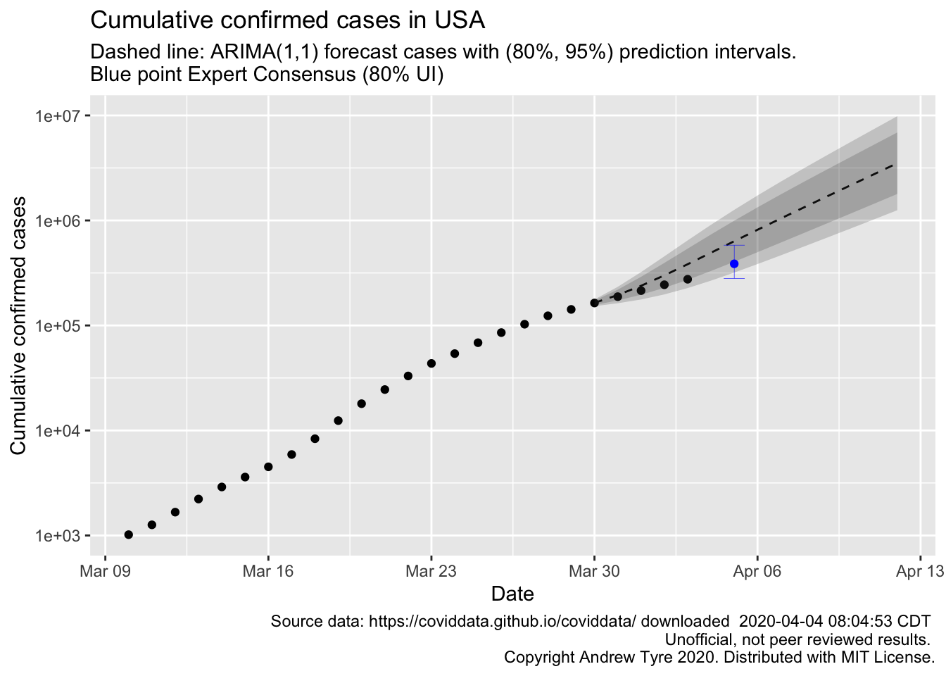
So this looks like good news to me. The observed points over the past few days are drifting below the expected value, although they are not outside the 95% prediction interval yet. Whether my model or the expert consensus does better remains to be seen. The experts were surveyed March 30-31, so my model is using 1-2 less days of data than the experts used.
