I was excited to see a plot of future cases in Nebraska with prediction limits! I had questions. I couldn’t find any answers.
The first post in this series was March 13, in case you’re just joining and want to see the progression. I’m now posting the bottom line figures for each state and province on the same post that just gets updated each day.
DISCLAIMER: These unofficial results are not peer reviewed, and should not be treated as such. My goal is to learn about forecasting in real time, how simple models compare with more complex models, and even how to compare different models.1
The figure was made in R, so clearly built by someone who knows what they are doing! It comes from the UNMC COVID-19 dashboard, on the Predictive Tool Tab. I was unable to find any documentation of how the model is estimated. It does have one unique feature: you get to choose your own inflection point!
As far as I can tell, the model being used is a simple logistic curve. This “S-shaped” curve is what you get if the per capita rate of population growth decreases with increasing population size. In the exponential models I’ve been fitting, the per capita rate of growth is constant. Epidemics follow logistic curves because the rate at which susceptible people get infected decreases as the epidemic progresses. In the very simplest models this happens because there are fewer and fewer susceptible people. Most people have already had the disease and recovered (or died), so the number of infected people shrinks as well. Infections happen when a susceptible person encounters an infected person, so the rate of new infections decreases as the epidemic progresses.
The “inflection point” that you get to choose is the moment in time were the rate of new infections stops accelerating and starts decelerating. In real life, this appears as a shrinking number of new cases per day. So why is the UNMC model using a “choose your own” strategy? I think it is really hard to estimate the inflection point before the epidemic reaches the inflection point. As a result model won’t identify a good answer unless an inflection point is specified. That is what I found when I played with logistic models a few weeks ago.
These models (and the similar ones from IMHE) are being used to predict (fancy guess!) how many people will ultimately get sick during this first wave of the epidemic. But these models are forced to be symmetrical about the inflection point, so if the model is using data from before the inflection point, it fits a rapidly rising curve. But then the prediction approaches the asymptote just as quickly. Which would be great, because it means fewer sick people! But there’s no guarantee that it will actually happen that way.
It is easy to see how important the inflection point is by changing it and inspecting the change in the predicted number of cases. As of this writing, April 20th, the model predicts 2994 cases and 64 deaths by the end of May. If I change the inflection point back a week, to April 13th, the model predicts 1771 cases and 38 deaths. In addition, you can see that later points are clearly exceeding the predictions:
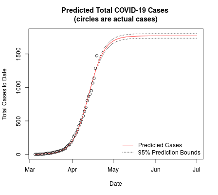
plot of cases by date
If I make the inflection point a week later, on April 27th, the model predicts 5135 cases and 109 deaths. Those are big swings! Looking at the data up to April 18th for Nebraska there is no sign of a slowdown in my analysis:
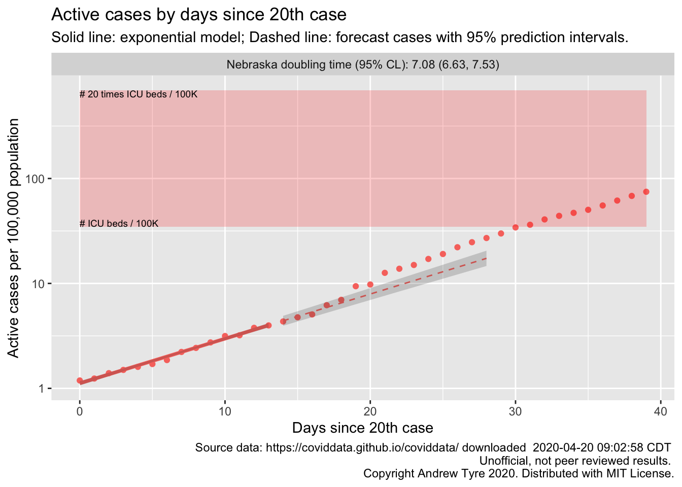
plot of cases by day for Nebraska
The simpler model I’m using can’t predict where the asymptote will be, but it can help identify when the epidemic has passed the inflection point. As of April 19 there were 1474 cases in Nebraska. The doubling time is about a week, so if our cases curve stays straight, we will have nearly 3000 cases in Nebraska by next Monday. That’s as many as the UNMC model has in the entire first wave, if the inflection point is today. Such is the unfortunate power of exponential growth.
I’m hoping reality turns out closer to the UNMC model than my model. I want those next few points dropping to the right!
