SOMEBODY READ MY BLOG! And had a question, even better:
I’m reading your latest entyrely too much post and I can’t help wondering, is there a discrepancy between the information presented? In the first plot, it looks as if Dawson county is still exponentially growing but when singled out as a county and plotted per 100,000 people, the graph is more or less flat, the date range is similar enough that it seems the data would be similar but maybe I’m missing something.
This is the post. I’m not proud of that post, it was done in a rush, and the first figure in particular is terrible. There are too many counties on it and it is hard to figure out which dots match which counties. However, it wouldn’t be my first public mistake, so let us take a closer look at Dawson county. For non-Nebraskan readers, Dawson county is along I-80 and the Platte River, west of Kearney. Lexington is the county seat.
The first post in this series was March 13, in case you’re just joining and want to see the progression.
DISCLAIMER: These unofficial results are not peer reviewed, and should not be treated as such. My goal is to learn about forecasting in real time, how simple models compare with more complex models, and even how to compare different models.1
For this analysis I’m going to the NY Times dataset directly, which has data for the USA broken
down by county. I’m also testing out a data package I contributed to – wnvdata2 –
has county level census
data so I can calculate per capita case rates.
library("tidyverse")
library("lubridate")
library("broom")
library("EpiEstim")
library("grid")
library("gridExtra")
library("gtable")

source("R/plot_functions.R")

# wnvdata package only from github.com/akeyel/wnvdata
census_data <- wnvdata::census.data %>%
  filter(year == 2019) %>%
  select(fips,POP)

nytimes_counties <- read_csv("https://raw.githubusercontent.com/nytimes/covid-19-data/master/us-counties.csv")
ne_counties <- nytimes_counties %>%
  filter(state == "Nebraska",
         county == "Dawson") %>%
  mutate(maxcases = max(cases))

linear <- ggplot(data = ne_counties,
       mapping = aes(x = date, y = cases)) +
  geom_point() +
#  scale_y_log10() +
  labs(x = "Date",
       y = "Cumulative confirmed cases")

county_data <- ne_counties %>%
  group_by(county) %>%
  summarize(fips = last(fips)) %>%
  left_join(census_data)

# makes a "tyreplot"
dawson <- plot_nytimes_counties(ne_counties,
                                          county_data,
                                          case_cutoff = 20,
                                          exclude = c())
# make a custom version for a single county from the data
logarithmic <- ggplot(data = filter(dawson$data, day >= 0),
                    mapping = aes(x = date)) +
      geom_point(mapping = aes(y = active)) +
      scale_y_log10() +
      geom_line(data = dawson$fits,
                mapping = aes(y = fit),
                size = 1.25) +
      geom_ribbon(data = dawson$fits,
                  mapping = aes(ymin = lcl, ymax = ucl),
                  alpha = 0.2) +
      geom_line(data = dawson$predictions,
                mapping = aes(y = fit),
                linetype = 2) +
      geom_ribbon(data = dawson$predictions,
                  mapping = aes(ymin = lpl, ymax = upl),
                  alpha = 0.2)  +
      labs(y = "Active/recovered cases \n per 100,000 population",
           x = paste0("Date since 20th case"))

# put plots side-by-side
grid.arrange(linear, logarithmic, ncol = 2,
             bottom = textGrob("Solid line: exponential model; Dashed line: forecast cases with 95% prediction intervals.", hjust = 1, x = 1),
             top = textGrob("Cumulative cases of COVID-19 for Dawson County, NE. Data from NY Times"))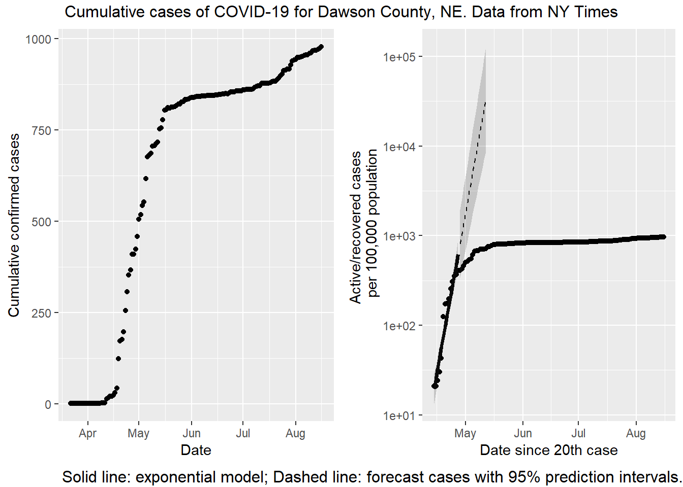
On a first glance, there is a big difference visually. The left hand plot is increasing while the right hand plot is not increasing (or not as quickly). The data are the same (or nearly, see below), but the vertical axes are scaled differently. On the left is a linear scale. With a linear scale the distance from one tick mark to the next is the same (200 cases, in this plot). On the right is a base 10 logarithmic scale. With this transformation the distance between tick marks is 10x greater than the previous one! There is one other difference; the right hand plot is cases / 100,000 population. In this case plotting a per capita rate is not changing the message, because the population of Dawson county isn’t changing.
The discrepancy is not a mistake. It is important to understand the differences between linear and logarithmic scales, because they tell very different stories! And the news media are throwing both around willy-nilly. If I want to sensationalize what is happening in Dawson county, I should use the left hand plot. Look how fast the disease is spreading! However, if I want to emphasize just how effective the citizens of Dawson county are at social distancing, I would use the right hand plot. The advantage of the right hand plot is that exponential growth appears linear. That’s the fitted line over the first two weeks. If Dawsonites are successfully lowering the rate of growth, the points start to fall away from the expected growth (the dashed line). If you know what to look for the slowdown is evident in the left hand plot as well, but it isn’t easy to see. The logarithmic scale makes it blatantly obvious.
There are two other subtle differences in the data between plots. The right hand plot has confirmed deaths subtracted. As of this writing 7 people have died from COVID-19 in Dawson county, so that isn’t making a big difference. The other difference is the right hand x axis starts on the day with 20 cases reported, not when the first case is reported. If I started the left hand plot on April 14, the apparent increase would be smaller, but not enough to account for the big visual difference.
Telling stories with data is fun, but as always, reader beware! Subtle choices made by the analyst can make for dramatic shifts in emphasis from the same data.
This package isn’t available on CRAN. Get it on Github.↩︎
