EDIT: 2020-03-20 22:42 CDT – I goofed on the per capita conversion. Absolute number comparisons were all too high but trends are the same.
New cases in the USA took a big jump up yesterday. Italy continues to add more than 3000 cases per day
than 20 times their ICU capacity. US states and Canadian provinces with the largest number
of cases so far are seeing new cases per day consistent with the exponential model.
The first post in this series was just over a week ago, in case you’re just joining and want to see the progression.
The bottom line
DISCLAIMER: These unofficial results are not peer reviewed, and should not be treated as such. My goal is to learn about forecasting in real time, how simple models compare with more complex models, and even how to compare different models.
The figure below is complex, so I’ll highlight some
features first. The y axis is now cases / 100,000 population to make it easier to compare Italy
and the USA. The SOLID LINES are exponential growth models that assume
the rate of increase is constant. The dashed lines are predictions from that
model. To make comparison easier, the estimated model and predictions for both countries are on both panels.
The lines and intervals for the other country are faded out. The horizontal DOTTED LINES
are 20 times the number of ICU beds per 100,000 population in each country. Note that
the y axis is logarithmic.
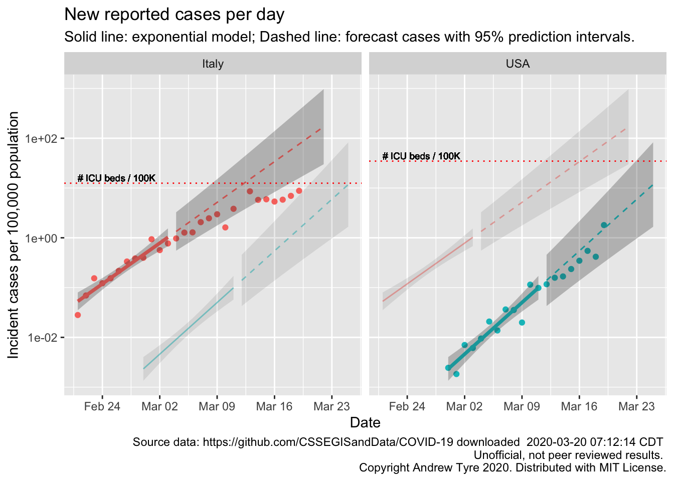
Unlike yesterday, new cases in the USA took a big jump up, but are still inside the prediction interval1. That jump up has multiple alternative explanations besides an increase in the actual number of cases. Yesterday’s number was low, so it could be that reporting glitches delayed some cases from wednesday to thursday. The USA is also trying to increase the rate of testing, with varying levels of success, so if testing has started to step up the number of reported cases could rise just due to that. Or both of those things could be happening, on top of an increase in the number of true cases.
Bit of perspective on the testing issue – apparently California has tested 17000 people so far, and 10000 of those tests are still pending.
Italy’s numbers continue the linear pattern that started around March 12 – they are going along at a constant
level, a flat line on this graph. Each day Italy adds about the same number of cases as
the day before. This is what “Flattening the curve” looks like. Unfortunately that is still more cases per day than their health care infrastructure can handle. To put those numbers in perspective, the latest point from italy is 880 cases / 100,000 population. That’s nearly 1%. New cases in Italy are nearly 1% of the population per day.
EDIT: 2020-03-20 23:00 CDT All wrong. Sorry. Can’t do basic algebra. But in one way it makes it worse. We know that Italy has more cases than they can handle. The infrastructure maxes out well below 20 times the beds
per 100,000 population.
Below are the same calculations but focused in on 3 US states and 3 Canadian provinces2. Each panel has the same features as the graph above. EDIT: 2020-03-20 23:00 CDT I changed the position of the horizontal line to just be the number of ICU beds per 100K population.
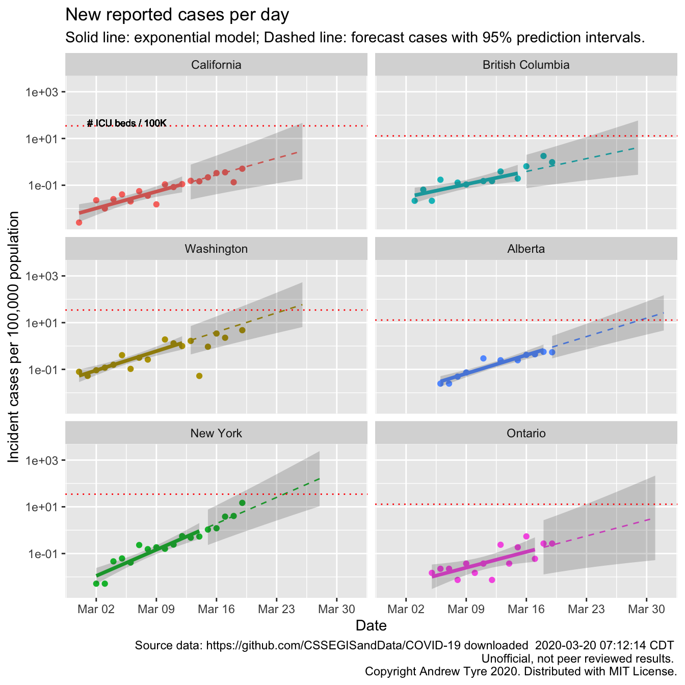
Washington, New York, and British Columbia are near or over the estimated per capita supply of ICU beds. The
projections are two weeks past the end of the window I used to fit the models; those forecasts indicate that
all six locales could be in trouble by the end of the month. If efforts to reduce transmission came too late,
New York could be seeing 10000 1000 A LOT of
cases per day by the end of the month. Those points better start dropping off the exponential curve soon.
This interview with an ER doctor in New York City
suggests they are already running out of critical equipment like ventilators and personal protective equipment.
Masks. Because there are not enough protective masks frontline healthcare workers are being exposed
unnecessarily. When all the doctors and nurses are sick who looks after them?
Many models can be
consistent with exponential growth at the beginning of a growth curve,
but do a lousy job of forecasting (for example, the logistic model scroll down).
Honestly, I’ve
been hoping the exponential model would become invalid in the USA and Canada. That would indicate
that efforts to reduce transmission were working. But there is no sign of that yet.
It’s also true that the forecasts here have a large amount of uncertainty – the forecast incident cases in
Ontario for March 30 span 3 orders of magnitude, between 100 and 10000 10 and 1000 new cases per 100,000 population.
However that is the worst case, caused by the
large day to day fluctuations in reported cases in Ontario. There is no guarantee that
the exponential model will falsely appear to work just because of this uncertainty. Look at the plot for Italy.
It was clear on March 13 that the exponential model was no longer valid in Italy.
Apparently, somewhere, there are people chanting “Colorado!”, “Nebraska!”. And I happen to know someone is paying attention in Missouri. So, due to popular demand:
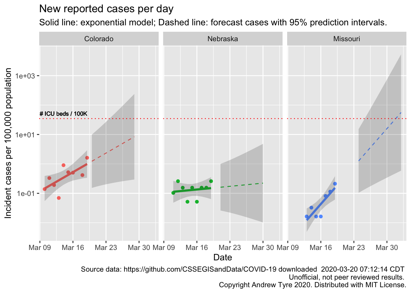
The Colorado and Nebraska regressions are not statistically significant. In Nebraska that line is very encouraging. We have already put in place measures to reduce transmission rates, so maybe that will be early enough to blunt the epidemic here. Colorado is clearly farther along, and with a few more observations that regression will be significant. Missouri is interesting because the epidemic started a few days later, but the rate of increase is much faster. Maybe there is better testing availability in Missouri? The uncertainty in the projections is still huge, so too early to say much of anything.
What’s next?
I think this will be my last post for a while. I’ve learned a ton, but trying to keep on top of the scientific literature and news posts, and hours of hard thinking about code each day is wearing me out. I’m also emotionally wrung out; it’s like watching a train wreck in slow motion. Too big to do anything about but the outcome is all too clear. I was in tears after reading the piece about the ER doc in New York. They can see it coming too. Here are my lessons learned
Simple models can be useful for decision making. I was already convinced of this, and this confirmed my belief. If I’d thought to do it, I could have predicted the ICU crunch in New York 2 weeks ago.
Open source science can work! The open John Hopkins University data aggregation is now the de facto go to for everyone, even the US government3.
Doing science in public without a safety net is risky?
If anyone wants an up to date figure for some state/province/country shoot me an email and I’ll see what I can do. Stay safe everyone, wash your hands, go for a walk.
Code not shown in the post can be found on Github. This post benefited from comments by Ramona Sky, Kelly Helm Smith, and Jessica Burnett.↩
Full disclosure: I’m Canadian!↩
A news article I looked at yesterday had a picture of the Department of Health and Human Services situation room in DC. The JHU dashboard was on the wallscreen in the background.↩
