Wednesday’s number of new cases in the USA was still inside the prediction interval, and still below expectations. Italy’s numbers appear to have leveled off from exponential to linear growth. Nonetheless, Italy continues to add more severe cases per day than their ICU bed capacity. Unless things change drastically, I predict the USA will start to exceed local ICU bed capacity by March 23, in places like New York, Washington state, and the Bay Area. Certainly by the end of March. Places like Nebraska may not experience these problems, because measures to reduce transmission started while case numbers were still low.
That outcome is not set in stone. The time to act is now. Even a one day delay in reducing transmission rate
dramatically increases the peak number of sick people. If you’re lucky to be
in a low risk group, you can still spread the virus. Although your symptoms are mild,
the person you hand the virus off to could experience much worse symptoms. You don’t
have to hermetically seal your house. I like this graphic:

This all started a week ago, in case you’re just joining.
The bottom line
DISCLAIMER: These unofficial results are not peer reviewed, and should not be treated as such. My goal is to learn about forecasting in real time, how simple models compare with more complex models, and even how to compare different models.
The figure below is complex, so I’ll highlight some features first. The y axis is now cases / 100,000 population to make it easier to compare Italy and the USA. As before, the BLUE LINES are exponential growth models that assume the rate of increase is constant. The dashed black lines are predictions from that model. To make comparison easier, the estimated model and predictions for both countries are on both panels. The lines and intervals for the other country are faded out. The RED LINES are 20 times the number of ICU beds per 100,000 population in each country. Note that the y axis is logarithmic.
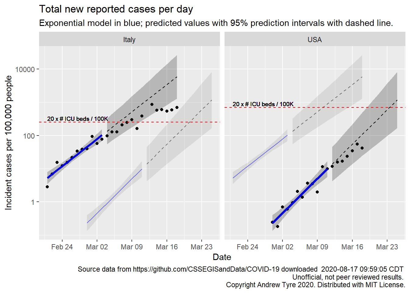
Much as yesterday, new cases in the USA are inside the prediction interval, and still below expectations1. Italy’s numbers appear to have leveled off from exponential to linear growth. Look at the new case numbers starting around March 12 – they are going along at a constant level, a flat line on this graph. Each day Italy adds about the same number of cases as the day before. In exponential growth, the number of cases per day increases at the same rate. On a log axis exponential growth looks like an increasing straight line. Nonetheless, Italy continues to add more severe cases per day than their ICU bed capacity.
Unless things change drastically, I predict the USA will start to exceed local ICU bed capacity by March 23, in places like New York, Washington state, and the Bay Area. Certainly by the end of March. Places like Nebraska may not experience these problems, because measures to reduce transmission started while case numbers were still low.
That is a bit more nuanced than yesterday’s prediction. I was looking at maps of the USA outbreak
last night and realized that the country level totals are obscuring a lot of variation
between states. This matters because when a locale starts reducing transmission by social
distancing relative to the size of the outbreak makes a big difference. Consider this
figure2 comparing two Italian provinces:
 The first confirmed case in Italy was in Lodi province on February 21. The Italian government prohibited
movement in or out of 10 municipalities in Lodi on February 23, only two days later. Although
cases began to increase in Bergamo province on February 28, movement prohibitions were not extended
there until March 8, more than a week after the first cases were reported. Cases increased in both
provinces, but in Lodi the increase is linear, while Bergamo the increase is exponential. I fear New York
and friends are like Bergamo. I’m hoping Nebraska and other small states are like Lodi.
The first confirmed case in Italy was in Lodi province on February 21. The Italian government prohibited
movement in or out of 10 municipalities in Lodi on February 23, only two days later. Although
cases began to increase in Bergamo province on February 28, movement prohibitions were not extended
there until March 8, more than a week after the first cases were reported. Cases increased in both
provinces, but in Lodi the increase is linear, while Bergamo the increase is exponential. I fear New York
and friends are like Bergamo. I’m hoping Nebraska and other small states are like Lodi.
Full data nerd past here
Remember – coding while thinking, no coherent story, ymmv.
I want to break down Canada and the USA to state / province, and see if there is anything useful I can get at that level. I’ll stick to the simple exponential model as a “null model” for now. UGH, I just remembered why I haven’t done that before … needed to be able to map the county rows with 2 letter state abbreviations to the state names in the state rows. So that took an hour. I took the opportunity to follow a suggestion from brilliant quantitative ecologist JB and put the data munging code that isn’t changing into a separate script file. And then that fancy new code broke everything in my base plot, so spent another hour figuring out how I broke everything.
us_by_state <- us_wide2long_old(jhu_wide,"USA") # see, fancy! ## Warning: Missing column names filled in: 'X12' [12]canada_by_prov <- other_wide2long_old(jhu_wide, countries = "Canada")
# reload the country data because I messed it up above
country_data <- read_csv("data/countries_covid-19.csv") %>%
mutate(start_date = mdy(start_date))
all_by_province <- bind_rows(us_by_state, canada_by_prov) %>%
left_join(country_data, by = c("province" ="Region")) %>%
group_by(country_region, province) %>%
mutate(incident_cases = c(0, diff(cumulative_cases)),
max_cases = max(cumulative_cases)) %>%
ungroup() %>%
mutate(icpc = incident_cases * 10 / popn,
group = as.numeric(factor(country_region))) %>%
# remove early rows from each state/province
# remove 0 rows in the middle that are probably reporting errors
filter(incident_cases > 0, Date >= start_date,
province %in% c("California", "Washington", "New York", "British Columbia", "Alberta", "Ontario")) %>%
mutate(province = factor(province, levels = c("California", "Washington", "New York", "British Columbia", "Alberta", "Ontario")))
base_plot <- ggplot(data = all_by_province,
mapping = aes(x = Date)) +
geom_point(mapping = aes(y = icpc, color = province)) +
facet_wrap(~province, dir="v") +
scale_y_log10() +
theme(legend.position = "none") +
labs(y = "Incident cases / 100K people")
# fit the models
all_models <- all_by_province %>%
mutate(log10_ic = log10(incident_cases),
day = as.numeric(Date - start_date)) %>%
filter(day <= 12) %>%
group_by(province) %>%
nest() %>%
mutate(model = map(data, ~lm(log10_ic~day, data = .)))
all_fit <- all_models %>%
mutate(fit = map(model, augment, se_fit = TRUE),
fit = map(fit, select, -c("log10_ic","day"))) %>%
select(-model) %>%
unnest(cols = c("data","fit")) %>%
mutate(fit = 10^.fitted,
lcl = 10^(.fitted - .se.fit * qt(0.975, df = 10)),
ucl = 10^(.fitted + .se.fit * qt(0.975, df = 10)),
fitpc = fit * 10 / popn,
lclpc = lcl * 10 / popn,
uclpc = ucl * 10 / popn)
all_predicted <- all_by_province %>%
mutate(day = as.numeric(Date - start_date)) %>%
filter(day > 12) %>% #these are the rows we want to predict with
group_by(province) %>%
nest() %>%
left_join(select(all_models, province, model), by="province") %>%
mutate(predicted = map2(model, data, ~augment(.x, newdata = .y, se_fit = TRUE)),
sigma = map_dbl(model, ~summary(.x)$sigma)) %>%
select(-c(model,data)) %>%
unnest(cols = predicted) %>%
mutate(
fit = 10^.fitted,
pred_var = sigma^2 + .se.fit^2,
lpl = 10^(.fitted - sqrt(pred_var)*qt(0.975, df = 10)),
upl = 10^(.fitted + sqrt(pred_var)*qt(0.975, df = 10)),
fitpc = fit * 10 / popn,
lplpc = lpl * 10 / popn,
uplpc = upl * 10 / popn)
base_plot +
geom_line(data = all_fit,
mapping = aes(y = fitpc, color = province),
size = 1.25) +
geom_ribbon(data = all_fit,
mapping = aes(ymin = lclpc, ymax = uclpc),
alpha = 0.2) +
geom_line(data = all_predicted,
mapping = aes(y = fitpc, color = province),
linetype = 2) +
geom_ribbon(data = all_predicted,
mapping = aes(ymin = lplpc, ymax = uplpc),
alpha = 0.2) 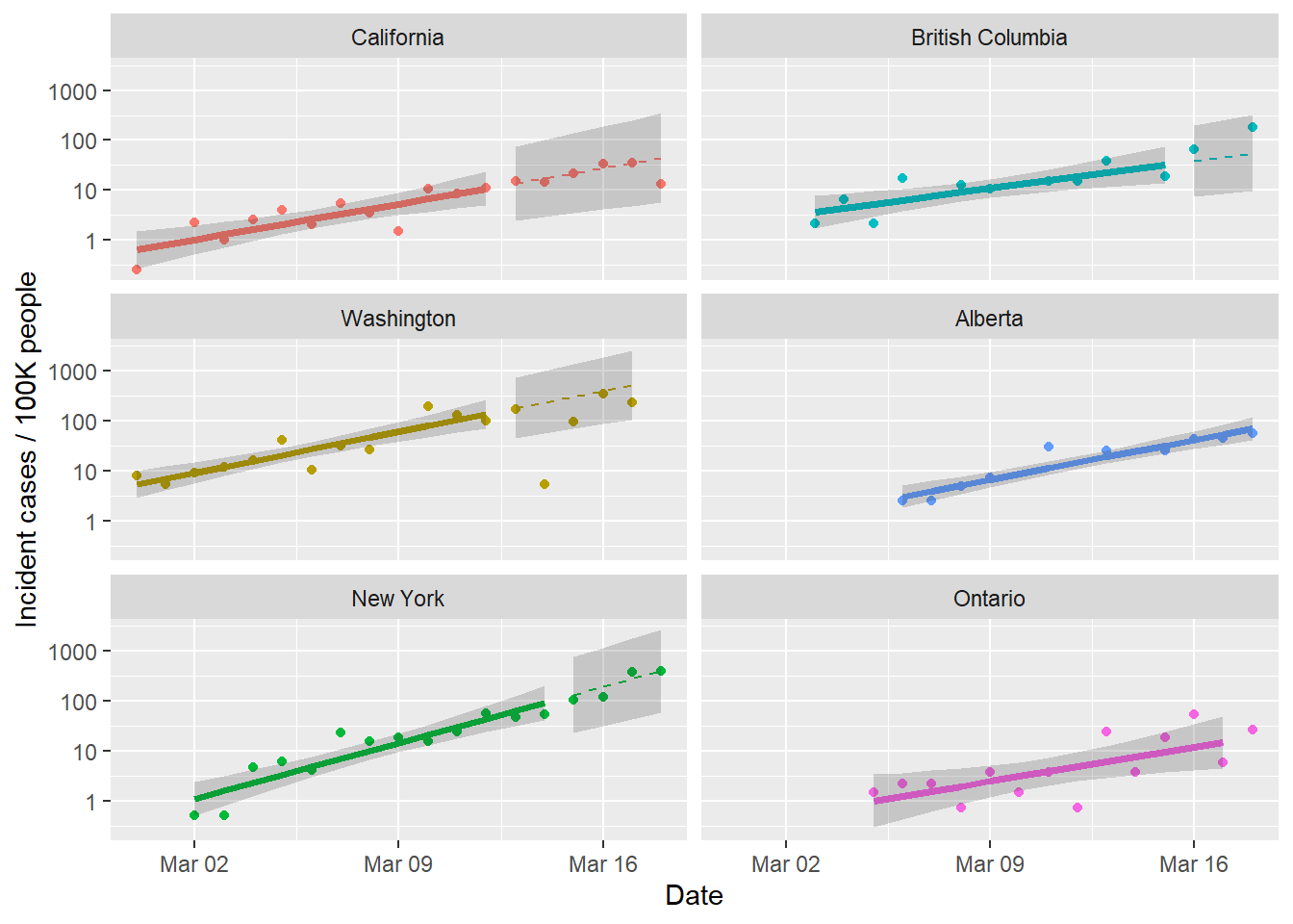
That figure is all per capita, so by that metric the two places that are worst off are New York and British Columbia, both adding around 0.5% of the population per day and accelerating. The worst news is that both New York and California continue to grow consistent with the exponential model. It’s a bit harder to tell with the Canadian provinces because the outbreaks are shorter there, so not much left after using 12 days to fit the model. Ontario is interesting because the total number of cases is highest there (for Canada), but per capita they are lower.
What’s next?
So tomorrow I should be able to fiddle the state/province graphs a bit more and get localized predictions for when ICU capacity might become a problem. I guess it’s getting time to find an alternative model to the exponential as well. The logistic curves from a few days ago were terrible at forecasting, so not sure what else to try. Suggestions in the comments please!
I’d also like to refine the prediction of ICU capacity. I finally found someone making predictions that include confidence limits and Dr. Higgie predicts the time at which Australia will start to experience issues with ICU capacity (early April). She makes a great point that cases occupy an ICU bed for some weeks, so just looking at the new cases is optimistic. Instead there needs to be a kind of sliding window sum of the new cases.
Code not shown in the post can be found on Github. This post benefited from comments by Ramona Sky, Kelly Helm-Smith, and Jessica Burnett.↩︎
This preprint is the source of the figure, and discusses age structure effects↩︎
