Monday’s number of new cases in the USA are inside the prediction interval, but are still below expectations. Good news! However, new cases per day in the USA grew about 25% faster than new cases in Italy over the first 12 days of the outbreak in each country. Italy’s numbers are showing clear signs of a slowdown relative to exponential growth.
The bottom line
DISCLAIMER: These unofficial results are not peer reviewed, and should be treated as such. My goal is to learn about forecasting in real time, how simple models compare with more complex models, and even how to compare different models.
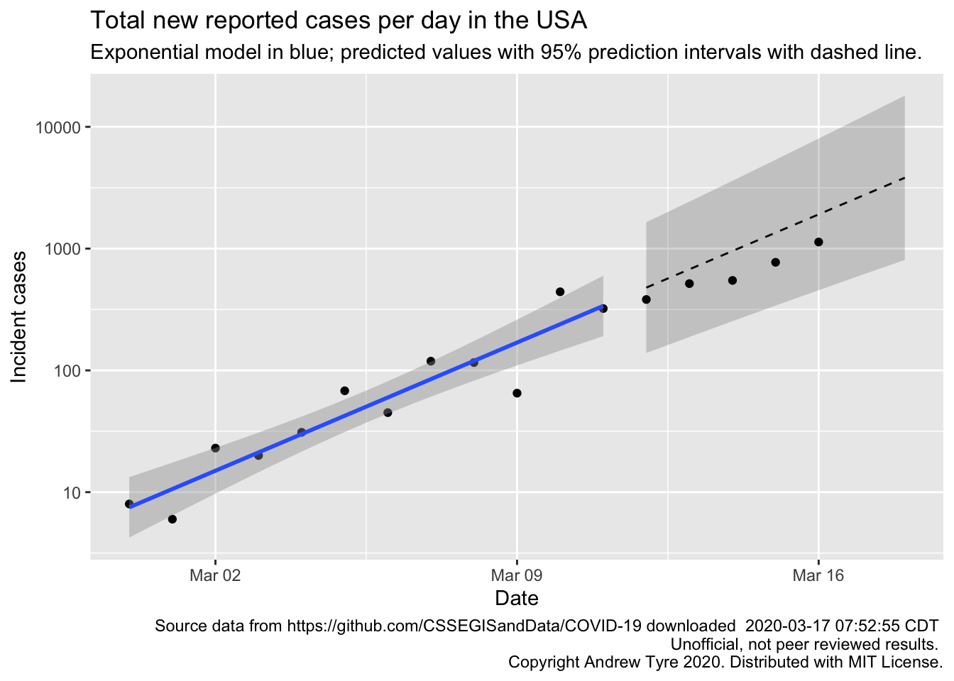
Much as yesterday, Monday’s new cases are inside the prediction intervals but below expectations for the exponential model1.
I don’t think there is a “weekend effect” reducing reporting (see Sunday’s post for the full hypothesis). Monday’s point is just as low as the previous Saturday and Sunday. The points are below expectations, but tracking along pretty parallel. This means that the rate of new cases hasn’t changed, but my estimate of the initial number of cases might be high. There is another possibility, but it’s a bit technical. My model assumes the deviations of the observations from the expected value are independent of each other. That is, the fact that Sunday’s observation is below the expected line doesn’t change the distribution of Monday’s observation. But this is probably not true. Both Sunday and Monday’s observations are coming from the same population of true (but unknown) cases. So if my model is overestimating one it is likely to overestimate the next one as well.
Below I fit the same model to case data from Italy, where the outbreak started a week or so sooner than in the USA. The number of new cases per day grew 25% faster in the USA than in Italy over the first 12 days of the outbreak in each country. That’s not such good news for the USA. The pandemic response in the USA is so fragmented and disorganized that it is hard to tell whether we took action earlier in the outbreak process than Italy did. Time will tell.
How long before we see effects of social distancing?
The effects of social distancing won’t be apparent for 5 or more days, because new cases
today are people that got sick up to 2 weeks ago.
In the meantime, if we start testing more frequently, the number
of new cases per day might go UP!
We currently have 18 cases in Nebraska. They got sick anywhere up to two weeks ago. We also know that only 20% of people get sick enough to go to hospital or the doctor, and only really sick people are being tested anyway. So on average, a week ago there could have been 18 / 0.2 = 90 cases in Nebraska. Obviously this is a very crude calculation, but the point is that we’re not seeing the full extent of the pandemic, just the tip of the iceberg. And just like an iceberg, what’s below the water line causes the problem.
Bottom line – the pandemic still spreading in USA consistent with exponential growth. The next 5-10 days will be critical to seeing what sort of trajectory the USA is on.
For students
This is a new section where I break down the steps of one of the figures or analyses elsewhere on the page. I’ll post the code here, but in the interest of saving space and typing, I’m going to walk through the code and make a video. I’ll try to keep those short by just focusing on one piece of code at a time. If you’re new to R/RStudio, I’ve got videos and instructions on how to set things up.
Today’s topic: making the figure above showing the number of cases and fitting a model. The USA is complicated, so I’m going to use a different country, say … mmm, Italy. Links to videos and some additional commentary below the figure.
library("tidyverse")
library("lubridate")
# Download and archive the data
# Uncomment the next 6 lines of code if this is the first time
# you are running it.
# jhu_url <- paste("https://raw.githubusercontent.com/CSSEGISandDATA/",
#                  "COVID-19/master/csse_covid_19_data/",
#                  "csse_covid_19_time_series/",
#                  "time_series_19-covid-Confirmed.csv", sep = "")
# jhu_wide <- read_csv(jhu_url)
# save(jhu_wide, file = "data/jhu_wide_2020-03-17.Rda")
# reload the data from the file, not the internet
load("data/jhu_wide_2020-03-17.Rda")

# Take the wide format data and make it long
italy_confirmed <- jhu_wide %>%
  # rename the problematic variables
  rename(province = "Province/State",
         country_region = "Country/Region") %>%
  # go from wide to long
  pivot_longer(col = -c("province","country_region","Lat", "Long"),
               names_to = "Date", values_to = "cumulative_cases") %>%
  # turn the Date column into actual Date type
  mutate(Date = mdy(Date)) %>%
  # just get Italy
  filter(country_region == "Italy") %>%
  # Calculate the number of new cases per day
  mutate(incident_cases = c(0, diff(cumulative_cases)))%>%
  # only keep data after feb 21 when the outbreak started, and remove row with no reported cases
  filter(Date >= "2020-02-21", incident_cases > 0)

# make the plot with data prior to March 4 (12 days), save as an object to reuse later
p1 <- ggplot(data = filter(italy_confirmed, Date <= "2020-03-03"),
       mapping = aes(x = Date)) +
  geom_point(mapping = aes(y = incident_cases)) +
  scale_y_log10() +
  geom_smooth(mapping = aes(y = incident_cases), method = "lm")

# Fit the model to the first 12 days of data (to match what I did with USA)
italy_exp_model <- italy_confirmed %>%
  filter(Date <= "2020-03-03") %>%
  mutate(log_incident_cases = log10(incident_cases),
         day = as.numeric(Date - ymd("2020-02-27"))) %>%
  lm(data = .,
     formula = log_incident_cases ~ day)

# Make predictions out to March 16
predicted <- tibble(day = 6:18)
predicted_list <- predict(italy_exp_model, newdata = predicted, se.fit = TRUE)
predicted <- predicted %>%
  mutate(Date = ymd("2020-02-27") + day,
         fit = predicted_list$fit,
         se.fit = predicted_list$se.fit,
         pred_var = se.fit^2 + predicted_list$residual.scale^2,
         lpl = 10^(fit - sqrt(pred_var)*qt(0.975, df = 10)),
         upl = 10^(fit + sqrt(pred_var)*qt(0.975, df = 10)),
         fit = 10^fit)

# Make the whole plot
p1 +
  # Expected values of prediction as a dashed line
  geom_line(data = predicted,
            mapping = aes(x = Date, y = fit),
            linetype = 2) +
  # Prediction interval as a partly transparent ribbon
  geom_ribbon(data = predicted,
              mapping = aes(x = Date, ymin = lpl, ymax = upl),
              alpha = 0.25) +
  # Add observed points after March 3
  geom_point(data = filter(italy_confirmed, Date > "2020-03-03"),
             mapping = aes(y = incident_cases)) +
  labs(y = "Incident cases", title = "Total new reported cases per day in Italy",
       subtitle = "Exponential model in blue; predicted values with 95% prediction intervals with dashed line.",
       caption = paste("Source data from https://github.com/CSSEGISandData/COVID-19 downloaded ",
                       format(file.mtime(savefilename), usetz = TRUE),
                       "\n Unofficial, not peer reviewed results.",
                       "\n Copyright Andrew Tyre 2020. Distributed with MIT License.")
       )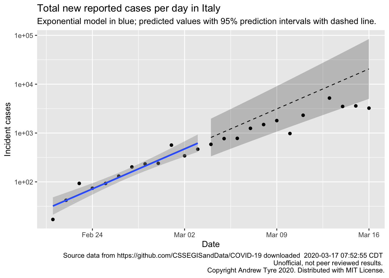
The code above is slightly tweaked relative to what I used in the video; I’ve adjusted the date range to match the USA analysis better, and the filename is slightly different. I also added labels and copyright and yada yada. But the steps and interpretation are the same.
Videos are way too long! But what else are you doing while social distancing? Learn some new stuff! I think two points are worth making about that figure. First, just like with the USA figure there are signs the number of new cases per day is slowing because the points are all falling below the expected line, and some are outside the 95% prediction interval. That’s great news for Italy. The estimated growth rate for italy is 0.12 compared to 0.15 for the USA over a similar 12 day span following the first day of sustained growth. So in the first 12 days of the outbreak the number of new cases per day was growing about 25% faster in the USA than in Italy. That’s not such good news.
Full data nerd below this point
Warning, not for the faint of heart. I’m basically typing while thinking, so if you’re looking for a nice coherent story beyond here, stop reading now.
I’ve got so many things to try, I’m losing track! My friend Scott is waiting on predictions of the cumulative cases from a logistic model, so lets do that with the cumulative data for the 6 countries. The logistic model has one more parameter than the exponential model, and levels off to an asymptote. This is what we expect for the cumulative number of cases, because as more and more people recover from the virus (or get vaccinated) the number of people left to infect gets lower, and the epidemic ends. The estimate of the Asymptote parameter in these models would give us an idea of how many people might ultimately be infected. I’m skeptical that these models will work, because early in the epidemic process the data have little information about where the asymptote is. But let’s try and see what happens.
# packages that I need
# have to load drc first or causes problems because of MASS::select conflicts with dplyr::select
# library("drc") # dose response curves for the 3 parameter logistic, more robust than nls()
# library("tidyverse") # plotting and data manipulation
# library("lubridate") # easier Date objects
countries <- c("Canada", "Australia", "Korea, South", "Italy", "Iran")
other_confirmed_total <- jhu_wide %>%
  rename(province = "Province/State",
         country_region = "Country/Region") %>%
  pivot_longer(-c(province, country_region, Lat, Long),
               names_to = "Date", values_to = "cumulative_cases") %>%
  filter(country_region %in% countries,
         # have to trap the rows with missing province (most other countries)
         # otherwise str_detect(province ...) is missing and dropped by filter()
         is.na(province) | str_detect(province, "Princess", negate = TRUE)) %>%
  mutate(Date = mdy(Date)) %>%
  # filter out state rows prior to march 9, and county rows after that.
  group_by(country_region, Date) %>% # then group by country and Date and sum
  summarize(cumulative_cases = sum(cumulative_cases)) %>%
  group_by(country_region) %>%
  mutate(incident_cases = c(0, diff(cumulative_cases))) %>%
  ungroup()
us_confirmed_total <- mutate(us_confirmed_total, country_region = "USA")
all_confirmed_total <- bind_rows(other_confirmed_total, us_confirmed_total)

pall <- ggplot(data = all_confirmed_total,
       mapping = aes(x = Date)) + # don't add y = here, so we can change variables later for ribbons etc
  geom_point(mapping = aes(y = cumulative_cases)) +
  facet_wrap(~country_region, scales = "free_y")

# these functions got out of control, so putting them in a separate file
# You can get the code at
# https://raw.githubusercontent.com/rbind/cheap_shots/master/content/post/R/drchelpers.R
source("R/drchelpers.R")
# fit the models
all_results <- all_confirmed_total %>%
  mutate(day = as.numeric(Date - ymd("2020-02-27"))) %>% # get day relative to Feb 27
  filter(Date > "2020-02-15", Date <= "2020-03-11") %>% # trim data to the dates we want
  group_by(country_region) %>%
  # nest() puts the data for each country into a "list column" called "data"
  # so that I can do the next step
  nest() %>%
  # fit the models to each dataframe in the list column
  mutate(models = map(data, ~drm(cumulative_cases~day, data = ., fct = drc::L.3())),#,
         data = map(models, augment_drc, interval = "confidence")) ## adds regression output to data
all_fitted <- all_results %>%
  select(-models) %>%  # remove the models column before the next step
  unnest(cols = data) %>%  # pulls the "data" column back out to make a single data frame
  mutate(Date = ymd("2020-02-27") + day)
predict_data <- data.frame(day = 14:20) # if use a tibble here doesn't work with drc
all_predictions <- all_results %>%
  mutate(predicted = map(models, augment_drc, newdata = predict_data, interval = "prediction")) %>%
  select(-c(models, data)) %>%
  unnest(cols = predicted) %>%
  mutate(Date = ymd("2020-02-27")+ day)
pall +
  geom_line(data = all_fitted,
            mapping = aes(y = Prediction),
            color = "blue", size = 1.5) +
  geom_ribbon(data = all_fitted,
              mapping = aes(ymin = Lower, ymax = Upper),
              alpha = 0.25)+
    geom_line(data = all_predictions,
            mapping = aes(y = Prediction),
            linetype = 2) +
  geom_ribbon(data = all_predictions,
              mapping = aes(ymin = Lower, ymax = Upper),
              alpha = 0.25)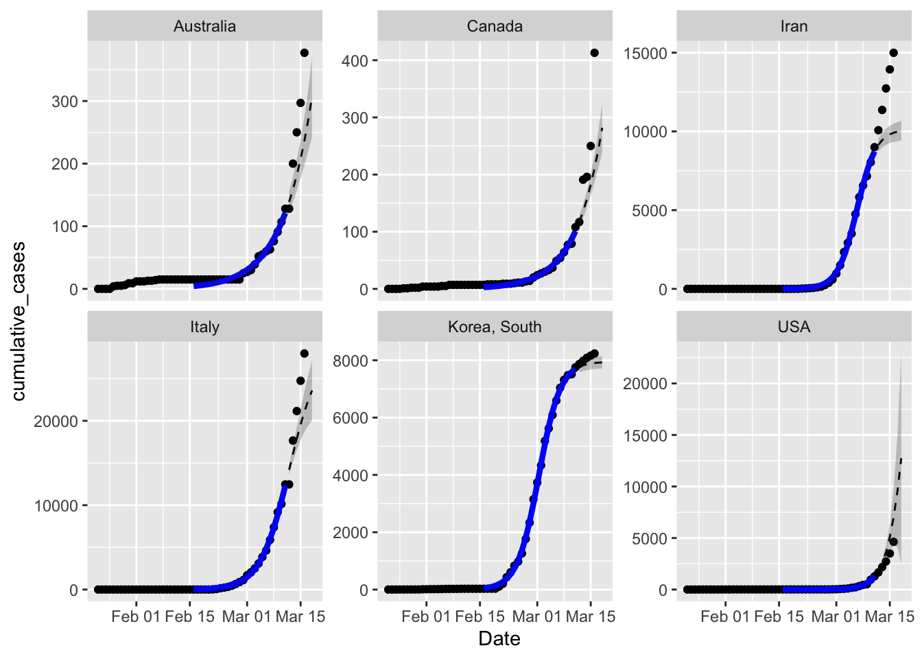
That was way harder than I planned on. The goto function for non-linear models like this is nls(), but the estimation algorithms available there were struggling to converge.
Package drc (dose response curve) gave me good results in past problems so I tried that.
Those models converged, but then I ran into all sorts of problems trying to get the predicted
values out of them. drc isn’t tidy-friendly, returning matrices and failing left and right
if you feed it a tibble. A few hours of hair-pulling later, I’ve got the fitted models and
predicted values. My first impression is that the confidence and prediction intervals are
way too narrow – I just don’t believe them.
But that’s not the reason to discard this model – with the exception of the USA, all five sets of observed cumulative cases are above the prediction interval. This is especially obvious with Iran. The best fit parameters have the curves tipping over towards the asymptote too soon. Within the data used to fit the models seem to be matching pretty well, except for Australia.
So why is this happening? I suspect that the culprit is actually a rate parameter that is slowing down with time, rather than constant. In the logistic equation the rate parameter controls how fast the curve climbs at the early stage, but also how fast the asymptote is approached. Given the data is all from the early phase the model is matching the rate parameter to what’s happening then. But then the forecast approaches the estimated asymptote too fast.
What about the estimated asymptotic sizes?
library("huxtable")
all_results %>%
  mutate(estimates = map(models, tidy_drc)) %>%
  select(-c(models, data)) %>%
  unnest(cols = estimates) %>%
  filter(Coefficient == "d:(Intercept)") %>% # grab the asymptote estimate
  select(country_region, Estimate, `2.5 %`, `97.5 %`) %>%
  mutate(`2.5 %` = case_when(`2.5 %` < 0 ~ 0, # truncate the lower limit to zero
                             TRUE ~ `2.5 %`)) %>%
  rename(Country = country_region) %>%
  hux(add_colnames = TRUE) %>% # I love huxtables
  set_number_format(row = 2:7, col = 2:4, value = 0) %>%
theme_article()| Country | Estimate | 2.5 % | 97.5 % |
| Australia | 3479 | 0 | 13364 |
| Canada | 6605 | 0 | 30952 |
| Iran | 10135 | 9523 | 10748 |
| Italy | 28453 | 21677 | 35229 |
| Korea, South | 7947 | 7816 | 8078 |
| USA | 53244 | 0 | 262967 |
Keep in mind that the logistic model is making terrible predictions for the first five rows, so in all likelihood the upper confidence limit is like a bare minimum given what’s happening now. Iran, Italy, and South Korea are all much too precise. The most interesting thing about the other three is how uncertain they are – I truncated negative lower limits to 0 for plausibility, and the upper limits are 5x bigger than the best estimate. As I suspected we can’t say anything about the ultimate size of the outbreak with these models.
What to try next?
I seem to have the code for multiple countries worked out, so tomorrow I’ll run the negative binomial model on all 6 countries with country specific 12 day windows. Time permitting I want to explore some of the epidemiological models.
