Sunday’s number of known cases in the USA are inside the prediction interval, but are below expectations. Good news! I’ve started adding more countries for comparison, to see whether USA is looking more like South Korea or more like Italy.
The bottom line
DISCLAIMER: These unofficial results are not peer reviewed, and should be treated as such. My goal is to learn about forecasting in real time, how simple models compare with more complex models, and even how to compare different models.
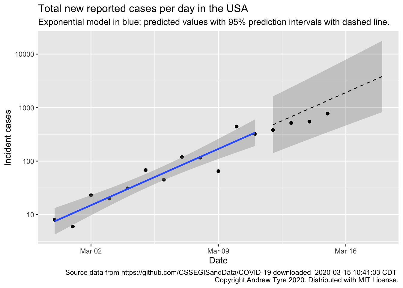
Much as yesterday, Sunday’s new cases are inside the prediction intervals but below expectations for the exponential model1. This is good news, maybe. One of the issues with using “reported cases” is that it is affected by the frequency of testing for COVID-19. This is starting to ramp up in the USA, so we might see the number of new cases per day go up as that happens.
If there is a “weekend effect” reducing reporting (see yesterday’s post for the full hypothesis), it would look like the two points for March 14 and 15 – dropping down below the expected values. Once there is more data I might be able to add a “weekend correction”, but not yet. It also probably doesn’t matter for decision making at this point.
One of my FaceBook friends asked, “Does anyone know anyone that actually has coronavirus?” This is an interesting question, because we humans tend to take things that happen to our circle of people more seriously. Unfortunately, in the USA you’re unlikely to know anyone at this stage – ~3500 cases out of 327 million. There are certainly more people with the disease than that, but they’re the lucky ones who get a mild case. The problem with exponential growth is that everything looks fine until it suddenly isn’t. People in Lombardy or Wuhan are much, much more likely to know someone who is ill. The goal of cancelling events and social distancing is to make sure you don’t know someone personally.
Bottom line – the pandemic still spreading in USA consistent with exponential growth. There are possible signs of improvement because the observations are all below the expected values, although that could still just be good luck. The next 5-10 days will be critical to seeing what sort of trajectory the USA is on.
Full data nerd below this point
Warning, not for the faint of heart. I’m basically typing while thinking, so if you’re looking for a nice coherent story beyond here, stop reading now.
This article by Tomas Pueyo has some good points about the difference between reported cases (what I’m using) and true cases (what I wish we had). The CDC does have a table of cases by date of infection, but it’s a small fraction of the total cases reported. Nonetheless, I thought it might be instructive to run the exponential model on that data. Annnd, it’s buried inside a JSON file used by a javascript widget that makes the figure and displays the table. No HTML table to scrape, so –
# if running this for the first time, uncomment (once!) all the lines from
# <HERE> to
# library("RJSONIO")
# library("RCurl")
#
# # grab the data
# raw_data <- getURL("https://www.cdc.gov/coronavirus/2019-ncov/us-cases-epi-chart.json")
# # Then covert from JSON into a list in R
# data <- fromJSON(raw_data)$data$columns # the list item named "data" has what we want, in an item named columns
# # now put in a tibble, need to do some manual things to remove the name from the start of the data
# cdc_epi <- tibble(
#   Date = mdy(data[[1]][-1]), # grab first item in list, remove first element (the name)
#   incident_cases = as.numeric(data[[2]][-1]) # grab second item in list, remove first element
# )
# # archive it, so that I use the same data for these figures always!
# also means I don't hit the server with data requests every time I save the post.
# save(cdc_epi, file = "data/cdc_epi_2020-03-15.Rda")
# <HERE>
load(file = "data/cdc_epi_2020-03-15.Rda")

# plot it, just to see what it looks like
ggplot(data = cdc_epi,
       mapping = aes(x = Date, y = incident_cases)) +
  geom_point() +
  geom_vline(xintercept = ymd("2020-03-05"), linetype = 2)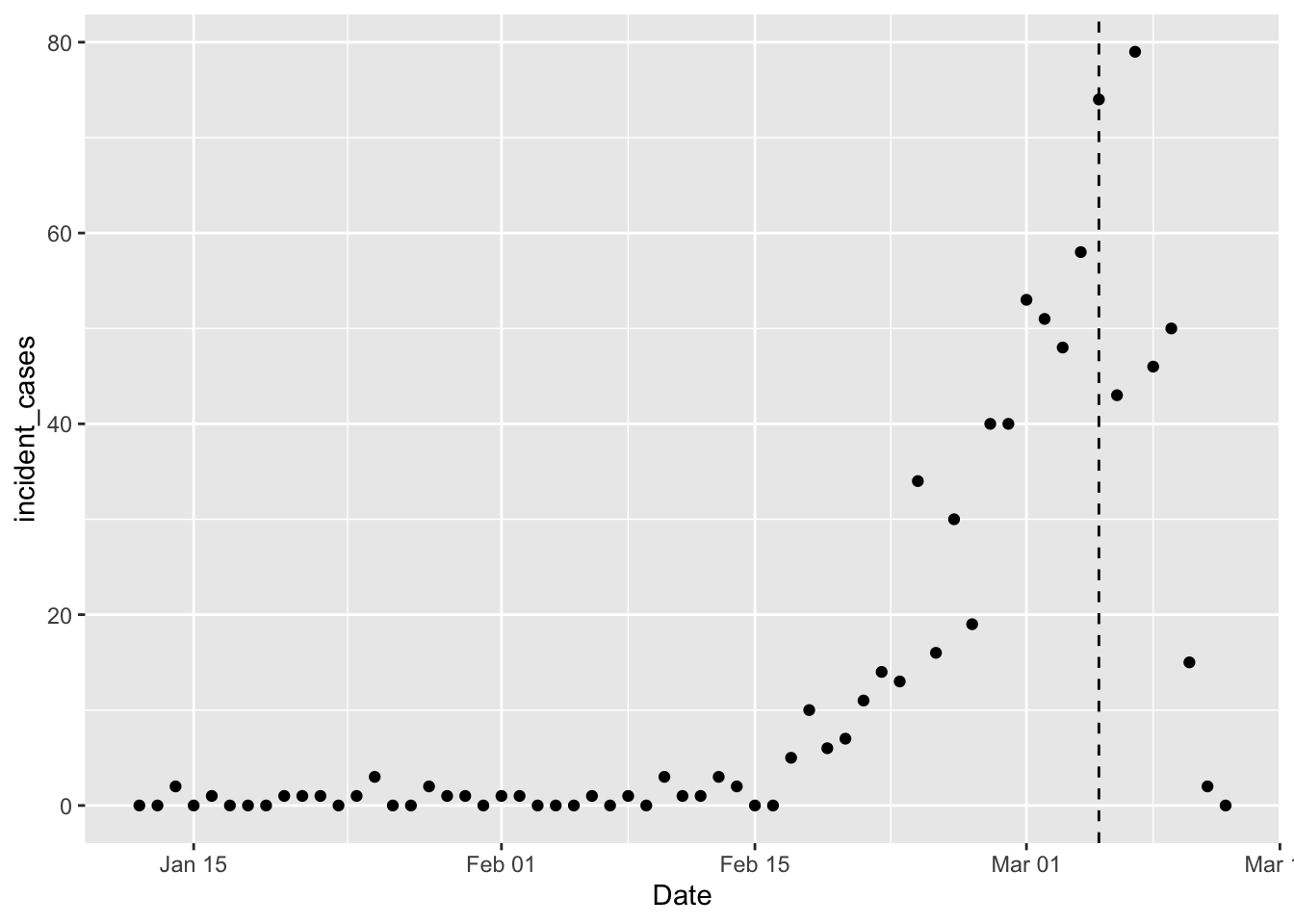
The vertical dashed line marks the point at which the CDC thinks not all cases are yet reported, so we shouldn’t model things after March 5th, yet. I want to fit the same model as before, but the difficulty with that model is that it doesn’t handle zeros well (because \(log_{10}(0) = -\infty\)). In my current predictions I’m dodging this issue by only using data after the number of incident cases is always positive. But I’ve been wondering how a glm with log link would do. Also need to choose an error distribution; I’ll try a Poisson distribution because it has only positive and discrete values.
cdc_epi_trimmed <- filter(cdc_epi, Date < "2020-03-05") %>%
  mutate(days = as.numeric(Date - ymd("2020-02-27"))) # use day relative to Feb 27, same as other model
cdc_epi_glm <- glm(incident_cases ~ days, data = cdc_epi_trimmed, family = poisson)
summary(cdc_epi_glm)
##
## Call:
## glm(formula = incident_cases ~ days, family = poisson, data = cdc_epi_trimmed)
##
## Deviance Residuals:
## Min 1Q Median 3Q Max
## -3.3802 -1.0380 -0.3911 0.7188 3.4028
##
## Coefficients:
## Estimate Std. Error z value Pr(>|z|)
## (Intercept) 3.306554 0.045628 72.47 <2e-16 ***
## days 0.142165 0.006575 21.62 <2e-16 ***
## ---
## Signif. codes: 0 '***' 0.001 '**' 0.01 '*' 0.05 '.' 0.1 ' ' 1
##
## (Dispersion parameter for poisson family taken to be 1)
##
## Null deviance: 1096.97 on 52 degrees of freedom
## Residual deviance: 108.51 on 51 degrees of freedom
## AIC: 237.87
##
## Number of Fisher Scoring iterations: 5Wow. Daily growth rate is 0.14 day-1, almost exactly the same estimate as I get for the model based on reported cases. That is a coincidence because the base of the logarithms is different. This is easy to see by running the transformation based model on the cases by infection date data.
cdc_epi_trimmed %>%
  filter(Date > ymd("2020-02-17")) %>%
  mutate(log_cases = log10(incident_cases)) %>%
  lm(log_cases ~ days, data = .) %>%
  summary()
##
## Call:
## lm(formula = log_cases ~ days, data = .)
##
## Residuals:
## Min 1Q Median 3Q Max
## -0.161794 -0.088745 -0.001402 0.091514 0.284924
##
## Coefficients:
## Estimate Std. Error t value Pr(>|t|)
## (Intercept) 1.440548 0.033381 43.155 2.71e-16 ***
## days 0.064664 0.006886 9.391 2.02e-07 ***
## ---
## Signif. codes: 0 '***' 0.001 '**' 0.01 '*' 0.05 '.' 0.1 ' ' 1
##
## Residual standard error: 0.127 on 14 degrees of freedom
## Multiple R-squared: 0.863, Adjusted R-squared: 0.8532
## F-statistic: 88.19 on 1 and 14 DF, p-value: 2.023e-07So reported cases are growing faster than the number of cases with known infection dates. Trouble is, the number of cases with known infection dates is compromised by a lack of reporting (or the numbers would match the reported cases).
The Poisson model is mildly overdispersed (ratio of residual deviance to degrees of freedom is 2.1), so how does a Negative Binomial model compare?
library("mgcv") # switch to mgcv::gam to estimate overdispersion parameter
cdc_epi_glm2 <- gam(incident_cases ~ days, data = cdc_epi_trimmed, family = nb)
summary(cdc_epi_glm2)
##
## Family: Negative Binomial(8.649)
## Link function: log
##
## Formula:
## incident_cases ~ days
##
## Parametric coefficients:
## Estimate Std. Error z value Pr(>|z|)
## (Intercept) 3.234943 0.100297 32.25 <2e-16 ***
## days 0.134150 0.009143 14.67 <2e-16 ***
## ---
## Signif. codes: 0 '***' 0.001 '**' 0.01 '*' 0.05 '.' 0.1 ' ' 1
##
##
## R-sq.(adj) = 0.925 Deviance explained = 85.4%
## -REML = 119.64 Scale est. = 1 n = 53The AIC for the Negative binomial is 235 so slightly moderately better than the Poisson model.
Fit the model for more countries
I’d like to get predictions for more countries so we can compare how the USA is doing with, say, Italy or South Korea. I’m going back to reported case data from JHU for this, and I’m going to use the Negative Binomial model because then I don’t have to worry about the odd zero close to the start of the time series. I’ll process the other countries separately because of the funky county/state business in the USA, then stick them together afterwards.
countries <- c("Canada", "Australia", "Korea, South", "Italy", "Iran")
other_confirmed_total <- jhu_wide %>%
  rename(province = "Province/State",
         country_region = "Country/Region") %>%
  pivot_longer(-c(province, country_region, Lat, Long),
               names_to = "Date", values_to = "cumulative_cases") %>%
  filter(country_region %in% countries,
         # have to trap the rows with missing province (most other countries)
         # otherwise str_detect(province ...) is missing and dropped by filter()
         is.na(province) | str_detect(province, "Princess", negate = TRUE)) %>%
  mutate(Date = mdy(Date)) %>%
  # filter out state rows prior to march 9, and county rows after that.
  group_by(country_region, Date) %>% # then group by country and Date and sum
  summarize(cumulative_cases = sum(cumulative_cases)) %>%
  group_by(country_region) %>%
  mutate(incident_cases = c(0, diff(cumulative_cases))) %>%
  ungroup()
us_confirmed_total <- mutate(us_confirmed_total, country_region = "USA")
all_confirmed_total <- bind_rows(other_confirmed_total, us_confirmed_total)

pall <- ggplot(data = all_confirmed_total,
       mapping = aes(x = Date)) + # don't add y = here, so we can change variables later for ribbons etc
  geom_point(mapping = aes(y = incident_cases)) +
  facet_wrap(~country_region, scales = "free_y")
pall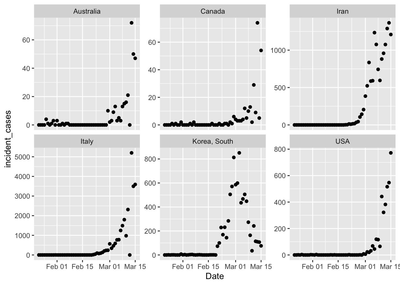
Phew. That took far too long to sort out, because I tried to filter() all the countries including the
USA, and that was just not working. Treating the USA separately was easy because I already
had that dataframe built above. The y axis scales are wildly different on those, but just eyeballing
the shape it’s clear that South Korea is doing something radically different. However, the exponential
growth in South Korea started earlier too, so that trajectory might not be impossible.
There are also a couple
weird outliers in Australia and Italy where incident cases dropped to zero suddenly for one day. Canada
also has a strange 2 day oscillation going on. I think these are likely reporting artifacts.
Now fit the models and see what that looks like. The early period of the time series for all these countries is mostly driven by travel related cases, so as before I’ll trim off the data prior to Feb 15. I picked that date by eyeballing the data and looking for a date prior to where case loads started accelerating for all countries. It would be better to have that set uniquely for each country, and I’ve got some thoughts on how to do that, but I’ll leave that for tomorrow.
all_results <- all_confirmed_total %>%
  mutate(day = as.numeric(Date - ymd("2020-02-27"))) %>% # get day relative to Feb 27
  filter(Date > "2020-02-15", Date <= "2020-03-11") %>% # trim data to the dates we want
  group_by(country_region) %>%
  # nest() puts the data for each country into a "list column" called "data"
  # so that I can do the next step
  nest() %>%
  # fit the models to each dataframe in the list column
  mutate(models = map(data, ~gam(incident_cases ~ day, data = ., family = nb)),
         data = map2(models, data, ~bind_cols(.y, tibble(.fitted = fitted.values(.x))))) ## adds regression output to data
all_fitted <- all_results %>%
  select(-models) %>%  # remove the models column before the next step
  unnest(cols = data)  # pulls the "data" column back out to make a single data frame
pall +
  geom_line(data = all_fitted,
            mapping = aes(y = .fitted))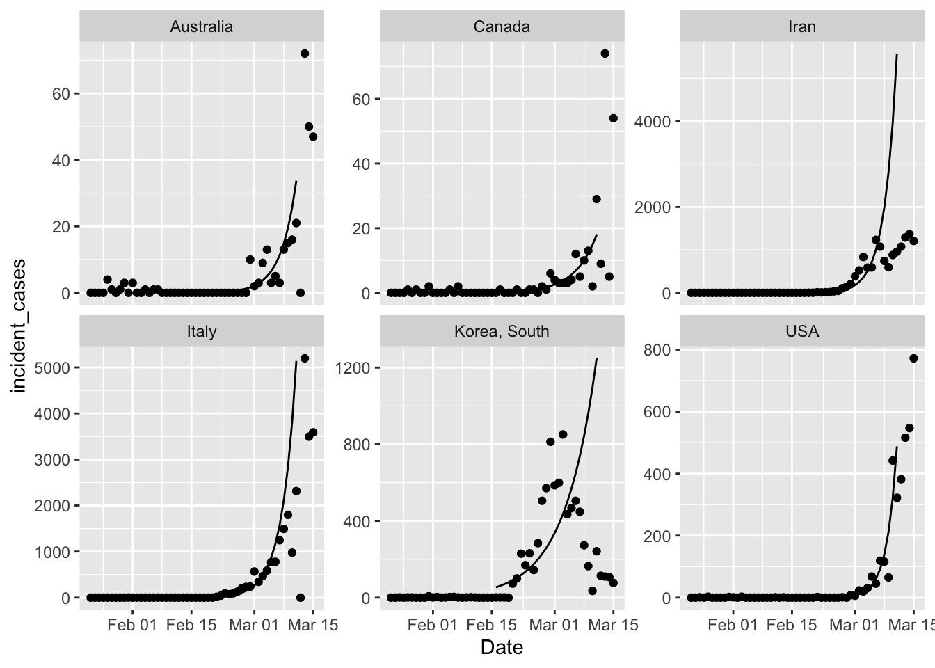
That’s a first cut, because broom functions don’t work on mgcv::gam objects. So I
need to write a custom function to get what I want. But it certainly looks like all
countries are showing less growth in cases than expected from a simple exponential
growth model. That’s good news.
augment_gam <- function(x, newdata = NULL, se.fit = FALSE){
  if (is.null(newdata)){
    result <- predict(x, se.fit = se.fit)
    original_data <- x$model
  } else {
    result <- predict(x, newdata = newdata, se.fit = se.fit)
    original_data <- newdata
  }
  if (se.fit){
    result <- bind_cols(original_data,
                     tibble(.fitted = result$fit,
                     .se.fit = result$se.fit))
  } else {
    result <- bind_cols(original_data,
                     tibble(.fitted = result))
  }
  return(result)
}

all_results <- all_confirmed_total %>%
  mutate(day = as.numeric(Date - ymd("2020-02-27"))) %>% # get day relative to Feb 27
  filter(Date > "2020-02-15", Date <= "2020-03-11") %>% # trim data to the dates we want
  group_by(country_region) %>%
  # nest() puts the data for each country into a "list column" called "data"
  # so that I can do the next step
  nest() %>%
  # fit the models to each dataframe in the list column
  mutate(models = map(data, ~gam(incident_cases ~ day, data = ., family = nb)),
         data = map(models, augment_gam, se.fit = TRUE), ## adds regression output to data
         theta = map(models, ~.x$family$getTheta(TRUE)),
         df = map_dbl(models, "df.residual"))

all_fitted <- all_results %>%
  select(-models) %>%  # remove the models column before the next step
  unnest(cols = data) %>%   # pulls the "data" column back out to make a single data frame
  mutate(Date = ymd("2020-02-27")+days(day), # recreate the Date column
         fitted_cases = exp(.fitted),        # .fitted on log scale
         lcl_cases = exp(.fitted - qt(0.975, df)*.se.fit),
         ucl_cases = exp(.fitted + qt(0.975, df)*.se.fit))

predict_data <- tibble(day = 14:20)
predicted <- all_results %>%
  mutate(predictions = map(models, augment_gam, se.fit = TRUE, newdata = predict_data),
         theta = map(models, ~.x$family$getTheta(TRUE)),
         df = map_dbl(models, "df.residual")) %>%
  select(-models, -data) %>%
  unnest(cols = c("predictions", "theta")) %>%
  mutate(Date = ymd("2020-02-27")+days(day), # recreate the Date column
         expected_cases = exp(.fitted),
         lpl = qnbinom(0.025, mu = expected_cases, size = theta),
         upl = qnbinom(0.975, mu = expected_cases, size = theta))
pall2 <- ggplot(data = filter(all_confirmed_total, Date >= ymd("2020-02-15")),
       mapping = aes(x = Date)) + # don't add y = here, so we can change variables later for ribbons etc
  geom_point(mapping = aes(y = incident_cases)) +
  facet_wrap(~country_region, scales = "free_y")

pall2 +
  geom_line(data = all_fitted,
            mapping = aes(y = fitted_cases),
            col = "blue", size = 1.5) +
  geom_ribbon(data = all_fitted,
              mapping = aes(ymin = lcl_cases, ymax = ucl_cases),
              alpha = 0.25) +
  geom_line(data = predicted,
            mapping = aes(y = expected_cases),
            linetype = 2) +
  geom_ribbon(data = predicted,
              mapping = aes(ymin = lpl, ymax = upl),
              alpha = 0.25) +
  scale_y_log10()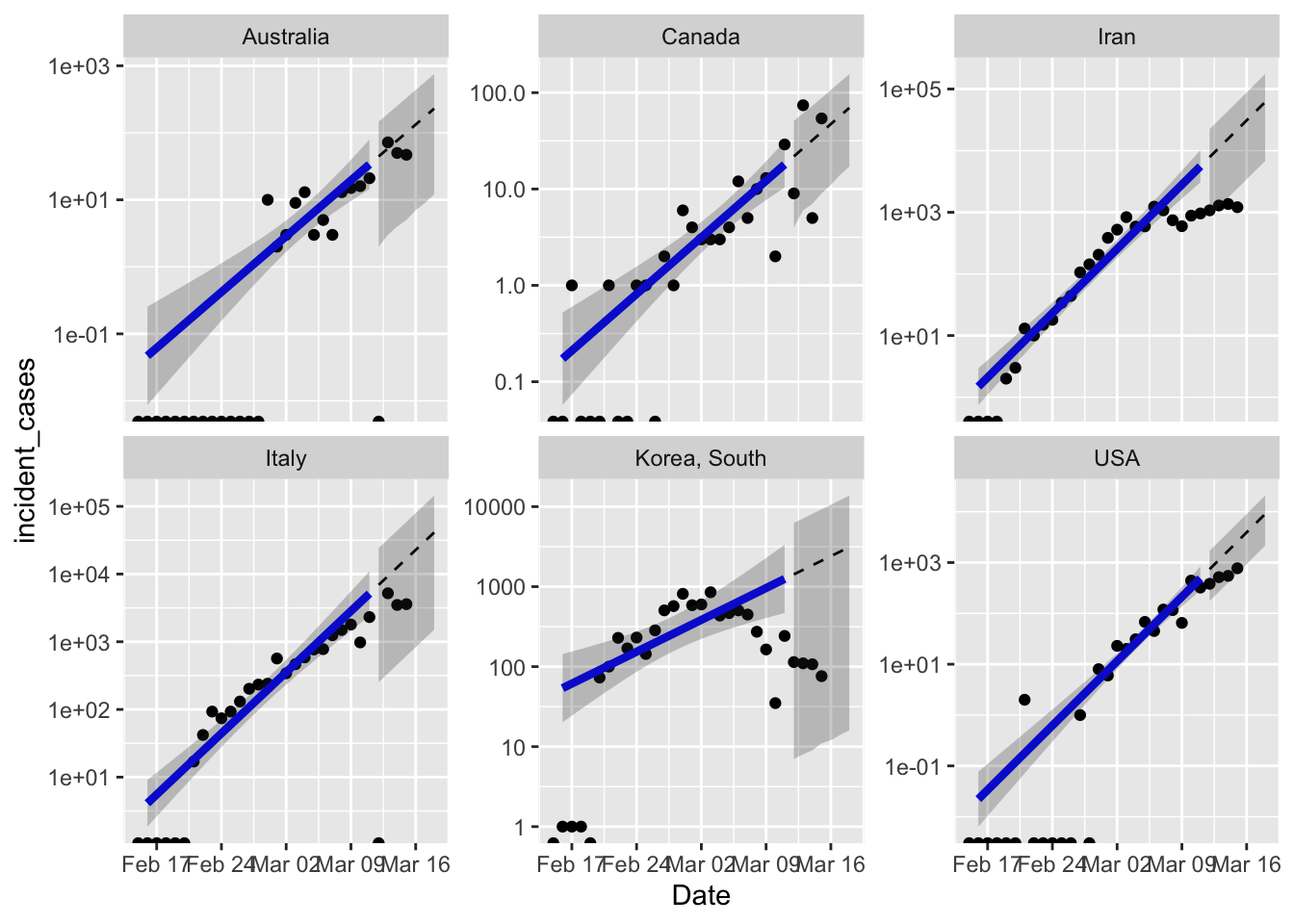
Clearly I need to figure out country specific ranges to fit the model. South Korea is clearly not growing anymore, so the terrible model fit is not unexpected. Iran is either doing great, or lying about the number of new cases, opinion out there seems divided on this point.
One excellent point raised by Brian McGill in the open discussion on Dyanmic Ecology is that the extreme response of South Korea and other countries which works in the short term, might not be the best strategy in the long term. The “squash it” strategy works for a disease like SARS or MERS which are less contagious, and can therefore really be put to bed for good. But seems like COVID-19 has exceeded global capacity to squash it everywhere. Which means we need to figure out how to live with it long term. With an estimated R0 = 2.5 COVID-19 will continue to be an issue until ~ 60% of the population are immune. I think the real goal of the “stretch it out” strategy by social distancing etc. is to buy us enough time to get a vaccine and build herd immunity artificially.
Next steps
I want to add some more models to the mix, I’m thinking maybe a logistic curve for the cumulative number of cases as suggested by my friend Scott Bradshaw (an MD), and then maybe a proper epidemiological model.
