Yesterday I got into the COVID-19 forecasting business. Today I want to see how my predictions held up.
EDIT 2020-03-16: DISCLAIMER: These unofficial results are not peer reviewed, and should be treated as such. My goal is to learn about forecasting in real time, how simple models compare with more complex models, and even how to compare different models.
Munging the data … again
My least favorite part of data analysis is munging the data into a usable form. Especially #otherpeoplesdata. John Hopkins University is doing a great service making their data under their COVID-19 dashboard open, but they’ve made some interesting choices. I can only assume these choices work well for what they are doing; certainly isn’t making my work easier! From the issues posted on github sounds like the JHU team might be getting overwhelmed. So I’m going to try the data from Our World In Data.
library("tidyverse")
library("lubridate")
owid_url <- "https://covid.ourworldindata.org/data/total_cases.csv"

owid_wide <- read_csv(owid_url) # just grab it once

us_confirmed_total <- owid_wide %>%
  pivot_longer(-1,
               names_to = "country", values_to = "cumulative_cases") %>%
  filter(country == "United States") %>%
  arrange(date)


p1 <- ggplot(data = us_confirmed_total,
       mapping = aes(x = date)) +
  geom_line(mapping = aes(y = cumulative_cases)) +
  geom_point(mapping = aes(y = cumulative_cases))
p1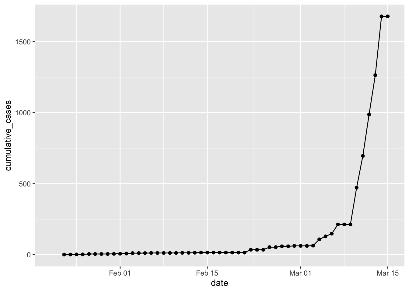
Well, fooey. CDC reports over 1600 cases for March 13. The WorldOMeter reports over 2000! However, the JHU data seems to have corrected in the last 12 hours, so I’ll go with that again. I’ll keep looking for new data sources. Another lesson from the past 24 hours – download and then save the data! Because the next time it is downloaded it might break everything …
load("data/jhu_wide_2020-03-14.Rda")
us_confirmed_total <- jhu_wide %>%
  rename(province = "Province/State",
         country_region = "Country/Region") %>%
  pivot_longer(-c(province, country_region, Lat, Long),
               names_to = "Date", values_to = "cumulative_cases") %>%
  filter(country_region == "US") %>%
  mutate(Date = mdy(Date)) %>%
#  mutate(Date = lubridate::mdy(Date) - lubridate::days(1)) %>%
  arrange(province, Date)  %>%
  # filter out state rows prior to march 8, and county rows after that.
  filter(str_detect(province, ", ") & Date <= "2020-03-9" |
           str_detect(province, ", ", negate = TRUE) & Date > "2020-03-9") %>%
  group_by(Date) %>% # then group by Date and sum
  summarize(cumulative_cases = sum(cumulative_cases)) %>%
  ungroup() %>%
  mutate(incident_cases = c(0, diff(cumulative_cases)))

p1 <- ggplot(data = filter(us_confirmed_total, Date > "2020-02-28", Date <= "2020-03-11"),
       mapping = aes(x = Date)) +
#  geom_line(mapping = aes(y = incident_cases)) +
  geom_point(mapping = aes(y = incident_cases)) +
  scale_y_log10() +
  geom_smooth(mapping = aes(y = incident_cases), method = "lm")

us_exp_model <- us_confirmed_total %>%
  mutate(log_incident_cases = log10(incident_cases),    # transform the data
         day = as.numeric(Date - ymd("2020-02-27"))) %>% # get day relative to Feb 27
  filter(Date > "2020-02-28", Date <= "2020-03-11") %>%
  lm(data = .,
     formula = log_incident_cases ~ day)

predicted <- tibble(day = 14:20)
predicted_list <- predict(us_exp_model, newdata = predicted, se.fit = TRUE)
predicted$fit <- predicted_list$fit # this is klutzy, but I want to see the answer!
predicted$se.fit <- predicted_list$se.fit
predicted <- predicted %>%
  mutate(Date = ymd("2020-2-27") + day,
         pred_var = se.fit^2 + predicted_list$residual.scale^2,
         lpl = 10^(fit - sqrt(pred_var)*qt(0.975, df = 11)),
         upl = 10^(fit + sqrt(pred_var)*qt(0.975, df = 11)),
         fit = 10^fit)

p1 +
  geom_line(data = predicted,
            mapping = aes(y = fit),
            linetype = 2) +
  geom_ribbon(data = predicted,
            mapping = aes(ymin = lpl, ymax = upl),
            alpha = 0.2) +
  geom_point(data = filter(us_confirmed_total, Date > "2020-03-11"),
             mapping = aes(y = incident_cases))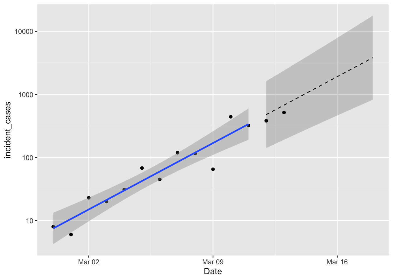
So not bad! Although if the observations continue to fall below the expected value that would indicate some lack of fit. If you take the time to carefully compare these predictions with yesterday’s predictions you’ll notice some small discrepancies. As I was wrestling with data inconsistencies, I realized that correcting the UTC dates by a whole day was throwing everything off. So everything is now shifted over by one day. The estimated coefficients of the model don’t change very much; the rate of growth is still 0.15 day-1 and the intercept dropped a little bit. Still forecasting 823 - 17714 new cases on March 18. That’s bigger than the range I mentioned in yesterday’s post, but I forgot about the effect of the logarithmic scale on y when I eyeballed it.
So, things to do: run different countries that I care about, like Canada, Germany, Australia etc etc. Find some additional models to try, and develop a good measure of comparison.
