UNL cancelled classes next week and will go to all online instruction for the rest of the semester to try and postpone the effects of COVID-19. I’m, uh, kind of a data nerd, so I’d like to know, how will we know if these drastic steps have worked?
EDIT (2020-03-14): As I worked on testing the predictions from this page I ran into a lot of issues with data consistency. Also, Tim Church’s correction of the date by 1 day is overly aggressive. Going forward I will not subtract off that one day, so the dates in future posts will shift relative to this one.
EDIT 2020-03-16: DISCLAIMER: These unofficial results are not peer reviewed, and should be treated as such. My goal is to learn about forecasting in real time, how simple models compare with more complex models, and even how to compare different models.
I also had some personal decisions to make about cancelling travel, so I went looking for some data and R examples of how to analyze epidemics. I found Tim Churches excellent blog post which also had some links to other more detailed tutorials on epidemilogy, R, and COVID-19. But that was published back on March 5, and there’s been a week’s worth of new data! I tried Tim’s code which uses the data underlying John Hopkins University COVID-19 Dashboard. That’s a pretty cool site too, and they have graciously made the data available on github. But it didn’t work; the underlying data had changed format since March 5. I got a nice visualization to work around 9 am Thursday, but by 2 pm it was broken and clearly wrong! I figured out what was going on today, and decided I’d better put it up publicly in case someone else wanted to dig in to this dataset.
library("tidyverse")
library("lubridate")
jhu_url <- paste("https://raw.githubusercontent.com/CSSEGISandData/",
                 "COVID-19/master/csse_covid_19_data/",
                 "csse_covid_19_time_series/",
                 "time_series_19-covid-Confirmed.csv", sep = "")

#jhu_wide <- read_csv(jhu_url) # just grab it once from github
# archive it!
#save(jhu_wide, file = "data/jhu_wide_2020-03-14.Rda")
load("data/jhu_wide_2020-03-14.Rda")
us_confirmed_long_jhu <- jhu_wide %>%
  rename(province = "Province/State",
         country_region = "Country/Region") %>%
  pivot_longer(-c(province, country_region, Lat, Long),
               names_to = "Date", values_to = "cumulative_cases") %>%
  # adjust JHU dates back one day to reflect US time, more or
  # less
  mutate(Date = lubridate::mdy(Date) - lubridate::days(1)) %>%
  filter(country_region == "US") %>%
  arrange(province, Date) %>%
  group_by(province) %>%
  mutate(incident_cases = c(0, diff(cumulative_cases))) %>%
  ungroup() %>%
  select(-c(country_region, Lat, Long, cumulative_cases)) %>%
  filter(str_detect(province, "Diamond Princess", negate = TRUE),
         str_detect(province, ", ", negate = TRUE))
So all that converts the JHU data from it’s wide format with one column per day
to a long format more suitable for plotting. Then the cumulative incidence is
differenced to get the number of new cases per day. The final filter()
removes some cases that were located on the Diamond Princess cruise ship and
removes the County level data. On inspection, that data frame has one row for
each state and day. Perfect! Lots of zeros … but lots of states have no cases
yet so that’s OK, right? Make a graph of the total cases in the USA.
us_total <- us_confirmed_long_jhu %>%
  group_by(Date) %>%
  summarize(incident_cases = sum(incident_cases))

ggplot(data = filter(us_total, Date > "2020-02-27", Date <= "2020-03-11"),
       mapping = aes(x = Date, y = incident_cases)) +
  geom_line() + geom_point() +
  geom_smooth(method = "lm")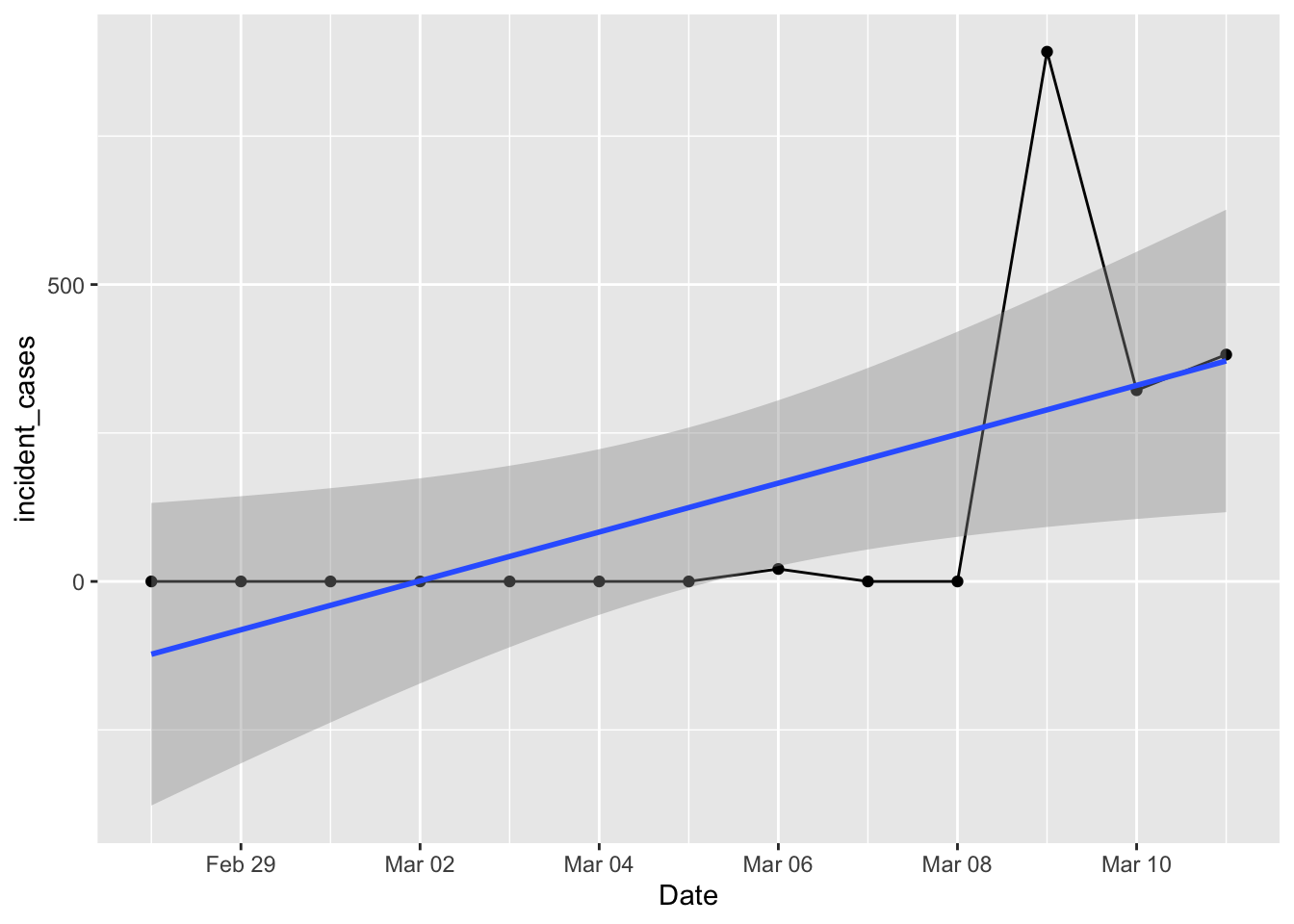
That doesn’t look right! Certainly wasn’t what I had on Thursday morning. Surely there were cases on the 7th and 8th? I tried using the county level data and rolling that up to a total, but that looked worse with logs of negative values and zeros after March 8. What happened?
Turns out the county level data stopped being collected after March 8. For a while
on Thursday there were a few days with BOTH county and state level numbers, and
there were plenty of github issues filed asking about the double counting. The
fix was easy – use the filter() I had above to get rid of the county data. But
instead they chose to do something rather intriguing. They kept both county and
state level data rows, but set all the state rows prior to march 8th, and all the
county rows after march 8th, to zero! So if you try to use either state or county
data by itself it isn’t correct … took me way too long to figure this out.
us_confirmed_total <- jhu_wide %>%
  rename(province = "Province/State",
         country_region = "Country/Region") %>%
  pivot_longer(-c(province, country_region, Lat, Long),
               names_to = "Date", values_to = "cumulative_cases") %>%
  # adjust JHU dates back one day to reflect US time, more or
  # less
  mutate(Date = lubridate::mdy(Date) - lubridate::days(1)) %>%
  filter(country_region == "US") %>%
  arrange(province, Date)  %>%
  # up to here, no problem. same as before.
  # solution? filter out state rows prior to march 8, and county rows after that.
  filter(str_detect(province, ", ") & Date <= "2020-03-8" |
           str_detect(province, ", ", negate = TRUE) & Date > "2020-03-8") %>%
  group_by(Date) %>% # then group by Date and sum
  summarize(cumulative_cases = sum(cumulative_cases)) %>%
  ungroup() %>%
  mutate(incident_cases = c(0, diff(cumulative_cases)))

ggplot(data = filter(us_confirmed_total, Date <= "2020-03-11"),
       mapping = aes(x = Date, y = incident_cases)) +
  geom_line() + geom_point()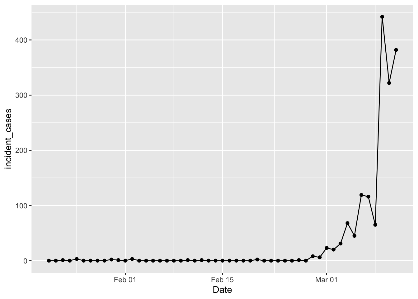
Yay! We’re back in business. Tim Church pointed out that this data is “date of reporting”, not “date of illness”; we can use it but there is some bias as a result. In Tim Church’s post he used a case level data table from wikipedia to separate cases into those imported from outside the US and those resulting from community spread inside the US. That table is gone, probably due to privacy concerns. The vast majority of cases reported prior to Feb 27 were travel related imports, while after that community spread cases dominate. So in what follows I will filter out data prior to Feb 27; poor proxy, but good enough in the moment. Another thing to keep in mind: difficulty with access to tests means the “confirmed cases” are a lower limit to the actual number of cases. A case is only “confirmed” when the patient tests positive for the virus. But there are stories of people getting sick, testing negative for everything else, but not “confirmed” because of delays in getting test results back.
So, I’m a population ecologist, so the first thing I wondered was how good an exponential model was approximating the growth in the number of cases. The exponential model assumes the rate of increase is constant with time.
p1 <- ggplot(data = filter(us_confirmed_total, Date > "2020-02-27", Date <= "2020-03-11"),
       mapping = aes(x = Date)) +
#  geom_line(mapping = aes(y = incident_cases)) +
  geom_point(mapping = aes(y = incident_cases)) +
  scale_y_log10() +
  geom_smooth(mapping = aes(y = incident_cases), method = "lm")
p1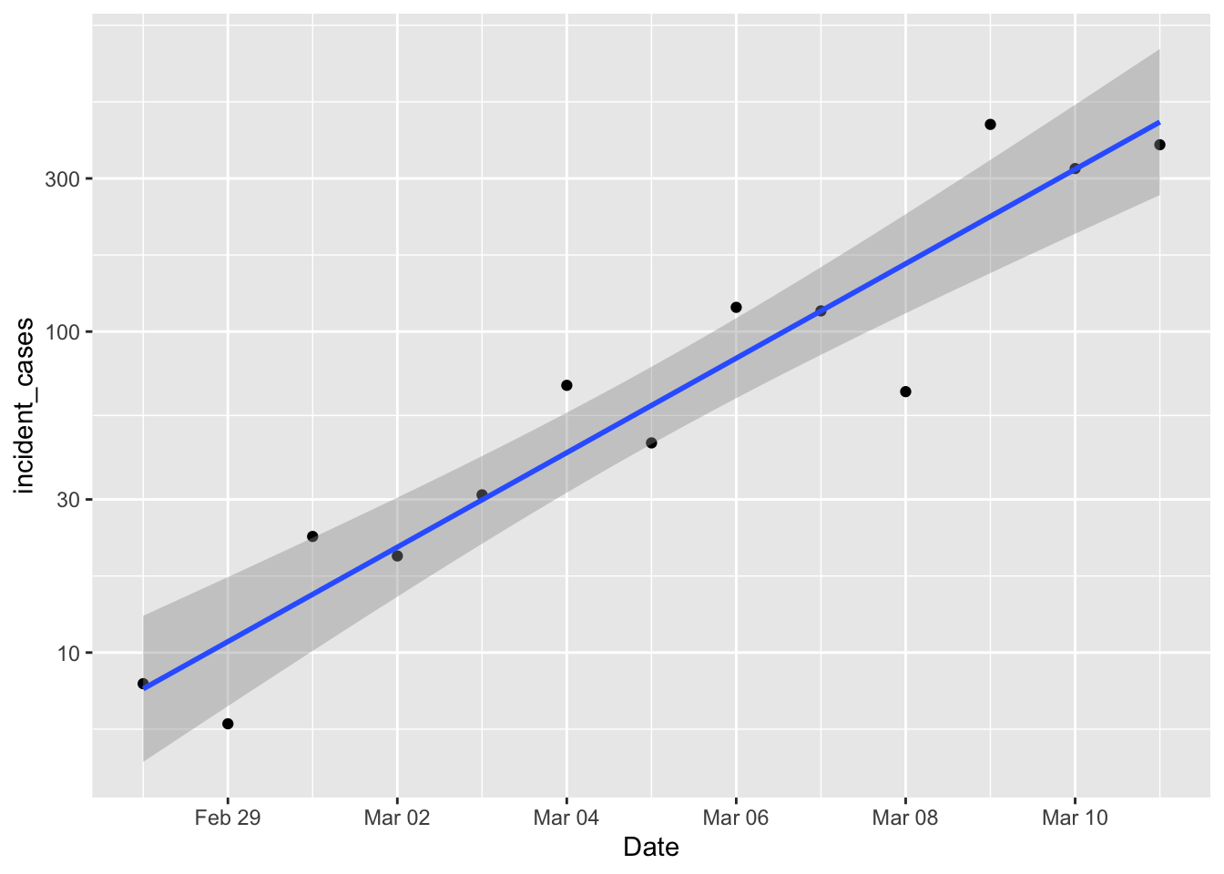
Damn. Exponential growth is linear on a log scale, and that’s looking pretty damn linear. So if efforts to diminish the growth of the pandemic are successful, then we should start to see new daily cases drop below that line. The underlying “population” model is
\[ N_t = N_0 10^{rt} \\ log_{10}(N_t) = log_{10}(N_0) + rt \] So the intercept and slope of that linear regression have some things to teach us, let’s see:
us_exp_model <- us_confirmed_total %>%
  mutate(log_incident_cases = log10(incident_cases),    # transform the data
         day = as.numeric(Date - ymd("2020-02-27"))) %>% # get day relative to Feb 27
  filter(Date > "2020-02-27", Date <= "2020-03-11") %>%
  lm(data = .,
     formula = log_incident_cases ~ day)
  broom::tidy(us_exp_model)
## # A tibble: 2 x 5
## term estimate std.error statistic p.value
## <chr> <dbl> <dbl> <dbl> <dbl>
## 1 (Intercept) 0.740 0.116 6.37 0.0000527
## 2 day 0.147 0.0146 10.1 0.000000695So the daily growth rate is 0.15. The “index case” would be reported when \(log_{10}(N_t) = 0\), and that will be when \[ log_{10}(N_t) = 0 = 0.74 + 0.15 t \\ -0.74 / 0.15 = -5 = t \]
So the case load is growing as if a single person was reported ill on Feb 22nd. How long does it take for the daily case load to double?
\[ \begin{align} 2N_0 =& N_0 10^{rt} \\ log_{10}(2) =& rt \\ t = \frac{log_{10}(2)}{r} \end{align} \]
So \(t = log_{10}(2) / 0.15 = 0.30103 / 0.15 = 2\). Wow. At that rate the number of new cases should be doubling every 2 days. Guess we’ll see.
The last thing I want to try is predicting how many cases there will be over the next week. I also want “prediction intervals” on those, which will give me the distribution of the next observation. If observations over the next few days fall below the lower prediction limit, that’s a sign that the exponential model is no longer holding, and indicates that efforts to slow the outbreak are working.
predicted <- tibble(day = 14:20)
predicted_list <- predict(us_exp_model, newdata = predicted, se.fit = TRUE)
predicted$fit <- predicted_list$fit # this is klutzy, but I want to see the answer!
predicted$se.fit <- predicted_list$se.fit
predicted <- predicted %>%
  mutate(Date = ymd("2020-2-27") + day,
         pred_var = se.fit^2 + predicted_list$residual.scale^2,
         lpl = 10^(fit - sqrt(pred_var)*qt(0.975, df = 11)),
         upl = 10^(fit + sqrt(pred_var)*qt(0.975, df = 11)),
         fit = 10^fit)

p1 +
  geom_line(data = predicted,
            mapping = aes(y = fit)) +
  geom_ribbon(data = predicted,
            mapping = aes(ymin = lpl, ymax = upl),
            alpha = 0.2)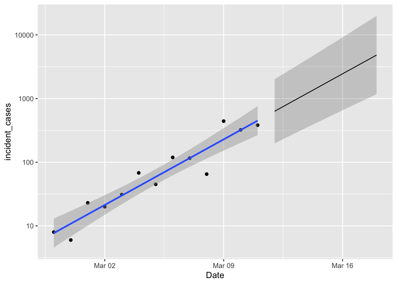
Nice! Well, not really. A week from now we expect between 1000 and 10,000 new cases. So if new case numbers start dipping below that lower limit then we are happy. Happier.
Wow, so much to learn here. I want to get this posted today though before the projections go stale. I’ll try to keep posting new versions – I think each day will be a new post so that I can plot new observations against the previous day (or weeks) predictions. I also know that epidemiologists have some much cooler models, so I want to see how those perform, but again, these words will only be current until the dataset is updated again at ~6pm CDT.
Stay safe all, and wash your hands.
