A colleague wrote:
Hi Drew,
I’m trying to make a really simple (I think) plot in R, but am not sure how to do it. I want to make the attached, where the size of each “bubble” in each grid location depends on a single raw data point (% cover of a type of grass). Can you point me in the right direction?

This is the goal.
I started out thinking “simple plot” meant “base graphics”, given that I think my colleague isn’t in the tidyverse yet. But even trying to think of how I would do it in base graphics, I realized I was thinking about it from a tidy, that is, data driven, perspective. So, tough. I’m going to do it in ggplot2. The first trick is to get the data organized.
library(tidyverse) # yeah I know, loads too much stuff. but so handy!
grasscover <- tribble(
  ~year, ~row, ~col, ~grass,
  2012, 1, 2, 25,
  2012, 2, 1, 5,
  2012, 3, 2, 100,
  2012, 3, 3, 15,
  2012, 4, 1, 15,
  2013, 1, 2, 10,
  2013, 3, 2, 25,
  2013, 4, 1, 25
)
Now the first cut is straightforward.
bubbles <- ggplot(data = grasscover,
                  mapping = aes(x = col, y = row)) +
  geom_point(mapping = aes(size = grass), color = "blue") +
  facet_wrap(~year)
bubbles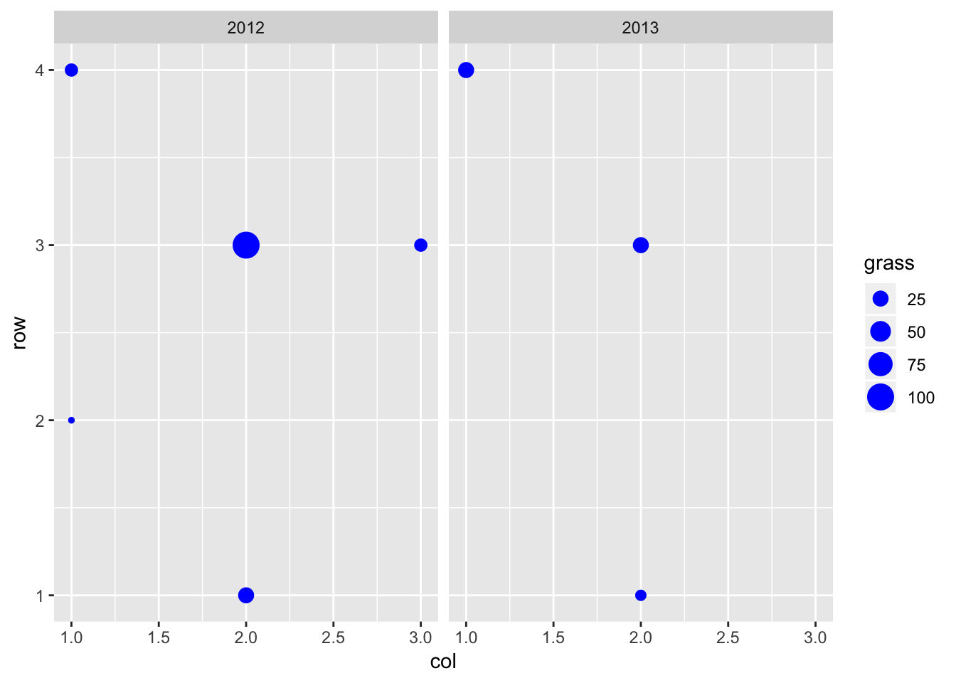
That’s most of the way there, but a few cosmetic things remain. This means delving into ggplot themes.
bubbles + theme_minimal()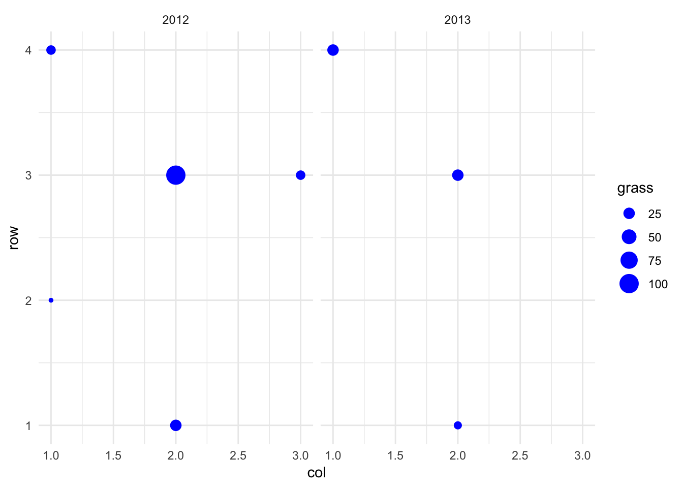
That didn’t do everything I wanted, but it’s an OK starting place. I need to eliminate the axis labels, tick labels, shift the gridlines to inbetween the points, and re-scale the bubbles so the biggest one is ~ 1 in diameter. And put back the plot outline. I’m not ashamed to say that my next move was to use Google. And that led me to my favorite site Cookbook for R.
bubbles + theme_minimal() +
  theme(axis.title = element_blank(),
        axis.text = element_blank(),
        panel.grid.minor = element_blank(),
        panel.grid.major = element_line(size = 1, color="black"),
        panel.spacing = unit(1, "cm"),
        panel.border = element_rect(fill = NA, size = 1),
        legend.position = "bottom") +
  scale_x_continuous(breaks = seq(0.5,3.5,1), limits=c(0.5,3.5), expand = c(0,0)) +
  scale_y_continuous(breaks = seq(0.5, 4.5, 1), limits = c(0.5,4.5), expand = c(0,0)) +
  scale_size_area(max_size = 24, name = "% Grass Cover")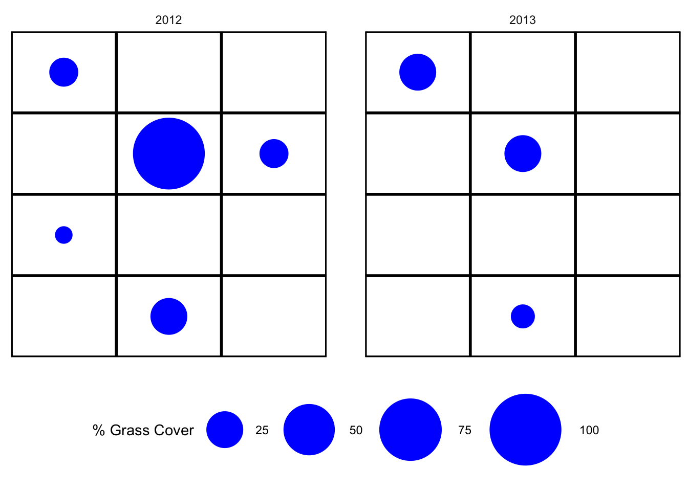
Pretty good! And, as a bonus I get a properly scaled legend. The one non-intuitive bit that involved some head scratching is the argument expand scale_x_continuous(..., expand = c(0,0)). That removed the extra space around the axes – the default c(0.05, 0) expands the plot area by 5% compared to the limits.
