I teach my students to check the assumptions of their models by making various diagnostic plots of residuals. One of the niftiest is the scale-location plot, which is useful for diagnosing changes in variance across the range of the model. If all’s well, a smooth line on that plot is flat. But how flat is flat?
The problem is that real data is never “flat” even if all the assumptions of a model are met. Any smooth line fitted to the residuals will bump up and down a bit. Take a look at the classic choice of example dataset for demonstrating this plot, the cars data.
library("tidyverse")
library("broom")
data("cars")
cars.lm <- lm(dist ~ speed, data = cars)
dist_speed <- ggplot(data = cars,
                     mapping = aes(x = speed, y = dist)) +
  geom_point()
dist_speed + geom_smooth(method = "lm")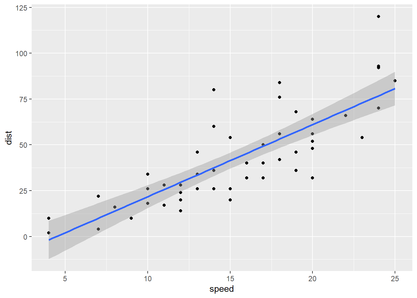
A scale-location plot puts the fitted values of the model (blue line) on the x axis, and the square root of the absolute value of the standardized residuals on the y axis. Say that last three times fast, I dare you.
diag_data <- augment(cars.lm)
diag_data <- mutate(diag_data,
                    sqrabs_resid = sqrt(abs(.std.resid)))
ggplot(data = diag_data,
       mapping = aes(x = .fitted, y = sqrabs_resid)) +
  geom_point() +
  geom_smooth() +
  geom_hline(yintercept = 1) +
  labs(x = "Distance [feet]",
       y = expression(sqrt(abs(epsilon))))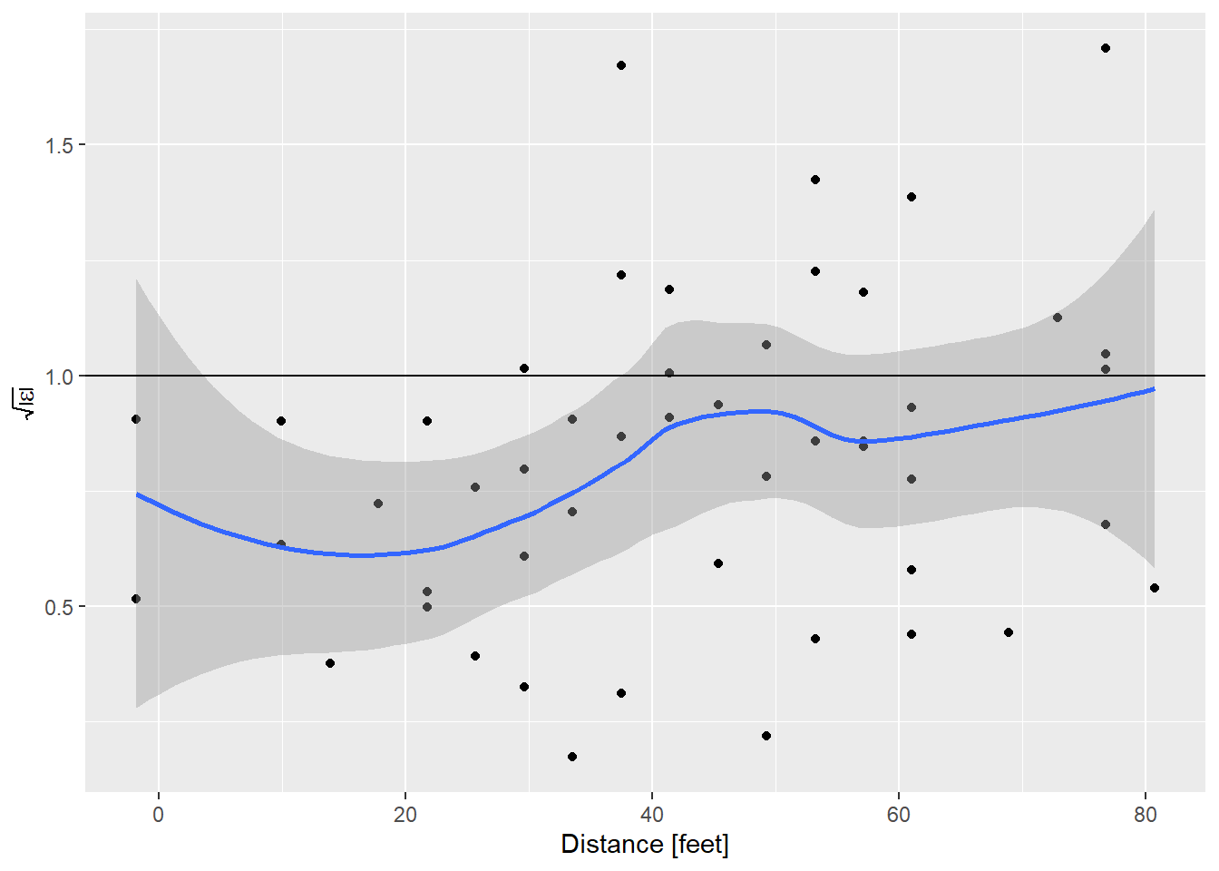
I like using ggplot to make these plots just for the ability to put confidence limits on that smooth line. This helps distinguish what is flat, and what is not really flat. To aid that interpretation, I’ve always told students that the expected value of the square root of the absolute value of the standardized residuals is 1. By that measure, the model of stopping distance vs. speed is showing a bit less variance than expected at low speed, and about right at higher speeds.
All was right with the world until earlier this week a student asked why the expected value was 1. Um. My brain coughed up an answer having to do with the variance of the standardized residuals being 1, but even as I said it I realized I hadn’t a clue. Searching around online I could find lots of people saying the plot should be flat, but no indication of what the value ought to be.
So what should it be? A couple quick simulations showed that it certainly isn’t 1!
# standardized residuals should be N(0,1), get 100
mean(sqrt(abs(rnorm(100)))) # run this as often as you like, it's never 1
## [1] 0.855145Stumped. Then I thought maybe the residuals are t distributed!
mean(sqrt(abs(rt(100, df = 2)))) # try different values of df.## [1] 1.092028So if the degrees of freedom are 2, a t distribution works. But as the degrees of freedom increase the expected value drops fast. This begs the question, why 2 degrees of freedom as the magic number?
This morning I realized I should be able to calculate the expected value using numeric integration. I’m sure someone could do it with pencil and paper but I’m not that smart. The expected value of a random variable is the integral of the value times the probability of getting that value.
\[ \begin{align} E\left(\sqrt{\left|\epsilon\right|}\right) = & \int_{-\infty}^\infty p(\epsilon) \sqrt{\left|\epsilon\right|} \, d\epsilon \\ = & \int_0^\infty 2 \frac{1}{\sqrt{2\pi}}e^{-\frac{1}{2}\epsilon}\, \sqrt{\epsilon} \, d\epsilon \end{align} \]
Now that I write out the equation it doesn’t look as bad because we’re using the standard normal with mean 0 and variance 1. But still.
integrand <- function(x){
  2 * dnorm(x) * sqrt(x)
}

integrate(integrand, 0, Inf)
## 0.822179 with absolute error < 9.5e-05What if we use that value in our scale-location plot?
ggplot(data = diag_data,
       mapping = aes(x = .fitted, y = sqrabs_resid)) +
  geom_point() +
  geom_smooth() +
  geom_hline(yintercept = 0.822179) +
  labs(x = "Speed [mph]",
       y = expression(sqrt(abs(epsilon))))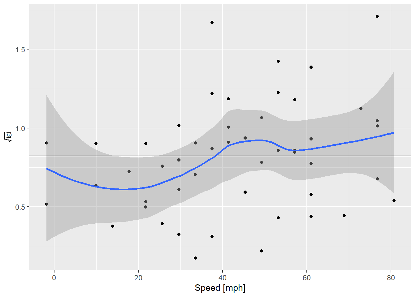
OK! That’s actually really nice. Although the expected value is everywhere inside the confidence envelope on the smooth curve, now that the line is in the middle what we’re seeing looks more like an increase in variance everywhere, instead of an abrupt bump up at ~ 30 mph. Perception is very sensitive to these guides. What does it look like if we simulate some data where the assumptions are perfectly met?
N = nrow(cars)
fakedata1 <- tibble(speed = runif(N, 0, 25),
                    dist = coef(cars.lm)[1] + coef(cars.lm)[2]*speed +
                      rnorm(N, sd = summary(cars.lm)$sigma))
fakemod1 <- lm(dist ~ speed, data = fakedata1)
dist_speed %+% fakedata1 + geom_smooth(method = "lm")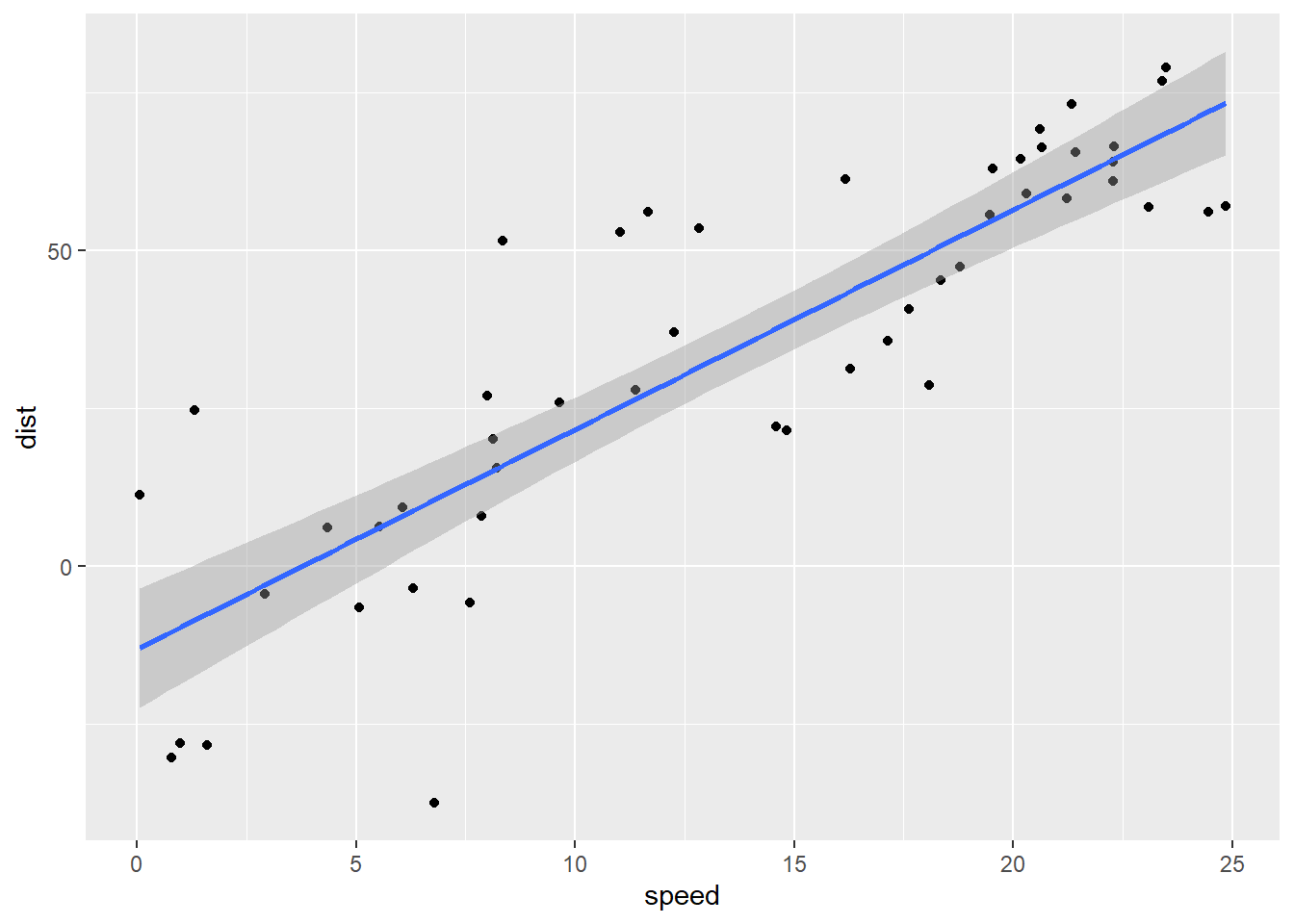
Alright … well, ignoring the obvious problem that cars stopping at low speeds don’t go backwards, how do these residuals look?
diag_fake <- augment(fakemod1)
diag_fake <- mutate(diag_fake,
                    sqrabs_resid = sqrt(abs(.std.resid)))
ggplot(data = diag_fake,
       mapping = aes(x = .fitted, y = sqrabs_resid)) +
  geom_point() +
  geom_smooth() +
  geom_hline(yintercept = 0.822179) +
  labs(x = "Distance [feet]",
       y = expression(sqrt(abs(epsilon))))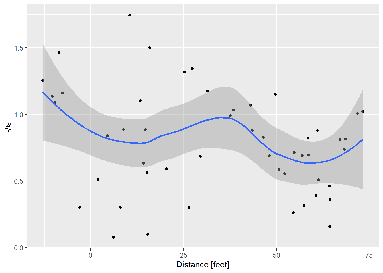
And that is very nice.
One more thing
Cars don’t go backwards. Looking at the intercept of the first fitted model -17.5790949, a car that is stopped should go backwards nearly 18 feet. Clearly the intercept should be zero. But is the relationship between stopping distance and speed linear? To answer that we need to look at a plot of the residuals vs. speed.
ggplot(data = diag_data,
       mapping = aes(x = speed, y = .resid)) +
  geom_point() +
  geom_smooth()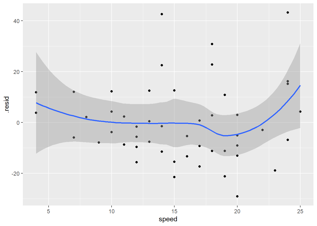
The increase in variance is a little bit apparent in this plot too. The zero line is everywhere inside the confidence envelope, although there is a hint that the residuals are higher at the ends, which would indicate a non-linear relationship. What if we fix the intercept to be zero, as we know it should be based on simple physics!
cars.lm2 <- lm(dist ~ speed + 0, data = cars)
summary(cars.lm2)
##
## Call:
## lm(formula = dist ~ speed + 0, data = cars)
##
## Residuals:
## Min 1Q Median 3Q Max
## -26.183 -12.637 -5.455 4.590 50.181
##
## Coefficients:
## Estimate Std. Error t value Pr(>|t|)
## speed 2.9091 0.1414 20.58 <2e-16 ***
## ---
## Signif. codes: 0 '***' 0.001 '**' 0.01 '*' 0.05 '.' 0.1 ' ' 1
##
## Residual standard error: 16.26 on 49 degrees of freedom
## Multiple R-squared: 0.8963, Adjusted R-squared: 0.8942
## F-statistic: 423.5 on 1 and 49 DF, p-value: < 2.2e-16Wow, that’s interesting, this is one of those rare occasions when reducing the number of parameters increases the fit of the model! What about the diagnostic plots?
diag_data2 <- augment(cars.lm2) %>%
  mutate(sqrabs_resid = sqrt(abs(.std.resid)))
sl_plot <- ggplot(data = diag_data2,
                  mapping = aes(x = .fitted, y = sqrabs_resid)) +
  geom_point() +
  geom_smooth() +
  geom_hline(yintercept = 0.822179) +
  labs(x = "distance [feet]",
       y = expression(sqrt(abs(epsilon))))
nl_plot <- ggplot(data = diag_data2,
                  mapping = aes(x = speed, y = .resid)) +
  geom_point() +
  geom_smooth() +
  geom_hline(yintercept = 0) +
  labs(x = "Speed [mph]",
       y = expression(epsilon))
egg::ggarrange(sl_plot, nl_plot, nrow=1)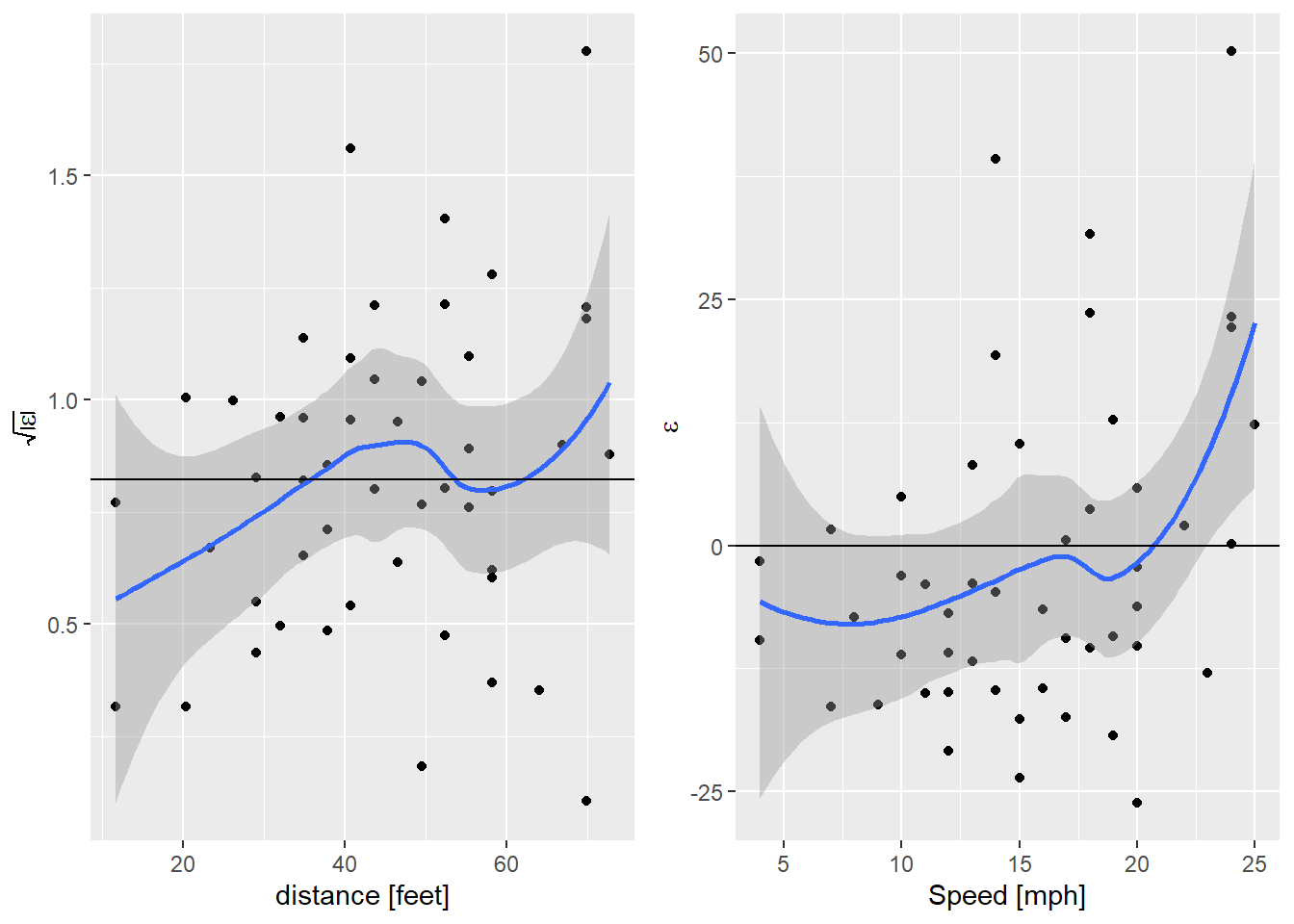
So now the failure of the linearity assumption is clear in the right hand plot. There is a hint of an increase in the variance, but still not significant. What about fitting a quadratic model?
cars.lm3 <- lm(dist ~ I(speed^2) + speed + 0, data = cars)
summary(cars.lm3)
##
## Call:
## lm(formula = dist ~ I(speed^2) + speed + 0, data = cars)
##
## Residuals:
## Min 1Q Median 3Q Max
## -28.836 -9.071 -3.152 4.570 44.986
##
## Coefficients:
## Estimate Std. Error t value Pr(>|t|)
## I(speed^2) 0.09014 0.02939 3.067 0.00355 **
## speed 1.23903 0.55997 2.213 0.03171 *
## ---
## Signif. codes: 0 '***' 0.001 '**' 0.01 '*' 0.05 '.' 0.1 ' ' 1
##
## Residual standard error: 15.02 on 48 degrees of freedom
## Multiple R-squared: 0.9133, Adjusted R-squared: 0.9097
## F-statistic: 252.8 on 2 and 48 DF, p-value: < 2.2e-16That model is slightly better, what do the residuals look like?
diag_data3 <- augment(cars.lm3) %>%
  mutate(sqrabs_resid = sqrt(abs(.std.resid)))
sl_plot <- ggplot(data = diag_data3,
                  mapping = aes(x = .fitted, y = sqrabs_resid)) +
  geom_point() +
  geom_smooth() +
  geom_hline(yintercept = 0.822179) +
  labs(x = "distance [feet]",
       y = expression(sqrt(abs(epsilon))))
nl_plot <- ggplot(data = diag_data3,
                  mapping = aes(x = speed, y = .resid)) +
  geom_point() +
  geom_smooth() +
  geom_hline(yintercept = 0) +
  labs(x = "Speed [mph]",
       y = expression(epsilon))
egg::ggarrange(sl_plot, nl_plot, nrow=1)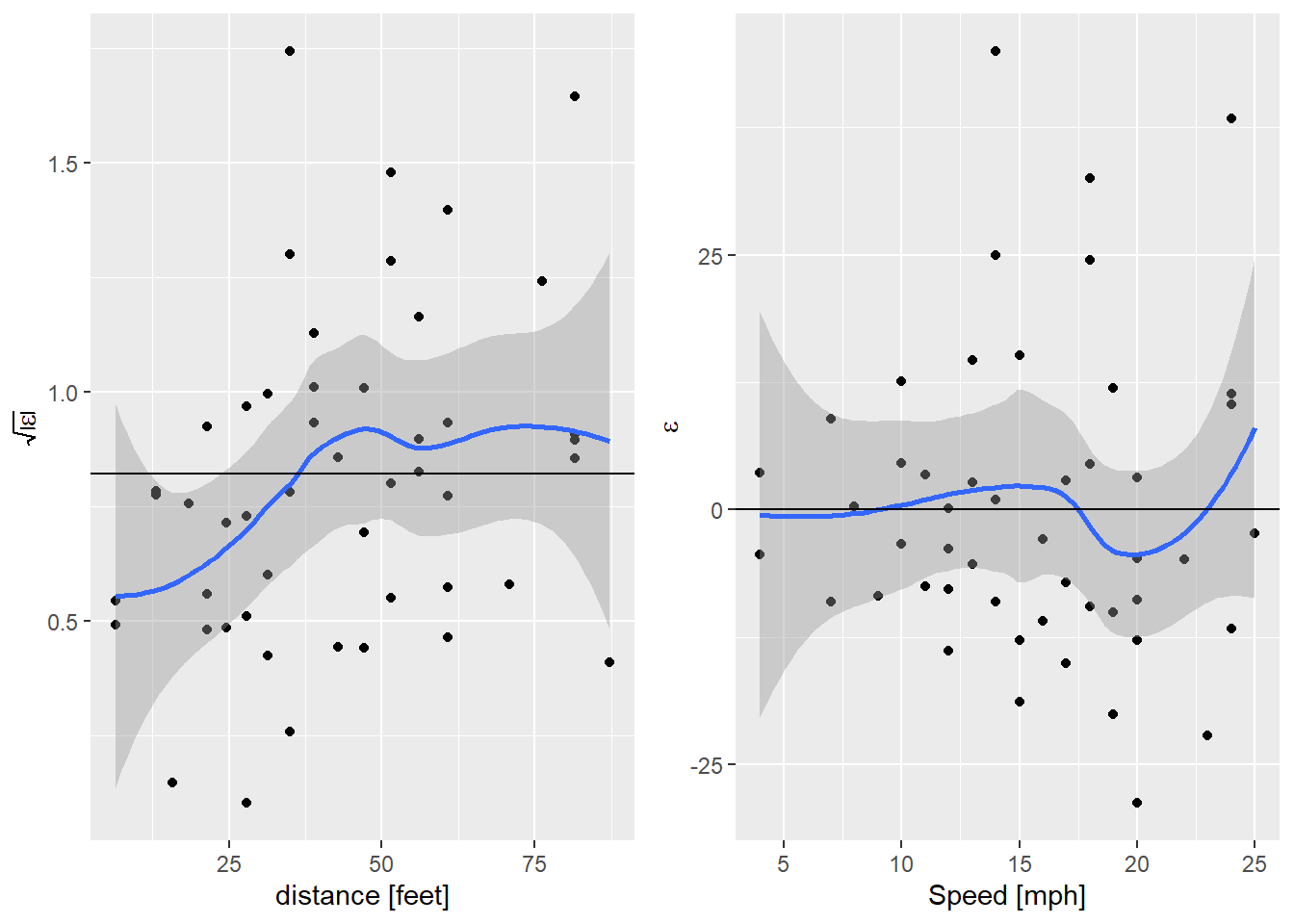
Nice! That’s got the non-linearity solved, but we’re still seeing that
increase in variance. I’m getting a bit carried away now, but I wonder if
that can be solved too. A little internet searching lead me to
package gamlss. This allows me to specify a model for the variance of the model as well as the mean.
library("gamlss")
cars.lss <- gamlss(dist ~ I(speed^2) + speed + 0, ~speed, data = cars)
## GAMLSS-RS iteration 1: Global Deviance = 404.4768
## GAMLSS-RS iteration 2: Global Deviance = 404.4393
## GAMLSS-RS iteration 3: Global Deviance = 404.4393summary(cars.lss)## ******************************************************************
## Family: c("NO", "Normal")
##
## Call:
## gamlss(formula = dist ~ I(speed^2) + speed + 0, sigma.formula = ~speed,
## data = cars)
##
## Fitting method: RS()
##
## ------------------------------------------------------------------
## Mu link function: identity
## Mu Coefficients:
## Estimate Std. Error t value Pr(>|t|)
## I(speed^2) 0.08494 0.02868 2.962 0.00483 **
## speed 1.33137 0.47851 2.782 0.00780 **
## ---
## Signif. codes: 0 '***' 0.001 '**' 0.01 '*' 0.05 '.' 0.1 ' ' 1
##
## ------------------------------------------------------------------
## Sigma link function: log
## Sigma Coefficients:
## Estimate Std. Error t value Pr(>|t|)
## (Intercept) 1.71050 0.37738 4.533 4.14e-05 ***
## speed 0.05941 0.02362 2.515 0.0155 *
## ---
## Signif. codes: 0 '***' 0.001 '**' 0.01 '*' 0.05 '.' 0.1 ' ' 1
##
## ------------------------------------------------------------------
## No. of observations in the fit: 50
## Degrees of Freedom for the fit: 4
## Residual Deg. of Freedom: 46
## at cycle: 3
##
## Global Deviance: 404.4393
## AIC: 412.4393
## SBC: 420.0874
## ******************************************************************And now for the residual plots. broom doesn’t appear to work with these
models.
diag_data4 <- cars %>%
  mutate(.fitted = fitted(cars.lss),
         .resid = resid(cars.lss, what = "mu"),
         .std.resid = resid(cars.lss, what = "z-scores"),
         sqrabs_resid = sqrt(abs(.std.resid)))
sl_plot <- ggplot(data = diag_data4,
                  mapping = aes(x = .fitted, y = sqrabs_resid)) +
  geom_point() +
  geom_smooth() +
  geom_hline(yintercept = 0.822179) +
  labs(x = "distance [feet]",
       y = expression(sqrt(abs(epsilon))))
nl_plot <- ggplot(data = diag_data4,
                  mapping = aes(x = speed, y = .resid)) +
  geom_point() +
  geom_smooth() +
  geom_hline(yintercept = 0) +
  labs(x = "Speed [mph]",
       y = expression(epsilon))
egg::ggarrange(sl_plot, nl_plot, nrow=1)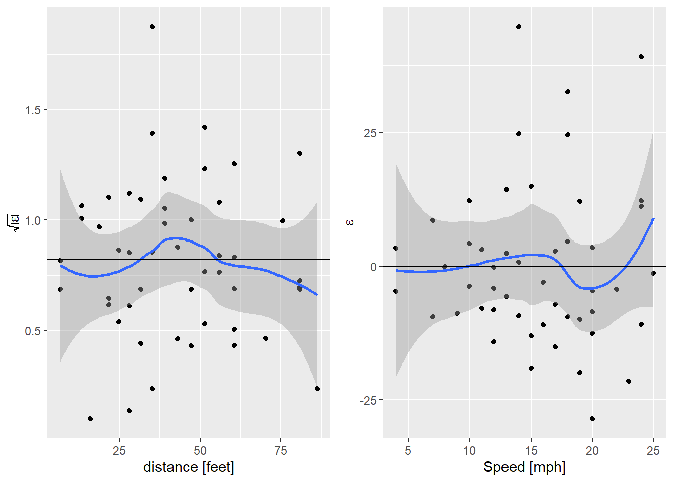
And that’s done it. For comparison, the AIC of the quadratic model with a fixed variance is 416.8016252, so modeling the variance has given us a better model by quite a bit.
I learned quite a bit from this little exercise, more than I expected! A really nice example of how thinking about the underlying process represented by a set of data can dramatically improve a statistical model.
