Yes, the USA has more cases than anyone else in the world, but per capita we have fewer than Australia, Germany, and Canada at the same point in the outbreak. However the rate of increase is higher, as shown by the shorter doubling time, and the slope of the US line being steeper. The USA will catch up to Germany on a per capita basis within the next few days.
I’ve got state level data back and do some exploration with that. I hope the data structure is a bit more stable going forward. The state and province figures are below the Full Data Nerd heading, just skip over the giant code blocks.
The first post in this series was a week and a half ago, in case you’re just joining and want to see the progression.
The bottom line
DISCLAIMER: These unofficial results are not peer reviewed, and should not be treated as such. My goal is to learn about forecasting in real time, how simple models compare with more complex models, and even how to compare different models.1
The figure below is complex, so I’ll highlight some features first. The y axis is now Active and Recovered cases / 100,000 population to make it easier to compare locales. The SOLID LINES are exponential growth models that assume the rate of increase is constant. The dashed lines are predictions from that model. The red rectangle shows the range of ICU bed capacity per 100,000 population in each country. The faded solid lines are the fitted models for the other countries, to facilitate comparisons. The lower limit assumes all reported cases need ICU care (unlikely, but worst case). The top of the rectangle assumes only 5% of cases need ICU support. That best case assumes that the confirmed cases are a good representation of the size of the outbreak (also unlikely, unfortunately). Note that the y axis is logarithmic. The x axis is days since the 100th case in each country.
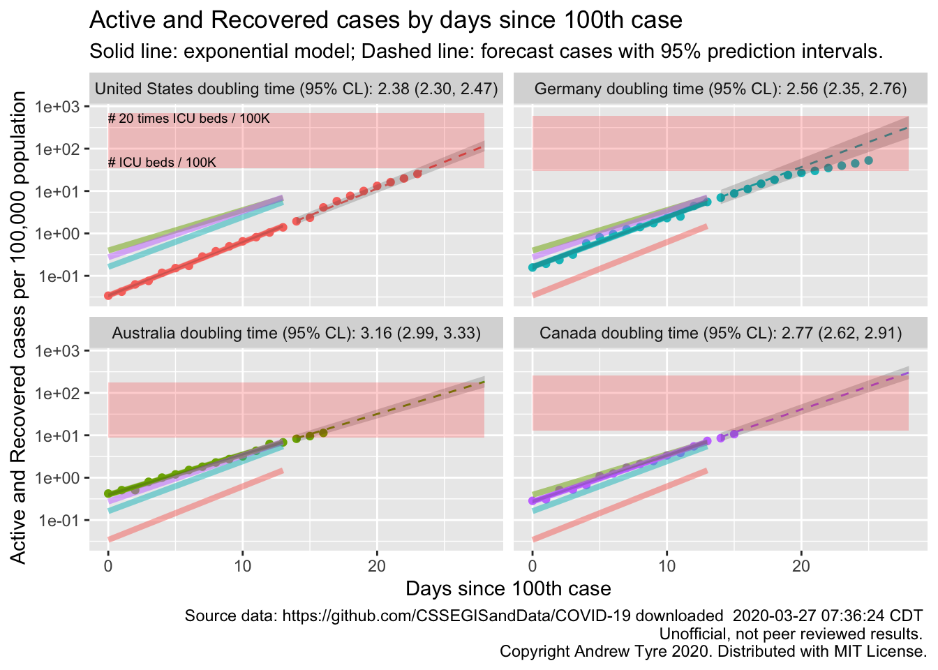
Other than Germany continuing to #flattenthecurve, the most interesting feature of today’s plot is how much lower the prevalence is in the USA. Yes, the USA has more cases than anyone else in the world, but per capita we have fewer than these countries here at the same point in the outbreak. However the rate of increase is higher, as shown by the shorter doubling time, and the slope of the US line being steeper. The USA will catch up to Germany on a per capita basis within the next few days.
I think it’s worth reminding everyone that the red box is a very fuzzy estimate of where ICU beds might be limited. There are 1.5 orders of magnitude in per capita beds between the top and the bottom. I’ve pulled those country level numbers from a wide range of reports and papers published over several years. Many hard hit locales are building more hospital beds, and there is variation from state to state in any case. Nurses, doctors, and the PPE they need to stay safe seem likely to be as or more limiting to care than beds at this stage.
If you’ve read this far, there’s a plot of canadian provinces, and several plots of different american states. Be sure to scroll down past the enormous blocks of code.
Full Data Nerd
Johannes Knops, a colleague from Xi’an Jiaotong Liverpool University, brought this site created by his staff to my attention. They have an R package for the data! Unfortunately it is weirdly tough to install, triggering lots of errors. Seems to work, but once I dug into it I couldn’t tell if the datasets were time series, or just the most recent day. They don’t use a standardized date format either, so I’ve given up on that.
It looks like the county / state level data is available through the daily reports at JHU. I had nearly resigned myself to processing all those reports into a time series myself, when I stumbled on this project that provides an API to formatted versions of the JHU data.
A little manual checking between the API values and the JHU dashboard shows some discrepancies, but could easily be due to differences in the time of updating. I’ll redo the figure from above pulling the data from the API.
library("tidyverse")
library("lubridate")
library("broom")
savefilename <- "data/api_wide_2020-03-27.Rda"
# The following code is commented out and left in place. This isn't particularly good coding
# practice, but I don't want to have to rewrite it every day when I get the updated data.
# I archive the data rather than pull fresh because this data source is very volatile, and
# data that worked with this code yesterday might break today.
# api_confirmed_countries <- read_csv("https://coviddata.github.io/covid-api/v1/countries/cases.csv")
# api_deaths_countries <- read_csv("https://coviddata.github.io/covid-api/v1/countries/deaths.csv")
# api_recoveries_countries <- read_csv("https://coviddata.github.io/covid-api/v1/countries/recoveries.csv")
#
# save(api_confirmed_countries, api_deaths_countries, api_recoveries_countries, file = savefilename)
load(savefilename)

country_data <- read_csv("data/countries_covid-19.csv") %>%
  mutate(start_date = mdy(start_date)) %>%
  rename(Country = country_region,
         Region = province)

only_country_data <- filter(country_data, is.na(Region))
source("R/jhu_helpers.R")

countries <- c("United States", "Australia", "Germany", "Canada")
# Take the wide format data and make it long
all_countries <- list(
  confirmed = other_wide2long(api_confirmed_countries, countries = countries),
  deaths = other_wide2long(api_deaths_countries, countries = countries)
  ) %>%
  bind_rows(.id = "variable") %>%
  pivot_wider(names_from = variable, values_from = cumulative_cases) %>%
  group_by(Country) %>%
  mutate(incident_cases = c(0, diff(confirmed)),
         incident_deaths = c(0, diff(deaths)),
         active_recovered = confirmed - deaths ) %>%
  left_join(only_country_data, by = "Country") %>%
  mutate(icpc = incident_cases / popn / 10,
         arpc = active_recovered / popn / 10,
         date_100 = Date[min(which(confirmed >= 100))],
         day100 = as.numeric(Date - date_100)) %>%
  ungroup() %>%
  mutate(Country = factor(Country, levels = countries),
         group = Country)

# recreate this adding date_100
only_country_data <- all_countries %>%
  group_by(Country) %>%
  summarize(date_100 = first(date_100),
            popn = first(popn),
            icu_beds = first(icu_beds)) %>%
  mutate(max_icu_beds = icu_beds * 20,
         start_day = 0,
         end_day = 28)

all_models <- all_countries %>%
  mutate(log10_ar = log10(active_recovered)) %>%
  filter(day100 <= 13, day100 >= 0) %>%  # model using first 2 weeks of data
  group_by(Country) %>%
  nest() %>%
    mutate(model = map(data, ~lm(log10_ar~day100, data = .)))

all_fit <- all_models %>%
  mutate(fit = map(model, augment, se_fit = TRUE),
         fit = map(fit, select, -c("log10_ar","day100"))) %>%
  select(-model) %>%
  unnest(cols = c("data","fit")) %>%
  mutate(fit = 10^.fitted,
         lcl = 10^(.fitted - .se.fit * qt(0.975, df = 10)),
         ucl = 10^(.fitted + .se.fit * qt(0.975, df = 10)),
    fitpc = fit / popn / 10,
         lclpc = lcl / popn / 10,
         uclpc = ucl / popn / 10) %>%
  ungroup()

#all_predicted <- all_by_province %>%
all_predicted <- cross_df(list(Country = factor(countries, levels = countries),
                               day100 = 14:28)) %>%
  group_by(Country) %>%
  nest() %>%
  left_join(select(all_models, Country, model), by="Country") %>%
  mutate(predicted = map2(model, data, ~augment(.x, newdata = .y, se_fit = TRUE)),
         sigma = map_dbl(model, ~summary(.x)$sigma)) %>%
  select(-c(model,data)) %>%
  unnest(cols = predicted) %>%
  ungroup() %>%
  left_join(only_country_data, by = "Country") %>%
  mutate(
    Date = date_100 + day100,
    Country = factor(Country, levels = countries), # use factor to modify plot order
    fit = 10^.fitted,
    pred_var = sigma^2 + .se.fit^2,
    lpl = 10^(.fitted - sqrt(pred_var)*qt(0.975, df = 10)),
    upl = 10^(.fitted + sqrt(pred_var)*qt(0.975, df = 10)),
    fitpc = fit / popn / 10,
         lplpc = lpl / popn / 10,
         uplpc = upl / popn / 10)

doubling_times <- all_models %>%
  mutate(estimates = map(model, tidy)) %>%
  unnest(cols = estimates) %>%  # produces 2 rows per country, (intercept) and day100
  filter(term == "day100") %>%
  select(Country, estimate, std.error) %>%
  mutate(var_b = std.error^2,
         t = log10(2) / estimate,
         var_t = var_b * log10(2)^2 / estimate^4,
         lcl_t = t - sqrt(var_t)*qt(0.975, 12),
         ucl_t = t + sqrt(var_t)*qt(0.975, 12),
         label = sprintf("%.2f (%.2f, %.2f)", t, lcl_t, ucl_t))

facet_labels <- doubling_times %>%
  mutate(label = paste0(Country," doubling time (95% CL): ", label)) %>%
  pull(label)
names(facet_labels) <- pull(doubling_times, Country)
ggplot(data = filter(all_countries, day100 >= 0),
                    mapping = aes(x = day100)) +
  geom_point(mapping = aes(y = arpc, color = Country)) +
  facet_wrap(~Country, dir="v", labeller = labeller(Country = facet_labels)) +
  scale_y_log10() +
  theme(legend.position = "none",
        legend.title = element_blank()) +
  geom_line(data = all_fit,
            mapping = aes(y = fitpc, color = Country),
            size = 1.25) +
      geom_line(data = select(all_fit, -Country),
            mapping = aes(y = fitpc, color = group), alpha = 0.5, size = 1.5) +
  geom_ribbon(data = all_fit,
            mapping = aes(ymin = lclpc, ymax = uclpc),
            alpha = 0.2) +
  geom_line(data = all_predicted,
            mapping = aes(y = fitpc, color = Country),
            linetype = 2) +
 geom_ribbon(data = all_predicted,
           mapping = aes(ymin = lplpc, ymax = uplpc),
           alpha = 0.2)  +
 geom_rect(data = only_country_data,
             mapping = aes(x = start_day, xmin = start_day, xmax = end_day, ymin = icu_beds, ymax = icu_beds * 20),
           fill = "red", alpha = 0.2) +
labs(y = "Active and Recovered cases per 100,000 population", title = "Active and Recovered cases by days since 100th case",
     x = "Days since 100th case",
       subtitle = "Solid line: exponential model; Dashed line: forecast cases with 95% prediction intervals.",
       caption = paste("Source data: https://github.com/CSSEGISandData/COVID-19 downloaded ",
                       format(file.mtime(savefilename), usetz = TRUE),
                       "\n Unofficial, not peer reviewed results.",
                       "\n Copyright Andrew Tyre 2020. Distributed with MIT License."))   +
  geom_text(data = slice(only_country_data, 1),
            mapping = aes(y = 1.4*icu_beds),
            x = 0, #ymd("2020-03-01"),
           label = "# ICU beds / 100K",
           size = 2.5, hjust = "left") +
    geom_text(data = slice(only_country_data, 1),
            mapping = aes(y = 20*icu_beds),
            x = 0, #ymd("2020-03-01"),
           label = "# 20 times ICU beds / 100K",
           size = 2.5, hjust = "left", vjust = "top")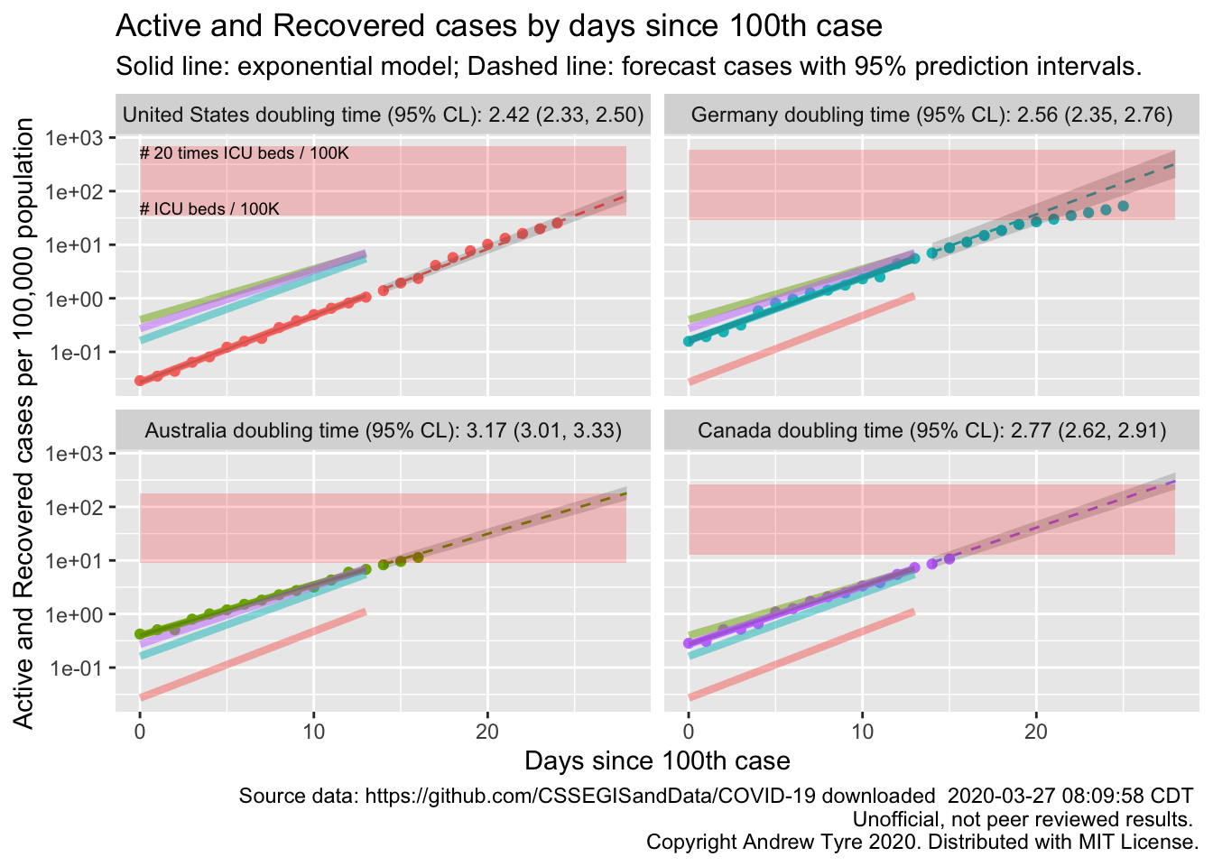
So, not identical, but close. Also the API has the recovered data back – there are some bugs in it, days with missing data etc, but I will resume using it to calculate active cases because lots of people are starting to recover.
Canada by Province
Now that I have an automated way to calculate a start date, lets get serious. What are the doubling times for each province in Canada with more than 20 cumulative cases and at least 5 days of data?
savefilename <- "data/api_regions_2020-03-27.Rda"
# The following code is commented out and left in place. This isn't particularly good coding
# practice, but I don't want to have to rewrite it every day when I get the updated data.
# I archive the data rather than pull fresh because this data source is very volatile, and
# data that worked with this code yesterday might break today.
# api_confirmed_regions <- read_csv("https://coviddata.github.io/covid-api/v1/regions/cases.csv")
# api_deaths_regions <- read_csv("https://coviddata.github.io/covid-api/v1/regions/deaths.csv")
# api_recoveries_regions <- read_csv("https://coviddata.github.io/covid-api/v1/regions/recoveries.csv")
#
# save(api_confirmed_regions, api_deaths_regions, api_recoveries_regions, file = savefilename)
load(savefilename)
canada_by_region <- list(
  confirmed = other_wide2long(api_confirmed_regions, countries = "Canada"),
  deaths = other_wide2long(api_deaths_regions, countries = "Canada"),
  # recovered data is a mess lots of missing values
  recoveries = other_wide2long(api_recoveries_regions, countries = "Canada")
  ) %>%
  bind_rows(.id = "variable") %>%
  pivot_wider(names_from = variable, values_from = cumulative_cases) %>%
  group_by(Region) %>%
  mutate(incident_cases = c(0, diff(confirmed)),
         incident_deaths = c(0, diff(deaths)),
         active = confirmed - deaths - recoveries) %>%
  left_join(country_data, by = c("Country", "Region")) %>%
  mutate(icpc = incident_cases / popn / 10,
         arpc = active / popn / 10,
         group = Region,
         date_20 = Date[min(which(confirmed >= 20))],
         day20 = as.numeric(Date - date_20),
         samplesize = max(day20)) %>%
  ungroup() %>%
  filter(!is.na(date_20),
         samplesize > 4) # remove regions with less than 20 cases total or fewer than 5 days.

# recreate this adding date_100
canada_data <- canada_by_region %>%
  group_by(Region) %>%
  summarize(date_20 = first(date_20),
            popn = first(popn),
            icu_beds = first(icu_beds),
            maxday20 = max(day20)) %>%
  mutate(max_icu_beds = icu_beds * 20,
         start_day = 0,
         end_day = 28)

all_models <- canada_by_region %>%
  mutate(log10_ar = log10(active)) %>%
  filter(day20 <= 13, day20 >= 0) %>%  # model using first 2 weeks of data
  group_by(Region) %>%
  nest() %>%
    mutate(model = map(data, ~lm(log10_ar~day20, data = .)))

all_fit <- all_models %>%
  mutate(fit = map(model, augment, se_fit = TRUE),
         fit = map(fit, select, -c("log10_ar","day20"))) %>%
  select(-model) %>%
  unnest(cols = c("data","fit")) %>%
  mutate(fit = 10^.fitted,
         lcl = 10^(.fitted - .se.fit * qt(0.975, df = 10)),
         ucl = 10^(.fitted + .se.fit * qt(0.975, df = 10)),
    fitpc = fit / popn / 10,
         lclpc = lcl / popn / 10,
         uclpc = ucl / popn / 10)

#all_predicted <- all_by_province %>%
all_predicted <- cross_df(list(Region = pull(canada_data, Region),
                               day20 = 5:28)) %>%
  group_by(Region) %>%
  nest() %>%
  left_join(select(all_models, Region, model), by="Region") %>%
  mutate(predicted = map2(model, data, ~augment(.x, newdata = .y, se_fit = TRUE)),
         sigma = map_dbl(model, ~summary(.x)$sigma)) %>%
  select(-c(model,data)) %>%
  unnest(cols = predicted) %>%
  ungroup() %>%
  left_join(canada_data, by = "Region") %>%
  filter(day20 > pmin(maxday20+1, 13)) %>%
  mutate(
    Date = date_20 + day20,
    Region = Region, # use factor to modify plot order
    fit = 10^.fitted,
    pred_var = sigma^2 + .se.fit^2,
    lpl = 10^(.fitted - sqrt(pred_var)*qt(0.975, df = 10)),
    upl = 10^(.fitted + sqrt(pred_var)*qt(0.975, df = 10)),
    fitpc = fit / popn / 10,
         lplpc = lpl / popn / 10,
         uplpc = upl / popn / 10)

doubling_times <- all_models %>%
  mutate(estimates = map(model, tidy)) %>%
  unnest(cols = estimates) %>%  # produces 2 rows per country, (intercept) and day100
  filter(term == "day20") %>%
  select(Region, estimate, std.error) %>%
  mutate(var_b = std.error^2,
         t = log10(2) / estimate,
         var_t = var_b * log10(2)^2 / estimate^4,
         lcl_t = t - sqrt(var_t)*qt(0.975, 12),
         ucl_t = t + sqrt(var_t)*qt(0.975, 12),
         label = sprintf("%.2f (%.2f, %.2f)", t, lcl_t, ucl_t))

facet_labels <- doubling_times %>%
  mutate(label = paste0(Region," doubling time (95% CL): ", label)) %>%
  pull(label)
names(facet_labels) <- pull(doubling_times, Region)
ggplot(data = filter(canada_by_region, day20 >= 0),
                    mapping = aes(x = day20)) +
  geom_point(mapping = aes(y = arpc, color = Region)) +
  facet_wrap(~Region, dir="v", labeller = labeller(Region = facet_labels)) +
  scale_y_log10() +
  theme(legend.position = "none",
        legend.title = element_blank()) +
  geom_line(data = all_fit,
            mapping = aes(y = fitpc, color = Region),
            size = 1.25) +
  geom_ribbon(data = all_fit,
            mapping = aes(ymin = lclpc, ymax = uclpc),
            alpha = 0.2) +
  geom_line(data = all_predicted,
            mapping = aes(y = fitpc, color = Region),
            linetype = 2) +
 geom_ribbon(data = all_predicted,
           mapping = aes(ymin = lplpc, ymax = uplpc),
           alpha = 0.2)  +
 geom_rect(data = canada_data,
             mapping = aes(x = start_day, xmin = start_day, xmax = end_day, ymin = icu_beds, ymax = icu_beds * 20),
           fill = "red", alpha = 0.2) +
labs(y = "Active cases per 100,000 population", title = "Active cases by days since 20th case",
     x = "Days since 20th case",
       subtitle = "Solid line: exponential model; Dashed line: forecast cases with 95% prediction intervals.",
       caption = paste("Source data: https://github.com/CSSEGISandData/COVID-19 downloaded ",
                       format(file.mtime(savefilename), usetz = TRUE),
                       "\n Unofficial, not peer reviewed results.",
                       "\n Copyright Andrew Tyre 2020. Distributed with MIT License."))   +
  geom_text(data = slice(canada_data, 1),
            mapping = aes(y = icu_beds),
            x = 0, #ymd("2020-03-01"),
           label = "# ICU beds / 100K",
           size = 2.5, hjust = "left", vjust = "bottom") +
    geom_text(data = slice(canada_data, 1),
            mapping = aes(y = 20*icu_beds),
            x = 0, #ymd("2020-03-01"),
           label = "# 20 times ICU beds / 100K",
           size = 2.5, hjust = "left", vjust = "top")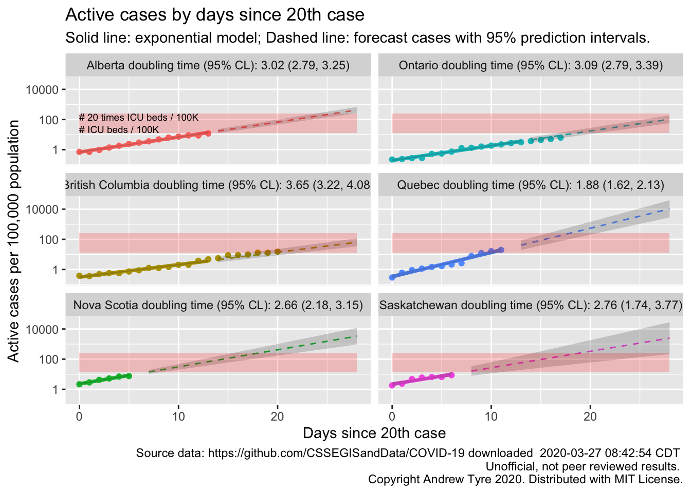
Quebec appears to be in the worst shape with the shortest doubling time in active cases and the highest prevalence. British Columbia and Ontario have the longest running outbreaks, and the trajectories are still consistent with exponential growth.
Back to America
usa_by_region <- list(
  confirmed = us_wide2long(api_confirmed_regions, "United States"),
  deaths = us_wide2long(api_deaths_regions, "United States"),
  # recovered data is a mess lots of missing values
  recoveries = us_wide2long(api_recoveries_regions, "United States")
  ) %>%
  bind_rows(.id = "variable") %>%
  pivot_wider(names_from = variable, values_from = cumulative_cases) %>%
  group_by(Region) %>%
  mutate(incident_cases = c(0, diff(confirmed)),
         incident_deaths = c(0, diff(deaths)),
         active = confirmed - deaths - recoveries) %>%
  left_join(country_data, by = c("Country", "Region")) %>%
  mutate(icpc = incident_cases / popn / 10,
         arpc = active / popn / 10,
         group = Region,
         date_20 = Date[min(which(confirmed >= 20))],
         day20 = as.numeric(Date - date_20),
         samplesize = max(day20)) %>%
  ungroup() %>%
  filter(!is.na(date_20),
         samplesize > 4) # remove regions with less than 20 cases total or fewer than 5 days.

# recreate this adding date_100
usa_data <- usa_by_region %>%
  group_by(Region) %>%
  summarize(date_20 = first(date_20),
            popn = first(popn),
            icu_beds = first(icu_beds),
            maxday20 = max(day20)) %>%
  mutate(max_icu_beds = icu_beds * 20,
         start_day = 0,
         end_day = 28)

all_models <- usa_by_region %>%
  mutate(log10_ar = log10(active)) %>%
  filter(day20 <= 13, day20 >= 0) %>%  # model using first 2 weeks of data
  group_by(Region) %>%
  nest() %>%
    mutate(model = map(data, ~lm(log10_ar~day20, data = .)))

all_fit <- all_models %>%
  mutate(fit = map(model, augment, se_fit = TRUE),
         fit = map(fit, select, -c("log10_ar","day20"))) %>%
  select(-model) %>%
  unnest(cols = c("data","fit")) %>%
  mutate(fit = 10^.fitted,
         lcl = 10^(.fitted - .se.fit * qt(0.975, df = 10)),
         ucl = 10^(.fitted + .se.fit * qt(0.975, df = 10)),
    fitpc = fit / popn / 10,
         lclpc = lcl / popn / 10,
         uclpc = ucl / popn / 10) %>%
  ungroup()

#all_predicted <- all_by_province %>%
all_predicted <- cross_df(list(Region = pull(usa_data, Region),
                               day20 = 5:28)) %>%
  group_by(Region) %>%
  nest() %>%
  left_join(select(all_models, Region, model), by="Region") %>%
  mutate(predicted = map2(model, data, ~augment(.x, newdata = .y, se_fit = TRUE)),
         sigma = map_dbl(model, ~summary(.x)$sigma)) %>%
  select(-c(model,data)) %>%
  unnest(cols = predicted) %>%
  ungroup() %>%
  left_join(usa_data, by = "Region") %>%
  filter(day20 > pmin(maxday20+1, 13)) %>%
  mutate(
    Date = date_20 + day20,
    Region = Region, # use factor to modify plot order
    fit = 10^.fitted,
    pred_var = sigma^2 + .se.fit^2,
    lpl = 10^(.fitted - sqrt(pred_var)*qt(0.975, df = 10)),
    upl = 10^(.fitted + sqrt(pred_var)*qt(0.975, df = 10)),
    fitpc = fit / popn / 10,
         lplpc = lpl / popn / 10,
         uplpc = upl / popn / 10)

doubling_times <- all_models %>%
  mutate(estimates = map(model, tidy)) %>%
  unnest(cols = estimates) %>%  # produces 2 rows per country, (intercept) and day100
  ungroup() %>%
  filter(term == "day20") %>%
  select(Region, estimate, std.error) %>%
  mutate(var_b = std.error^2,
         t = log10(2) / estimate,
         var_t = var_b * log10(2)^2 / estimate^4,
         lcl_t = t - sqrt(var_t)*qt(0.975, 12),
         ucl_t = t + sqrt(var_t)*qt(0.975, 12),
         label = sprintf("%.2f (%.2f, %.2f)", t, lcl_t, ucl_t),
         Region = fct_reorder(Region, t, .desc = TRUE))

ggplot(data = doubling_times,
       mapping = aes(x = Region))+
  geom_point(mapping = aes(y = t))+
  geom_errorbar(mapping = aes(ymin = lcl_t, ymax = ucl_t),
                width = 0) +
  labs(y = "Doubling Time [days 95%CI]",
       title = "Doubling time of active cases",
       subtitle = "Estimated from first 14 days since 20th case reported.") +
  theme_classic() +
  theme(axis.text.x  = element_text(angle=90, vjust=0.5, size=9),
        axis.title.x = element_blank())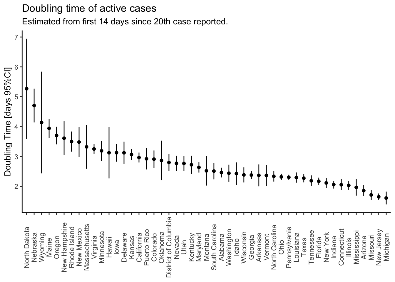
There are too many states to show the trajectories effectively, so I just plot the doubling times from longest (best) to shortest (worst). States with larger confidence limits are states with less than 14 days of data since reporting their 20th case. All states in that plot (49) have statistically significant exponential growth during the first days of the epidemic. I’m going to pick out the trajectories of the states on the far left and far right.
states_2_plot <- c("North Dakota", "Nebraska", "Wyoming", "Missouri", "New Jersey", "Michigan")
state_data <- filter(usa_data, Region %in% states_2_plot) %>%
    mutate(Region = factor(Region, levels = states_2_plot)) # control plot order
point_data <- filter(usa_by_region, day20>=0,
                     Region %in% states_2_plot) %>%
  mutate(Region = factor(Region, levels = states_2_plot)) # control plot order
fit_data <- filter(all_fit, Region %in% states_2_plot) %>%
  mutate(Region = factor(Region, levels = states_2_plot)) # control plot order
predict_data <- filter(all_predicted, Region %in% states_2_plot) %>%
  mutate(Region = factor(Region, levels = states_2_plot)) # control plot order
doubling_t_data <- filter(doubling_times, Region %in% states_2_plot) %>%
  mutate(Region = factor(Region, levels = states_2_plot)) # control plot order

facet_labels <- doubling_t_data %>%
  arrange(desc(t)) %>%
  mutate(label = paste0(Region," doubling time (95% CL): ", label)) %>%
  pull(label)
names(facet_labels) <- doubling_t_data %>%
  arrange(desc(t)) %>%
  pull(Region)

ggplot(data = point_data,
                    mapping = aes(x = day20)) +
  geom_point(mapping = aes(y = arpc, color = Region)) +
  facet_wrap(~Region, dir="v", labeller = labeller(Region = facet_labels)) +
  scale_y_log10() +
  theme(legend.position = "none",
        legend.title = element_blank()) +
  geom_line(data = fit_data,
            mapping = aes(y = fitpc, color = Region),
            size = 1.25) +
  geom_ribbon(data = fit_data,
            mapping = aes(ymin = lclpc, ymax = uclpc),
            alpha = 0.2) +
  geom_line(data = predict_data,
            mapping = aes(y = fitpc, color = Region),
            linetype = 2) +
 geom_ribbon(data = predict_data,
           mapping = aes(ymin = lplpc, ymax = uplpc),
           alpha = 0.2)  +
 geom_rect(data = state_data,
             mapping = aes(x = start_day, xmin = start_day, xmax = end_day, ymin = icu_beds, ymax = icu_beds * 20),
           fill = "red", alpha = 0.2) +
labs(y = "Active cases per 100,000 population", title = "Active cases by days since 20th case",
     x = "Days since 20th case",
       subtitle = "Solid line: exponential model; Dashed line: forecast cases with 95% prediction intervals.",
       caption = paste("Source data: https://github.com/CSSEGISandData/COVID-19 downloaded ",
                       format(file.mtime(savefilename), usetz = TRUE),
                       "\n Unofficial, not peer reviewed results.",
                       "\n Copyright Andrew Tyre 2020. Distributed with MIT License."))   +
  geom_text(data = slice(state_data, 5),
            mapping = aes(y = icu_beds),
            x = 0, #ymd("2020-03-01"),
           label = "# ICU beds / 100K",
           size = 2.5, hjust = "left", vjust = "bottom") +
    geom_text(data = slice(state_data, 5),
            mapping = aes(y = 20*icu_beds),
            x = 0, #ymd("2020-03-01"),
           label = "# 20 times ICU beds / 100K",
           size = 2.5, hjust = "left", vjust = "top")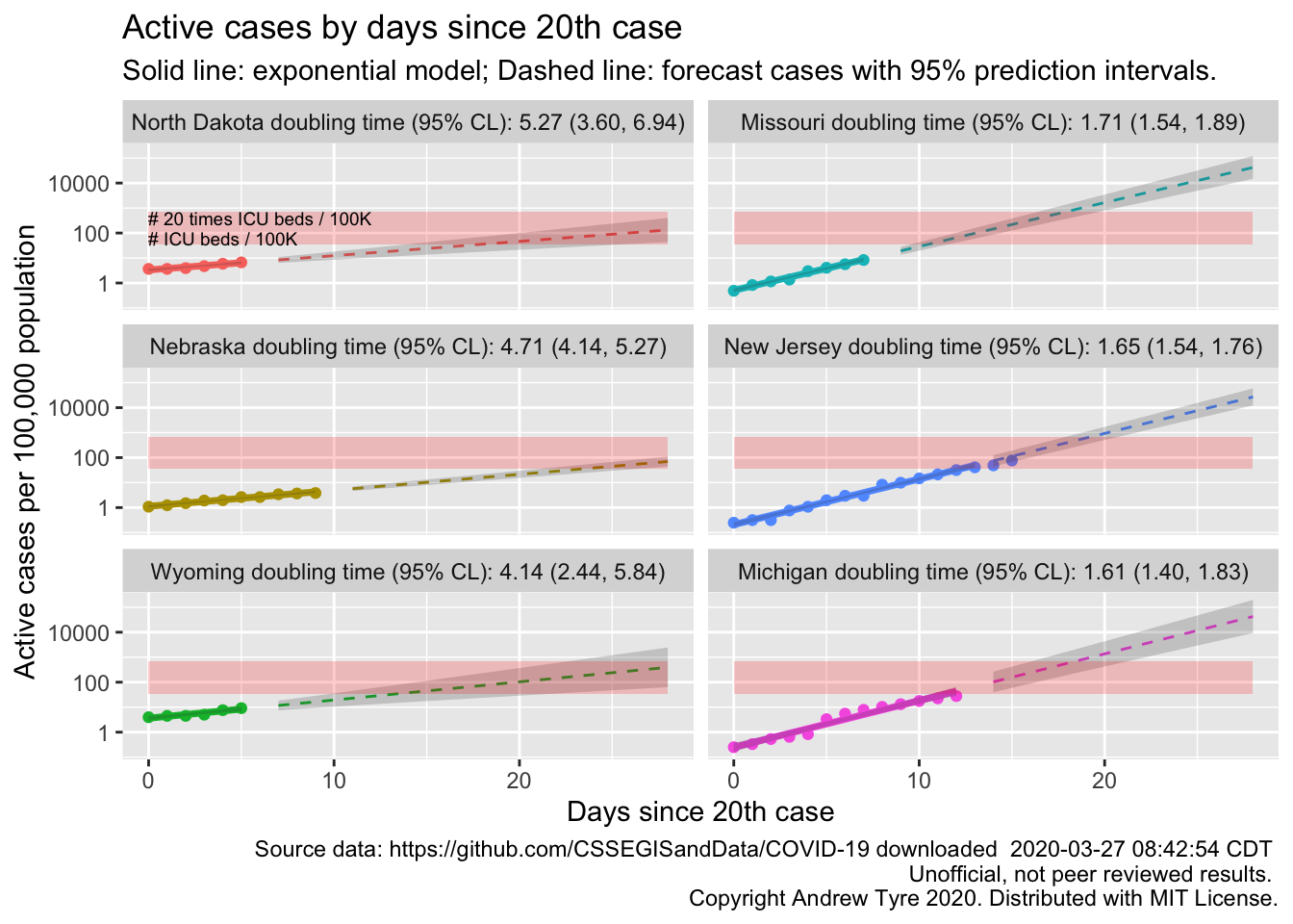
Looks like Michigan is the next state to be in trouble? Actually, other states might have higher prevalence but longer doubling times. Which four states have the highest per capita prevalence?
usa_by_region %>%
  group_by(Region) %>%
  summarize(highest_prevalence = max(arpc)) %>%
  ungroup() %>%
  arrange(desc(highest_prevalence)) %>%
  slice(1:4)
## # A tibble: 4 x 2
## Region highest_prevalence
## <chr> <dbl>
## 1 New York 193.
## 2 New Jersey 76.5
## 3 Louisiana 47.8
## 4 Washington 40.1That’s cases per 100,000 population, so even New York is only just 0.2%. So just by the numbers your chance of being sick is 2 out of 1000 right now in the worst hit place in the country. Of course it isn’t evenly spread as that calculation assumes.
states_2_plot <- c("New York", "New Jersey", "Louisiana", "Washington")
state_data <- filter(usa_data, Region %in% states_2_plot) %>%
    mutate(Region = factor(Region, levels = states_2_plot)) # control plot order
point_data <- filter(usa_by_region, day20>=0,
                     Region %in% states_2_plot) %>%
  mutate(Region = factor(Region, levels = states_2_plot)) # control plot order
fit_data <- filter(all_fit, Region %in% states_2_plot) %>%
  mutate(Region = factor(Region, levels = states_2_plot)) # control plot order
predict_data <- filter(all_predicted, Region %in% states_2_plot) %>%
  mutate(Region = factor(Region, levels = states_2_plot)) # control plot order
doubling_t_data <- filter(doubling_times, Region %in% states_2_plot) %>%
  mutate(Region = factor(Region, levels = states_2_plot)) # control plot order

facet_labels <- doubling_t_data %>%
  arrange(desc(t)) %>%
  mutate(label = paste0(Region," doubling time (95% CL): ", label)) %>%
  pull(label)
names(facet_labels) <- doubling_t_data %>%
  arrange(desc(t)) %>%
  pull(Region)

ggplot(data = point_data,
                    mapping = aes(x = day20)) +
  geom_point(mapping = aes(y = arpc, color = Region)) +
  facet_wrap(~Region, dir="v", labeller = labeller(Region = facet_labels)) +
  scale_y_log10() +
  theme(legend.position = "none",
        legend.title = element_blank()) +
  geom_line(data = fit_data,
            mapping = aes(y = fitpc, color = Region),
            size = 1.25) +
  geom_ribbon(data = fit_data,
            mapping = aes(ymin = lclpc, ymax = uclpc),
            alpha = 0.2) +
  geom_line(data = predict_data,
            mapping = aes(y = fitpc, color = Region),
            linetype = 2) +
 geom_ribbon(data = predict_data,
           mapping = aes(ymin = lplpc, ymax = uplpc),
           alpha = 0.2)  +
 geom_rect(data = state_data,
             mapping = aes(x = start_day, xmin = start_day, xmax = end_day, ymin = icu_beds, ymax = icu_beds * 20),
           fill = "red", alpha = 0.2) +
labs(y = "Active cases per 100,000 population", title = "Active cases by days since 20th case",
     x = "Days since 20th case",
       subtitle = "Solid line: exponential model; Dashed line: forecast cases with 95% prediction intervals.",
       caption = paste("Source data: https://github.com/CSSEGISandData/COVID-19 downloaded ",
                       format(file.mtime(savefilename), usetz = TRUE),
                       "\n Unofficial, not peer reviewed results.",
                       "\n Copyright Andrew Tyre 2020. Distributed with MIT License."))   +
  geom_text(data = slice(state_data, 5),
            mapping = aes(y = icu_beds),
            x = 0, #ymd("2020-03-01"),
           label = "# ICU beds / 100K",
           size = 2.5, hjust = "left", vjust = "bottom") +
    geom_text(data = slice(state_data, 5),
            mapping = aes(y = 20*icu_beds),
            x = 0, #ymd("2020-03-01"),
           label = "# 20 times ICU beds / 100K",
           size = 2.5, hjust = "left", vjust = "top")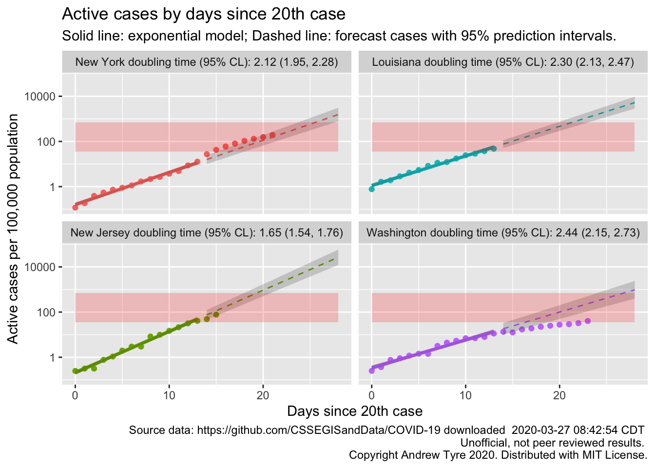
OK, so that’s interesting. Washington now clearly showing that they are #flatteningthecurve. It’s clear why New York is hurting so bad; cases grew faster than the initial exponential rate, and they are now deep into the red zone. Louisiana and New Jersey are heading that way too.
Finally, lets make a few specific states for people who are watching from home.
states_2_plot <- c("Colorado", "Virginia", "Minnesota")
state_data <- filter(usa_data, Region %in% states_2_plot) %>%
    mutate(Region = factor(Region, levels = states_2_plot)) # control plot order
point_data <- filter(usa_by_region, day20>=0,
                     Region %in% states_2_plot) %>%
  mutate(Region = factor(Region, levels = states_2_plot)) # control plot order
fit_data <- filter(all_fit, Region %in% states_2_plot) %>%
  mutate(Region = factor(Region, levels = states_2_plot)) # control plot order
predict_data <- filter(all_predicted, Region %in% states_2_plot) %>%
  mutate(Region = factor(Region, levels = states_2_plot)) # control plot order
doubling_t_data <- filter(doubling_times, Region %in% states_2_plot) %>%
  mutate(Region = factor(Region, levels = states_2_plot)) # control plot order

facet_labels <- doubling_t_data %>%
  arrange(desc(t)) %>%
  mutate(label = paste0(Region," : ", label)) %>%
  pull(label)
names(facet_labels) <- doubling_t_data %>%
  arrange(desc(t)) %>%
  pull(Region)

ggplot(data = point_data,
                    mapping = aes(x = day20)) +
  geom_point(mapping = aes(y = arpc, color = Region)) +
  facet_wrap(~Region, dir="h", labeller = labeller(Region = facet_labels)) +
  scale_y_log10() +
  theme(legend.position = "none",
        legend.title = element_blank()) +
  geom_line(data = fit_data,
            mapping = aes(y = fitpc, color = Region),
            size = 1.25) +
  geom_ribbon(data = fit_data,
            mapping = aes(ymin = lclpc, ymax = uclpc),
            alpha = 0.2) +
  geom_line(data = predict_data,
            mapping = aes(y = fitpc, color = Region),
            linetype = 2) +
 geom_ribbon(data = predict_data,
           mapping = aes(ymin = lplpc, ymax = uplpc),
           alpha = 0.2)  +
 geom_rect(data = state_data,
             mapping = aes(x = start_day, xmin = start_day, xmax = end_day, ymin = icu_beds, ymax = icu_beds * 20),
           fill = "red", alpha = 0.2) +
labs(y = "Active cases per 100,000 population", title = "Active cases by days since 20th case",
     x = "Days since 20th case",
       subtitle = "Solid line: exponential model; Dashed line: forecast cases with 95% prediction intervals.",
       caption = paste("Source data: https://github.com/CSSEGISandData/COVID-19 downloaded ",
                       format(file.mtime(savefilename), usetz = TRUE),
                       "\n Unofficial, not peer reviewed results.",
                       "\n Copyright Andrew Tyre 2020. Distributed with MIT License."))   +
  geom_text(data = slice(state_data, 5),
            mapping = aes(y = icu_beds),
            x = 0, #ymd("2020-03-01"),
           label = "# ICU beds / 100K",
           size = 2.5, hjust = "left", vjust = "bottom") +
    geom_text(data = slice(state_data, 5),
            mapping = aes(y = 20*icu_beds),
            x = 0, #ymd("2020-03-01"),
           label = "# 20 times ICU beds / 100K",
           size = 2.5, hjust = "left", vjust = "top")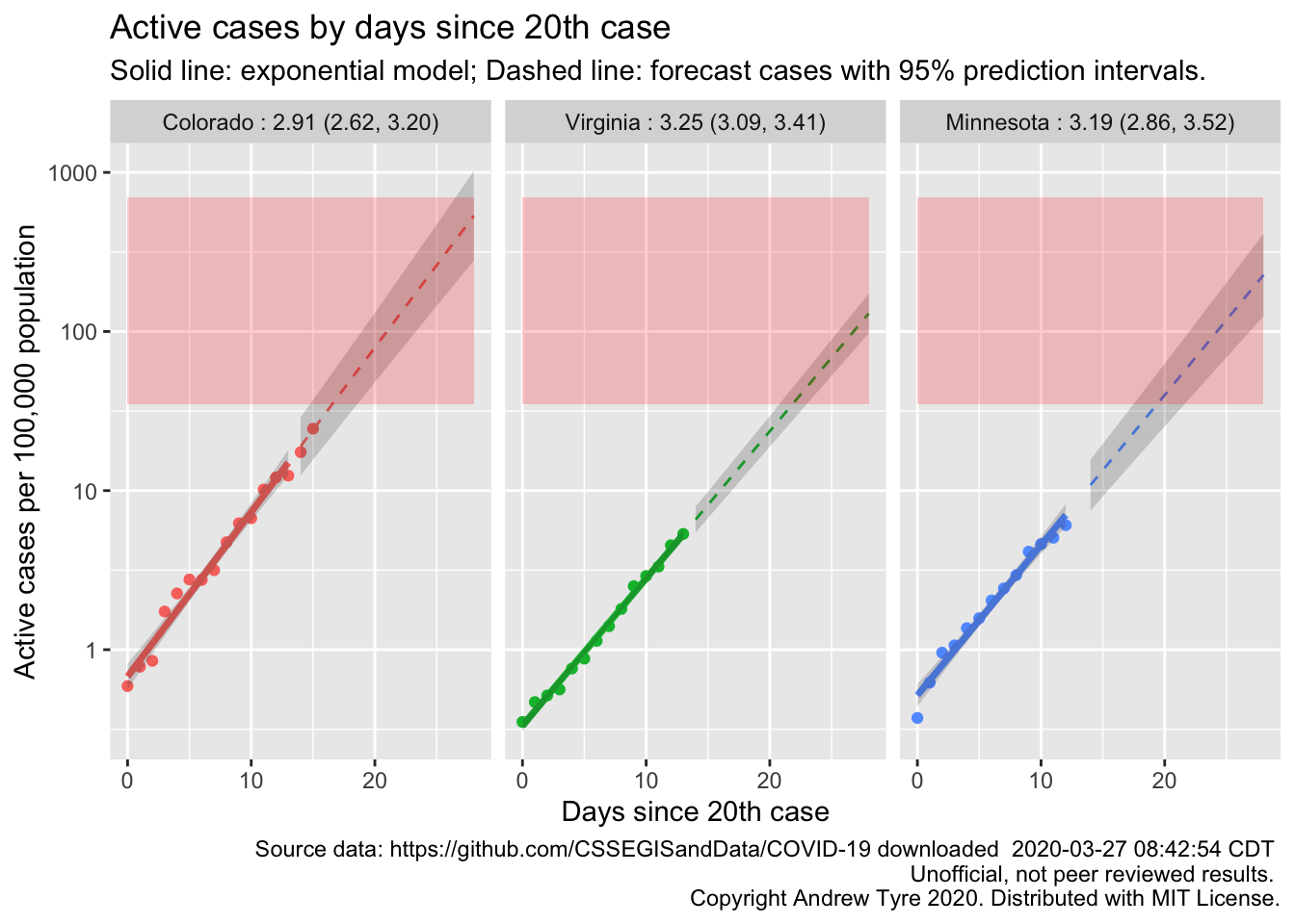
South Dakota is the one state without sufficient data. All three of these states are showing exponential growth. Only Colorado is getting close to the red zone.
