The first post in this series was a week and a half ago, in case you’re just joining and want to see the progression.
The bottom line
DISCLAIMER: These unofficial results are not peer reviewed, and should not be treated as such. My goal is to learn about forecasting in real time, how simple models compare with more complex models, and even how to compare different models.1
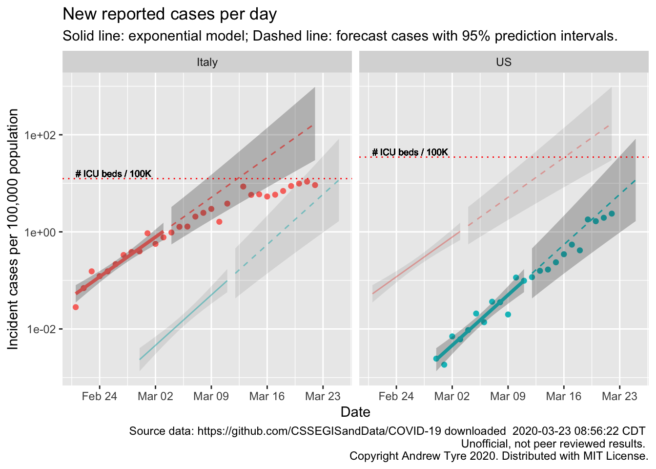
The figure below is complex, so I’ll highlight some features first. The y axis is now cases / 100,000 population to make it easier to compare Italy and the USA. The SOLID LINES are exponential growth models that assume the rate of increase is constant. The dashed lines are predictions from that model. To make comparison easier, the estimated model and predictions for both countries are on both panels. The lines and intervals for the other country are faded out. The horizontal DOTTED LINES are the number of ICU beds per 100,000 population in each country. Note that the y axis is logarithmic.
Below are the same calculations but focused in on 3 US states and 3 Canadian provinces2. Each panel has the same features as the graph above.
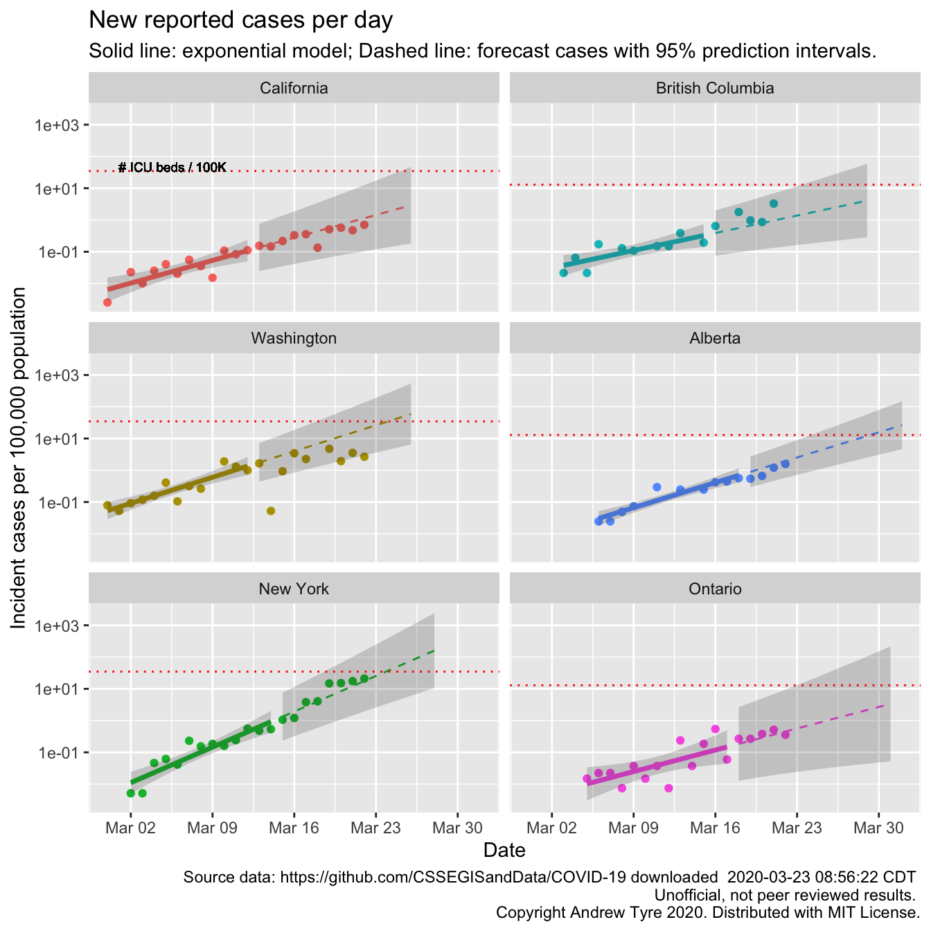
Looks to me like Washington and New York are showing signs of a slow down in the rate of growth. New york is still within the prediction interval, but the last 4 days the new cases are closer to linear.
Here are a few more states people have asked for, along with New York for comparison
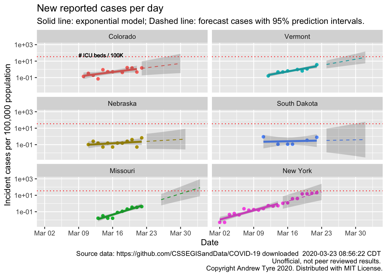
The South Dakota, and Nebraska regressions are not statistically significant. In Nebraska that line is very encouraging. We have already put in place measures to reduce transmission rates, so maybe that will be early enough to blunt the epidemic here.
Tomas Pueyo had another good post on Medium where he articulated the “Hammer and Dance” strategy. It’s the best description yet of what South Korea, Singapore et al. are doing, and translated into US and western sensibility generally. Gave me a bit of hope that we might be able to ease back on the hammer in weeks rather than months, and minimize the economic damage. Key piece is to reduce transmission as much as possible (that’s on us), and a massive testing effort to identify where the virus is and get exposed people in quarantine (that’s on the government). All that buys time. Time for a vaccine to be developed, time for medical science to identify drugs that can help, time for manufacturing to spool up increased PPE production for frontline medical staff. Time is what we need.
Full Data Nerd
The usual warning – thinking while coding, not necessarily well thought out. Even less helpful than the stuff up above.
First up, Jessica Burnett wanted a plot with all the lines starting from Day 0, which in my posts differs by state/province and is picked manually based on when I think cases started growing consistently.
us_by_state <- us_wide2long(jhu_confirmed, "US") # see, fancy!
canada_by_prov <- other_wide2long(jhu_confirmed, countries = "Canada")
state_province <- c("California", "Washington", "New York", "British Columbia", "Alberta", "Ontario")
all_by_province <- bind_rows(us_by_state, canada_by_prov) %>%
  left_join(country_data) %>%
  group_by(country_region, province) %>%
  mutate(incident_cases = c(0, diff(cumulative_cases)),
         max_cases = max(cumulative_cases)) %>%
  ungroup() %>%
  mutate(icpc = incident_cases / popn / 10,
         group = as.numeric(factor(country_region)),
         day = as.numeric(Date - start_date)) %>%
  # remove early rows from each state/province
  # remove 0 rows in the middle that are probably reporting errors
  filter(incident_cases > 0, Date >= start_date,
         province %in% state_province) %>%
  mutate(province = factor(province, levels = state_province))


# fit the models
all_models <- all_by_province %>%
  mutate(log10_ic = log10(incident_cases)) %>%
  filter(day <= 12) %>%
  group_by(province) %>%
  nest() %>%
    mutate(model = map(data, ~lm(log10_ic~day, data = .)))

all_fit <- all_models %>%
  mutate(fit = map(model, augment, se_fit = TRUE),
         fit = map(fit, select, -c("log10_ic","day"))) %>%
  select(-model) %>%
  unnest(cols = c("data","fit")) %>%
  mutate(fit = 10^.fitted,
         lcl = 10^(.fitted - .se.fit * qt(0.975, df = 10)),
         ucl = 10^(.fitted + .se.fit * qt(0.975, df = 10)),
    fitpc = fit / popn / 10,
         lclpc = lcl / popn / 10,
         uclpc = ucl / popn / 10)

#all_predicted <- all_by_province %>%
all_predicted <- cross_df(list(province = factor(state_province, levels = state_province),
                               day = 13:26)) %>%
  #   mutate(day = as.numeric(Date - start_date)) %>%
  # filter(day > 12) %>% #these are the rows we want to predict with
  group_by(province) %>%
  nest() %>%
  left_join(select(all_models, province, model), by="province") %>%
  mutate(predicted = map2(model, data, ~augment(.x, newdata = .y, se_fit = TRUE)),
         sigma = map_dbl(model, ~summary(.x)$sigma)) %>%
  select(-c(model,data)) %>%
  unnest(cols = predicted) %>%
  ungroup() %>%
  left_join(country_data, by = "province") %>%
  mutate(
    Date = start_date + day,
    province = factor(province, levels = state_province), # use factor to modify plot order
    fit = 10^.fitted,
    pred_var = sigma^2 + .se.fit^2,
    lpl = 10^(.fitted - sqrt(pred_var)*qt(0.975, df = 10)),
    upl = 10^(.fitted + sqrt(pred_var)*qt(0.975, df = 10)),
    fitpc = fit / popn / 10,
         lplpc = lpl / popn / 10,
         uplpc = upl / popn / 10)

ggplot(data = all_by_province,
                    mapping = aes(x = day)) +
#  geom_point(mapping = aes(y = icpc, color = province)) +
#  facet_wrap(~province, dir="v") +
  scale_y_log10() +
  theme(legend.position = "top",
        legend.title = element_blank()) +
  geom_line(data = all_fit,
            mapping = aes(y = fitpc, color = province),
            size = 1.25) +
  # geom_ribbon(data = all_fit,
  #           mapping = aes(ymin = lclpc, ymax = uclpc),
  #           alpha = 0.2) +
  geom_line(data = all_predicted,
            mapping = aes(y = fitpc, color = province),
            linetype = 2) +
  # geom_ribbon(data = all_predicted,
  #           mapping = aes(ymin = lplpc, ymax = uplpc),
  #           alpha = 0.2)  +
 # geom_hline(mapping = aes(yintercept = icu_beds), color = "red", linetype = 3) +
  labs(y = "Incident cases per 100,000 population", title = "New reported cases per day",
       subtitle = "Solid line: exponential model; Dashed line: forecast cases with 95% prediction intervals.",
       caption = paste("Source data: https://github.com/CSSEGISandData/COVID-19 downloaded ",
                       format(file.mtime(savefilename), usetz = TRUE),
                       "\n Unofficial, not peer reviewed results.",
"\n Copyright Andrew Tyre 2020. Distributed with MIT License.")) 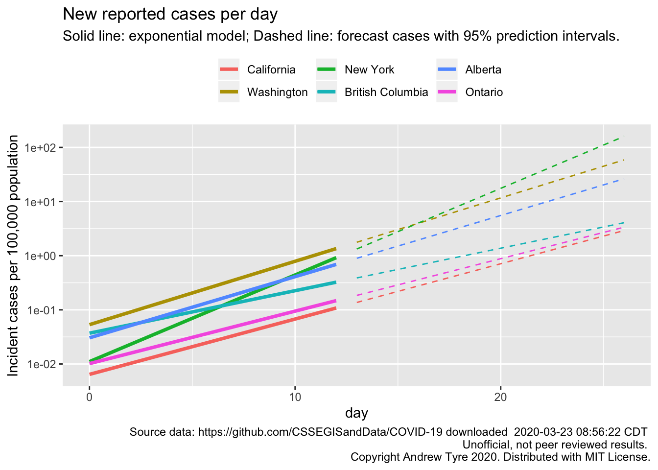
I removed the points as well to reduce clutter. The most remarkable thing about that figure is the consistency of the slopes for 4 locales. New York is the one growing faster than the others. British Columbia is the one growing slower.
David Harris, a FaceBook correspondent, asked why I was using incident cases instead of cumulative cases. I gave a half-baked answer at the time, but really the reason is because Tim Church used incident cases in his example modelling post. I was thinking that cumulative cases is misleading because it ignores recoveries and deaths. However … the JHU data set includes numbers for recoveries and deaths. So it is straightforward to subtract those off and get something like “active cases”. And that would be directly proportional to the load on the healthcare system.
us_by_state <- list(
  Confirmed = us_wide2long(jhu_confirmed, "US"), # see, fancy!
  Deaths = us_wide2long(jhu_deaths,"US"),
  Recovered = us_wide2long(jhu_recovered,"US")
) %>%
  bind_rows(.id = "variable") %>%
  pivot_wider(names_from = variable, values_from = cumulative_cases)

canada_by_prov <- list(
  Confirmed = other_wide2long(jhu_confirmed, countries = "Canada"),
  Deaths = other_wide2long(jhu_deaths, countries = "Canada"),
  Recovered = other_wide2long(jhu_recovered, countries = "Canada")

) %>%
  bind_rows(.id = "variable") %>%
  pivot_wider(names_from = variable, values_from = cumulative_cases)

state_province <- c("California", "Washington", "New York", "British Columbia", "Alberta", "Ontario")
all_by_province <- bind_rows(us_by_state, canada_by_prov) %>%
  left_join(country_data) %>%
  group_by(country_region, province) %>%
  mutate(incident_cases = c(0, diff(Confirmed)),
         active_cases = Confirmed - Deaths - Recovered,
         max_cases = max(Confirmed)) %>%
  ungroup() %>%
  mutate(icpc = incident_cases / popn / 10,
         acpc = active_cases / popn / 10,
         group = as.numeric(factor(country_region)),
         day = as.numeric(Date - start_date)) %>%
  # remove early rows from each state/province
  # remove 0 rows in the middle that are probably reporting errors
  filter(active_cases > 0, Date >= start_date,
         province %in% state_province) %>%
  mutate(province = factor(province, levels = state_province))


# fit the models
all_models <- all_by_province %>%
  mutate(log10_ac = log10(active_cases)) %>%
  filter(day <= 12) %>%
  group_by(province) %>%
  nest() %>%
    mutate(model = map(data, ~lm(log10_ac~day, data = .)))

all_fit <- all_models %>%
  mutate(fit = map(model, augment, se_fit = TRUE),
         fit = map(fit, select, -c("log10_ac","day"))) %>%
  select(-model) %>%
  unnest(cols = c("data","fit")) %>%
  mutate(fit = 10^.fitted,
         lcl = 10^(.fitted - .se.fit * qt(0.975, df = 10)),
         ucl = 10^(.fitted + .se.fit * qt(0.975, df = 10)),
    fitpc = fit / popn / 10,
         lclpc = lcl / popn / 10,
         uclpc = ucl / popn / 10)

#all_predicted <- all_by_province %>%
all_predicted <- cross_df(list(province = factor(state_province, levels = state_province),
                               day = 13:26)) %>%
  #   mutate(day = as.numeric(Date - start_date)) %>%
  # filter(day > 12) %>% #these are the rows we want to predict with
  group_by(province) %>%
  nest() %>%
  left_join(select(all_models, province, model), by="province") %>%
  mutate(predicted = map2(model, data, ~augment(.x, newdata = .y, se_fit = TRUE)),
         sigma = map_dbl(model, ~summary(.x)$sigma)) %>%
  select(-c(model,data)) %>%
  unnest(cols = predicted) %>%
  ungroup() %>%
  left_join(country_data, by = "province") %>%
  mutate(
    Date = start_date + day,
    province = factor(province, levels = state_province), # use factor to modify plot order
    fit = 10^.fitted,
    pred_var = sigma^2 + .se.fit^2,
    lpl = 10^(.fitted - sqrt(pred_var)*qt(0.975, df = 10)),
    upl = 10^(.fitted + sqrt(pred_var)*qt(0.975, df = 10)),
    fitpc = fit / popn / 10,
         lplpc = lpl / popn / 10,
         uplpc = upl / popn / 10)

ggplot(data = all_by_province,
                    mapping = aes(x = day)) +
  geom_point(mapping = aes(y = acpc, color = province)) +
  facet_wrap(~province, dir="v") +
  scale_y_log10() +
  theme(legend.position = "none",
        legend.title = element_blank()) +
  geom_line(data = all_fit,
            mapping = aes(y = fitpc, color = province),
            size = 1.25) +
  geom_ribbon(data = all_fit,
            mapping = aes(ymin = lclpc, ymax = uclpc),
            alpha = 0.2) +
  geom_line(data = all_predicted,
            mapping = aes(y = fitpc, color = province),
            linetype = 2) +
 geom_ribbon(data = all_predicted,
           mapping = aes(ymin = lplpc, ymax = uplpc),
           alpha = 0.2)  +
 geom_hline(mapping = aes(yintercept = icu_beds), color = "red", linetype = 3) +
labs(y = "Active cases per 100,000 population", title = "Active cases by date",
     x = "Days since start of exponential growth",
       subtitle = "Solid line: exponential model; Dashed line: forecast cases with 95% prediction intervals.",
       caption = paste("Source data: https://github.com/CSSEGISandData/COVID-19 downloaded ",
                       format(file.mtime(savefilename), usetz = TRUE),
                       "\n Unofficial, not peer reviewed results.",
                       "\n Copyright Andrew Tyre 2020. Distributed with MIT License."))   +
  geom_text(data = filter(all_by_province, province == "California"),
            mapping = aes(y = 1.4*icu_beds),
            x = ymd("2020-03-01"),
           label = "# ICU beds / 100K",
           size = 2.5, hjust = "left")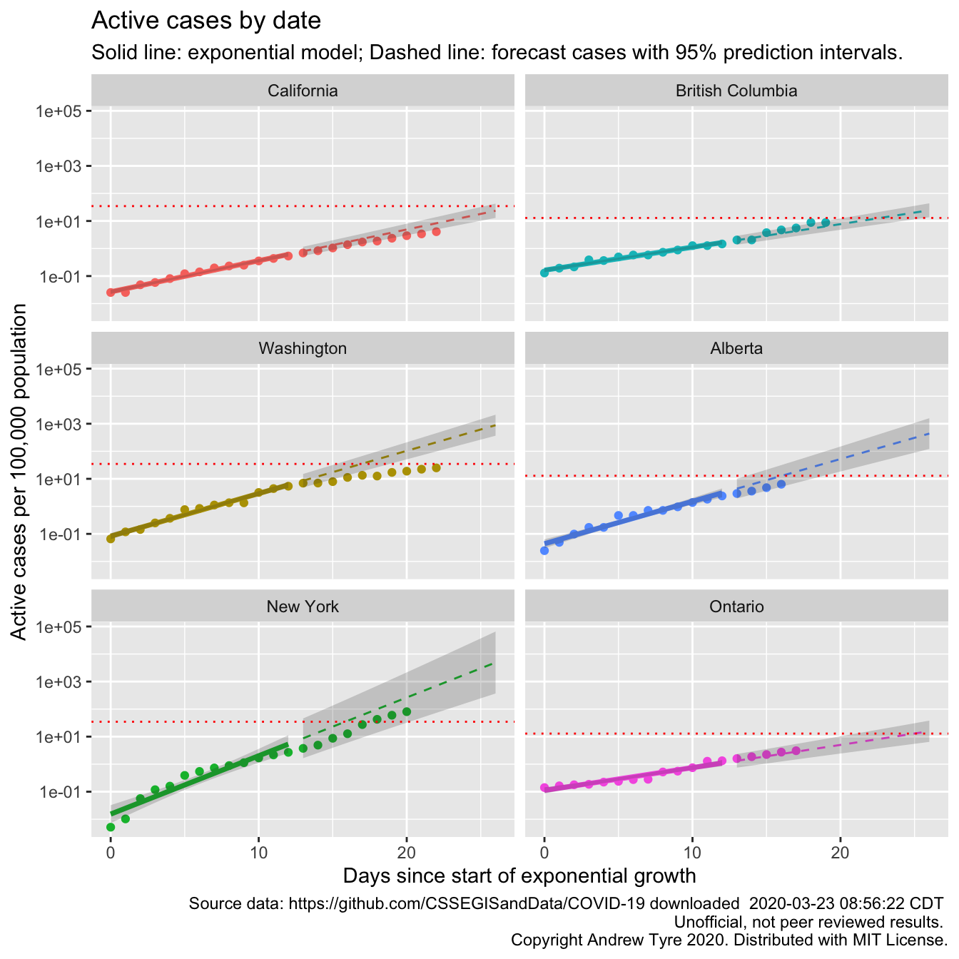
“Flattening the curve” is clearer in this plot for California, Washington, and New York. The autocorrelation I’ve been ignoring is also clearer, especially in the New York plot. The points “wave” up and down around the expected value. The red line is per capita ICU beds by country, so could be different by state or province. The comparison between the points and the ICU line is affected by one question – what proportion of “active cases” need ICU support? If the “Confirmed” cases were ALL of the COVID-19 cases, then the red line is too low by a factor of 5-20. However, we know that not all cases are being tested and “confirmed”. Confirmed cases right now are overwhelmingly the ones that are really sick. So the dotted line is a “lower bound” that assumes all reported cases need ICU support. Maybe that should be a region of uncertainty between ICU beds and 20 x ICU beds.
ggplot(data = all_by_province,
                    mapping = aes(x = day)) +
  geom_point(mapping = aes(y = acpc, color = province)) +
  facet_wrap(~province, dir="v") +
  scale_y_log10() +
  theme(legend.position = "none",
        legend.title = element_blank()) +
  geom_line(data = all_fit,
            mapping = aes(y = fitpc, color = province),
            size = 1.25) +
  geom_ribbon(data = all_fit,
            mapping = aes(ymin = lclpc, ymax = uclpc),
            alpha = 0.2) +
  geom_line(data = all_predicted,
            mapping = aes(y = fitpc, color = province),
            linetype = 2) +
 geom_ribbon(data = all_predicted,
           mapping = aes(ymin = lplpc, ymax = uplpc),
           alpha = 0.2)  +
  # replace this line
  # geom_hline(mapping = aes(yintercept = icu_beds), color = "red", linetype = 3) +
  # with this:
  geom_ribbon(mapping = aes(ymin = icu_beds, ymax = icu_beds*20), fill = "red", alpha = 0.2) +
labs(y = "Active cases per 100,000 population", title = "Active cases by date",
     x = "Days since start of exponential growth",
       subtitle = "Solid line: exponential model; Dashed line: forecast cases with 95% prediction intervals.",
       caption = paste("Source data: https://github.com/CSSEGISandData/COVID-19 downloaded ",
                       format(file.mtime(savefilename), usetz = TRUE),
                       "\n Unofficial, not peer reviewed results.",
                       "\n Copyright Andrew Tyre 2020. Distributed with MIT License."))   +
  geom_text(data = filter(all_by_province, province == "California"),
            mapping = aes(y = 1.4*icu_beds),
            x = ymd("2020-03-01"),
           label = "# ICU beds / 100K",
           size = 2.5, hjust = "left")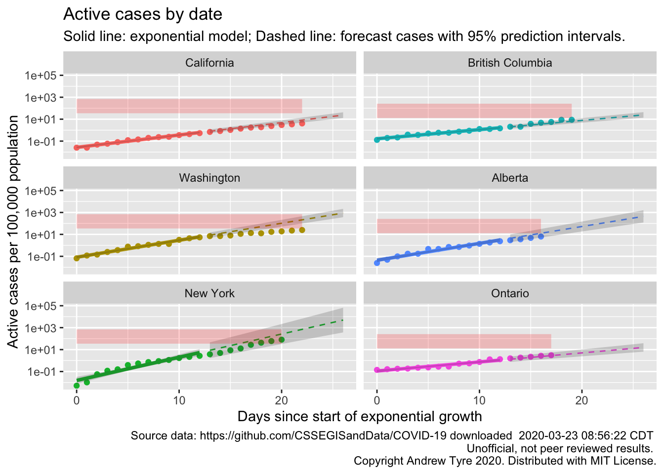
Hmm, so that’s better than the line. New York is clearly into the red zone, while Washington so far seems to be avoiding it.
What’s next?
I promised myself to not spend more than 1/2 a day on these posts! Taking a break was good. Next new thing to try tomorrow is calculating the doubling time and adding that to each panel.
