FiveThirtyEight is reporting on a project generating consensus predictions from experts. The consensus prediction of total cases in the USA on Sunday April 5 was 386,500 (80% UI: 280,500-581,500). My prediction used a time series model. How did we do?
The first post in this series was March 13, in case you’re just joining and want to see the progression. I’m now posting the bottom line figures for each state and province on the same post that just gets updated each day.
DISCLAIMER: These unofficial results are not peer reviewed, and should not be treated as such. My goal is to learn about forecasting in real time, how simple models compare with more complex models, and even how to compare different models.1
library("tidyverse")
library("lubridate")
library("broom")
library("forecast")

savefilename <- "data/api_all_2020-04-06.Rda"

load(savefilename)

country_data <- read_csv("data/countries_covid-19.csv") %>%
  mutate(start_date = mdy(start_date))

source("R/jhu_helpers.R")
source("R/plot_functions.R")


usa_by_state <- list(
  confirmed = us_wide2long(api_confirmed_regions, "United States"),
  deaths = us_wide2long(api_deaths_regions, "United States"),
  # recovered data is a mess lots of missing values
  recoveries = us_wide2long(api_recoveries_regions, "United States")
  ) %>%
  bind_rows(.id = "variable") %>%
  pivot_wider(names_from = variable, values_from = cumulative_cases)
usa_by_state2 <- plot_active_case_growth(usa_by_state, country_data)$data

usa_total <- usa_by_state2 %>%
  group_by(Date) %>%
  summarize(confirmed_cases = sum(confirmed, na.rm = TRUE)) %>%
  mutate(log10_cc = log10(confirmed_cases),
         # match how autoplot is representing the x axis?
         Time = as.numeric(Date),
         n_obs = n(),
         Training = Date <= "2020-03-29")
training_data <- filter(usa_total, Training)
expert_consensus <- tibble(
  Date = ymd("2020-04-05"),
  fit = 386500,
  lpl = 280500,
  hpl = 581500
)
usat_ts <- zoo::zoo(pull(training_data, log10_cc), pull(training_data, Date))
usat_ts_fit <- auto.arima(usat_ts, seasonal = FALSE)
usat_forecast <- forecast(usat_ts_fit, h = 14) %>%
  as_tibble() %>%
  mutate(Date = as.Date(max(training_data$Time) + 1:14, ymd("1970-01-01")),
         fit = 10^`Point Forecast`,
         l80pl = 10^`Lo 80`,
         h80pl = 10^`Hi 80`,
         l95pl = 10^`Lo 95`,
         h95pl = 10^`Hi 95`)
ggplot(data = usa_total)  + scale_y_log10() +
  geom_point(mapping = aes(x = Date, y = confirmed_cases))+
  geom_line(data = usat_forecast,
            mapping = aes(x = Date, y = fit), linetype = 2)+
  geom_ribbon(data = usat_forecast,
              mapping = aes(x = Date, ymin = l80pl, ymax = h80pl), alpha = 0.2) +
    geom_ribbon(data = usat_forecast,
              mapping = aes(x = Date, ymin = l95pl, ymax = h95pl), alpha = 0.2) +
  geom_point(data = expert_consensus,
             mapping = aes(x = Date, y = fit), color = "blue") +
  geom_errorbar(data = expert_consensus,
                mapping = aes(x = Date, ymin = lpl, ymax = hpl), size = 0.1, color = "blue") +
        labs(y = "Cumulative confirmed cases",
           title = paste0("Cumulative confirmed cases in USA"),
           x = "Date",
           subtitle = "Dashed line: ARIMA(1,1) forecast cases with (80%, 95%) prediction intervals. \nBlue point Expert Consensus (80% UI)",
           caption = paste("Source data: https://coviddata.github.io/coviddata/ downloaded ",
                           format(file.mtime(savefilename), usetz = TRUE),
                           "\n Unofficial, not peer reviewed results.",
                           "\n Copyright Andrew Tyre 2020. Distributed with MIT License."))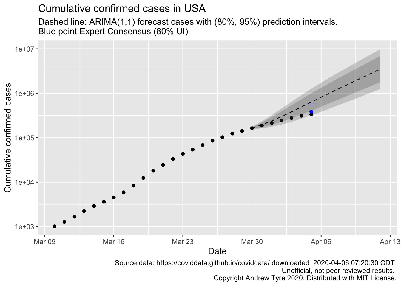
So the time series model that assumes the rate of growth is constant is too pessimistic. That’s more or less what I expected. I didn’t think the exponential growth model would succeed anywhere near as long as it has. The expert consensus was much closer. I’m guessing there will be another expert consensus for next sunday, so I’m going to make a prediction for then using the automatic time series modelling.
usat_ts2 <- zoo::zoo(pull(usa_total, log10_cc), pull(usa_total, Date))
usat_ts_fit2 <- auto.arima(usat_ts2, seasonal = FALSE)
usat_forecast2 <- forecast(usat_ts_fit2, h = 7) %>%
  as_tibble() %>%
  mutate(Date = as.Date(max(usa_total$Time) + 1:7, ymd("1970-01-01")),
         fit = 10^`Point Forecast`,
         l80pl = 10^`Lo 80`,
         h80pl = 10^`Hi 80`,
         l95pl = 10^`Lo 95`,
         h95pl = 10^`Hi 95`)
ggplot(data = usa_total)  + scale_y_log10() +
  geom_point(mapping = aes(x = Date, y = confirmed_cases))+
  geom_line(data = usat_forecast2,
            mapping = aes(x = Date, y = fit), linetype = 2)+
  geom_ribbon(data = usat_forecast2,
              mapping = aes(x = Date, ymin = l80pl, ymax = h80pl), alpha = 0.2) +
    geom_ribbon(data = usat_forecast2,
              mapping = aes(x = Date, ymin = l95pl, ymax = h95pl), alpha = 0.2) +
  geom_point(data = expert_consensus,
             mapping = aes(x = Date, y = fit), color = "blue") +
  geom_errorbar(data = expert_consensus,
                mapping = aes(x = Date, ymin = lpl, ymax = hpl), size = 0.1, color = "blue") +
        labs(y = "Cumulative confirmed cases",
           title = paste0("Cumulative confirmed cases in USA"),
           x = "Date",
           subtitle = "Dashed line: ARIMA(0,2,1) forecast cases with (80%, 95%) prediction intervals. \nBlue point Expert Consensus (80% UI)",
           caption = paste("Source data: https://coviddata.github.io/coviddata/ downloaded ",
                           format(file.mtime(savefilename), usetz = TRUE),
                           "\n Unofficial, not peer reviewed results.",
                           "\n Copyright Andrew Tyre 2020. Distributed with MIT License."))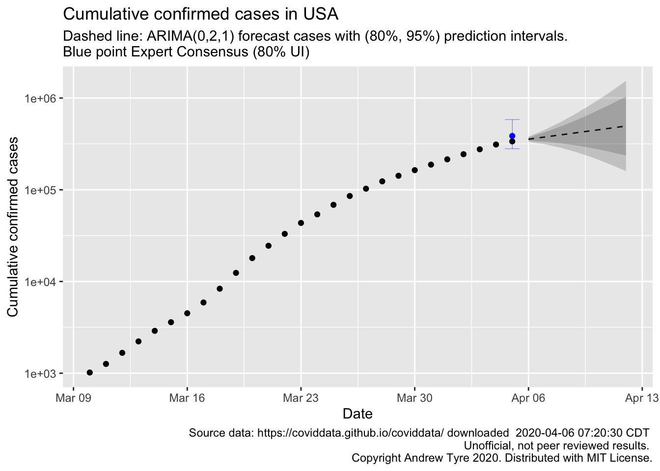
So using all the data up to now, the automatic model selection picked quite a different model, a moving average model. I can also see a significant problem with this approach to forecasting these data – the cumulative number of cases cannot go down, while the model assumes it can. I think the solution is to model the number of new cases per day (yes, that’s where I started oh so long ago!). Then simulate from the posterior of the forecasts, calculating the cumulative sums.
But that’s for another day.
