The goal of this week’s lab is just getting your feet wet, learning how to use R. Like all labs, I expect you to submit an R Markdown file that I can compile to html. You should assume any data files are in a subdirectory called “data”. Your file should not echo the code used. Answer the numbered questions in text, referring to graphical and tabular output as needed. You may use base graphics or ggplot2, according to your preference.
Open RStudio and create a new project. I recommend creating a project for each week of class inside a folder called NRES222 or whatever else works for you.
If you haven’t previously, do
install.packages("tidyverse")If R prompts you with a question about installing from source because of a newer version, answer n for no.
Download the data from the link in Canvas, saving it into a subdirectory of your project called data.
Create a new R Markdown file by clicking the button in the top left of RStudio with a + on it. Save this file into your project directory with a filename yourlastname_week1.Rmd. Your file pane should look something like this:
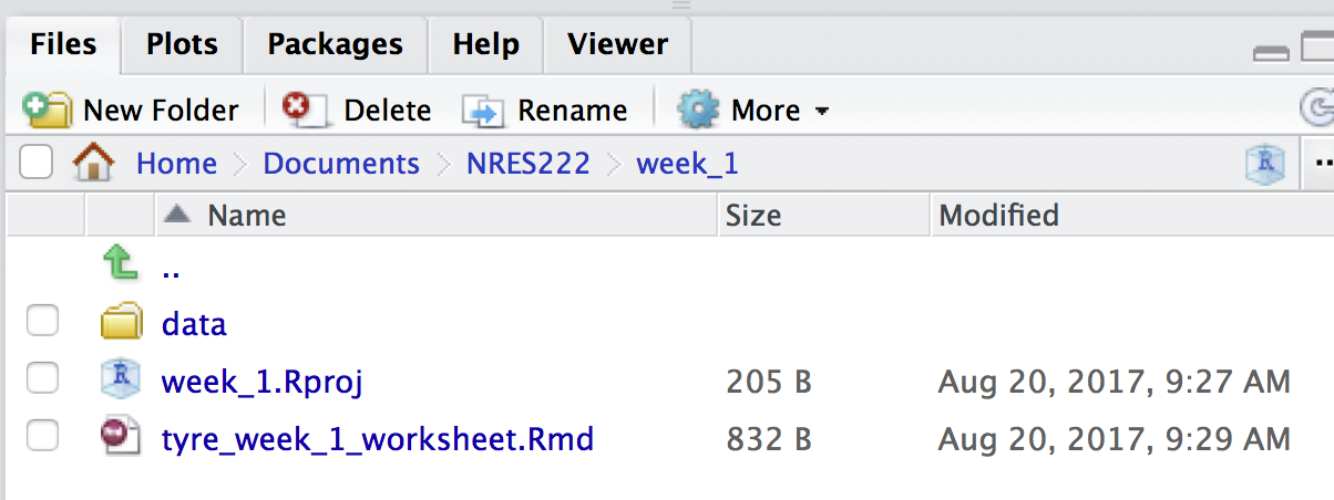
A good directory structure at this point.
At the top of the file is some header information that you can leave as is for now.
On line 8 you will see a block of text with``` on the top and bottom:
```{r setup, include=FALSE}
knitr::opts_chunk$set(echo = TRUE)
`````` is treated as instructions to the computer. Everything outside the code chunk is rendered as regular text. Add a line to the code chunk to load the tidyverse package we installed above.
```{r setup, include=FALSE}
knitr::opts_chunk$set(echo = TRUE)
library(tidyverse)
```
You can delete everything from the end of that code chunk to the bottom of the file. Click the Knit button at the top. You should get a preview of an HTML file that just has the header information in it. An html file will also appear in the file pane next to the Rmd file.
Bring the data in
We add another line to the code to read the data into an R object called adata.frame
```{r setup, include=FALSE}
knitr::opts_chunk$set(echo = TRUE)
library(tidyverse)
beetles <- read_csv("data/dobesh_bettles.csv")
```
Run that line of code (control / command - enter). You will likely get an error:
Error: 'data/dobesh_bettles.csv' does not exist in current working directory ('/Users/atyre2/Documents/NRES222/week_1').Double check the spelling of the file name (I misspelled it), and if that is good, double check that you saved the file in the right place with the right name.
make a figure
We want to make three figures. Two showing the average beetle diversity or average beetle abundance in the two habitats, and one showing how diversity changes with abundance. The third one is easier, so let’s start there. The TA will demonstrate building up the code below bit by bit explaining what each piece does. Start by inserting a new code chunk (use the insert button or control-alt-i (pc) or option-command-i (mac) )
```{r figure-diversity-vs-abundance}
ggplot(data=beetles,
       mapping = aes(x = abundance, y = diversity, color=habitat)) +
  geom_point() +
  geom_smooth(method="lm", alpha = 0.4) +
  labs(x = "Habitat Type",
       y = "Mean abundance of beetles (95% CI)",
       caption="Figure 2: Mean and 95% confidence limits of burying beetle abundance in two Nebraska habitats.") +
  scale_color_discrete(name = "Habitat type",
                       labels = c("Dense cedar", "Grassland"))
```
From here on, I won’t show the code chunk information, just the code that goes in the code chunk. The label that comes after the r is optional, but can help you figure out where things are going wrong.
Here are a few questions to answer with that graph. Remember to type your answers outside the code chunks. Start each answer with the number of the question.
Overall, what happens to species diversity (response variable) as abundance (predictor variable) increases?
Does the same thing happen within each habitat? Do both habitats have the same slope (rate of change) for the trendline?
Comparing average abundance between habitats.
In order to make a bar plot that compares mean abundance between the two habitats we first have to calculate the averages. We also want to use error bars, so we will need to calculate the standard errors of our means. Again, insert a code chunk, optionally give it a label, and then put the code inside the chunk. The TA will demonstrate the code line by line.
t1 <- group_by(beetles, habitat)
t2 <- summarize(t1,
                mean_abundance = mean(abundance),
                sd_abundance = sd(abundance),
                n = n(),
                se_abundance = sd_abundance / n)
# make a nice summary table
knitr::kable(t2, digits = 2, caption = "Table 1: Beetle Abundance by habitat type.")
Then make a figure. This code demonstrate a different way to fix axis labels that also allows you to add a caption.
ggplot(data = t2,
       mapping = aes(x=habitat, y = mean_abundance)) +
  geom_bar(stat="identity") +
  geom_errorbar(mapping = aes(ymin = mean_abundance - 2*se_abundance,
                              ymax = mean_abundance + 2*se_abundance),
                width = 0.2) +
  labs(x = "Habitat Type",
       y = "Mean abundance of beetles (95% CI)",
caption="Figure 2: Mean and 95% confidence limits of burying beetle abundance in two Nebraska habitats.")- Do the two habitats differ for the mean abundance of beetles (explain briefly)? If there is a difference, does it appear to be statistically significant? Base your interpretation on both the means and a measure of variability (i.e. the SE you calculated and the plotted confidence intervals).
Comparing species richness between habitats
# we don't need to do this again
#t1 <- group_by(beetles, habitat)
# reuse the t1 object
t3 <- summarize(t1,
                mean_diversity = mean(diversity),
                sd_diversity = sd(diversity),
                n = n(),
                se_diversity = sd_diversity / n)
# make a nice summary table
knitr::kable(t3, digits = 2, caption = "Table 2: Beetle Species richness by habitat type.")
Then make a figure. This code demonstrate a different way to fix axis labels that also allows you to add a caption.
ggplot(data = t3,
       mapping = aes(x=habitat, y = mean_diversity)) +
  geom_bar(stat="identity") +
  geom_errorbar(mapping = aes(ymin = mean_diversity - 2*se_diversity,
                              ymax = mean_abundance + 2*se_diversity),
                width = 0.2) +
  labs(x = "Habitat Type",
       y = "Species Richness of beetles (Mean and 95% CI)",
caption="Figure 3: Mean and 95% confidence limits of burying beetle species richness in two Nebraska habitats.")- Does species richness differ between the two habitats? If there is a difference, does it appear to be statistically significant? Base your interpretation on both the means and a measure of variability (i.e. the SE you calculated and the plotted confidence intervals).
Turn in
In Canvas, you will submit your R markdown file. Be sure your last name is the first part of the filename, and that it says “week1” somewhere as well. Double check that it will work (necessary for full points) by clicking the “knit” button. If it produces an HTML file with all your figures and answers to the questions, you’re good!
